Exists in small "trick" using the edges in CSS which allows us to make triangular edges.
I personally insert these edges with :after or :before.
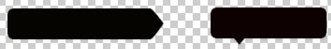
Here’s an example of how I would make your examples using what I said
HTML
Here we create our HTML, with two divs to simulate the dialogue balloons
<div class="balao"></div>
<div class="balao2"></div>
CSS
And here’s the styling needed for them
.balao{
    background: #000;
    border-radius: 0 30px 30px 0;
    width: 300px;
    height: 100px;

    /* Position relative para a seta não exceder os limites do balão, já que vamos usar position absolute nele */
    position: relative;

    margin-bottom: 1em;
}
.balao:after{
    /* content necessário para a criação de um elemento vazio */
    content: "";

    width: 0;
    height: 0;

    /* position: absolute para manipularmos a posição da seta */
    position: absolute;

    /* Right com valor negativo para ele ficar para fora do balão de dialogo */
    right: -32px;

    /* E aqui o truque com as bordas */
    /* 50px é a metade da altura do elemento, assim temos uma seta da mesma altura que nosso elemento */
    border-top: 50px solid transparent;
    border-bottom: 50px solid transparent;
    border-left: 50px solid #000;

    border-radius: 50%;

}
.balao2{
    background: #000;
    border-radius: 15px;
    width: 300px;
    height: 100px;

    position: relative;
}
.balao2:after{

    content: "";

    width: 0;
    height: 0;

    position: absolute;

    border-left: 20px solid transparent;
    border-right: 20px solid transparent;
    border-top: 20px solid #000;

    bottom: -20px;
    left: 20%;
}
Follow the example in Jsfiddle: http://jsfiddle.net/Wagner/m0qyayf7
.balao {
  background: #000;
  border-radius: 0 30px 30px 0;
  width: 300px;
  height: 100px;
  /* Position relative para a seta não exceder os limites do balão, já que vamos usar position absolute nele */
  position: relative;
  margin-bottom: 1em;
}

.balao:after {
  /* content necessário para a criação de um elemento vazio */
  content: "";
  width: 0;
  height: 0;
  /* position: absolute para manipularmos a posição da seta */
  position: absolute;
  /* Right com valor negativo para ele ficar para fora do balão de dialogo */
  right: -32px;
  /* E aqui o truque com as bordas */
  /* 50px é a metade da altura do elemento, assim temos uma seta da mesma altura que nosso elemento */
  border-top: 50px solid transparent;
  border-bottom: 50px solid transparent;
  border-left: 50px solid #000;
  border-radius: 50%;
}

.balao2 {
  background: #000;
  border-radius: 15px;
  width: 300px;
  height: 100px;
  position: relative;
}

.balao2:after {
  content: "";
  width: 0;
  height: 0;
  position: absolute;
  border-left: 20px solid transparent;
  border-right: 20px solid transparent;
  border-top: 20px solid #000;
  bottom: -20px;
  left: 20%;
}
<div class="balao"></div>
<div class="balao2"></div>
There are quite complete examples on the internet, and even automatic generators for this, just do a Google search for "css triangles"
http://answall.com/questions/2394/cria-um-tri%C3%A2ngulo-com-css
– bfavaretto
The explanation there is quite complete. I liked it! I knew the trick, but I didn’t know how it worked 100%, thank you :)
– waghcwb