Problems with list and grid thumbnails with bootstrap

Asked

Viewed 128 times

0

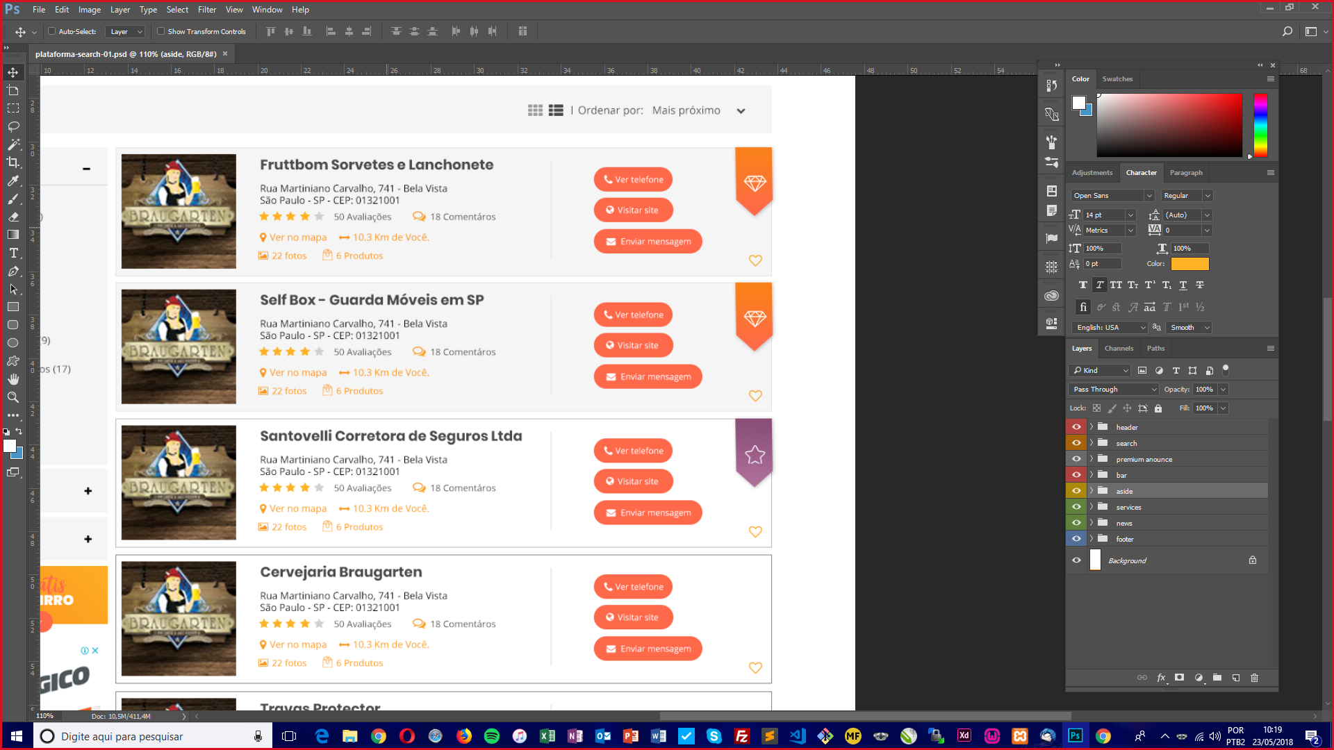
I need to make these cards in list mode and grid mode I’m using flex-column to make the dynamic grids more when I add the cards they no longer work this is the list mode of my layout:

inserir a descrição da imagem aqui

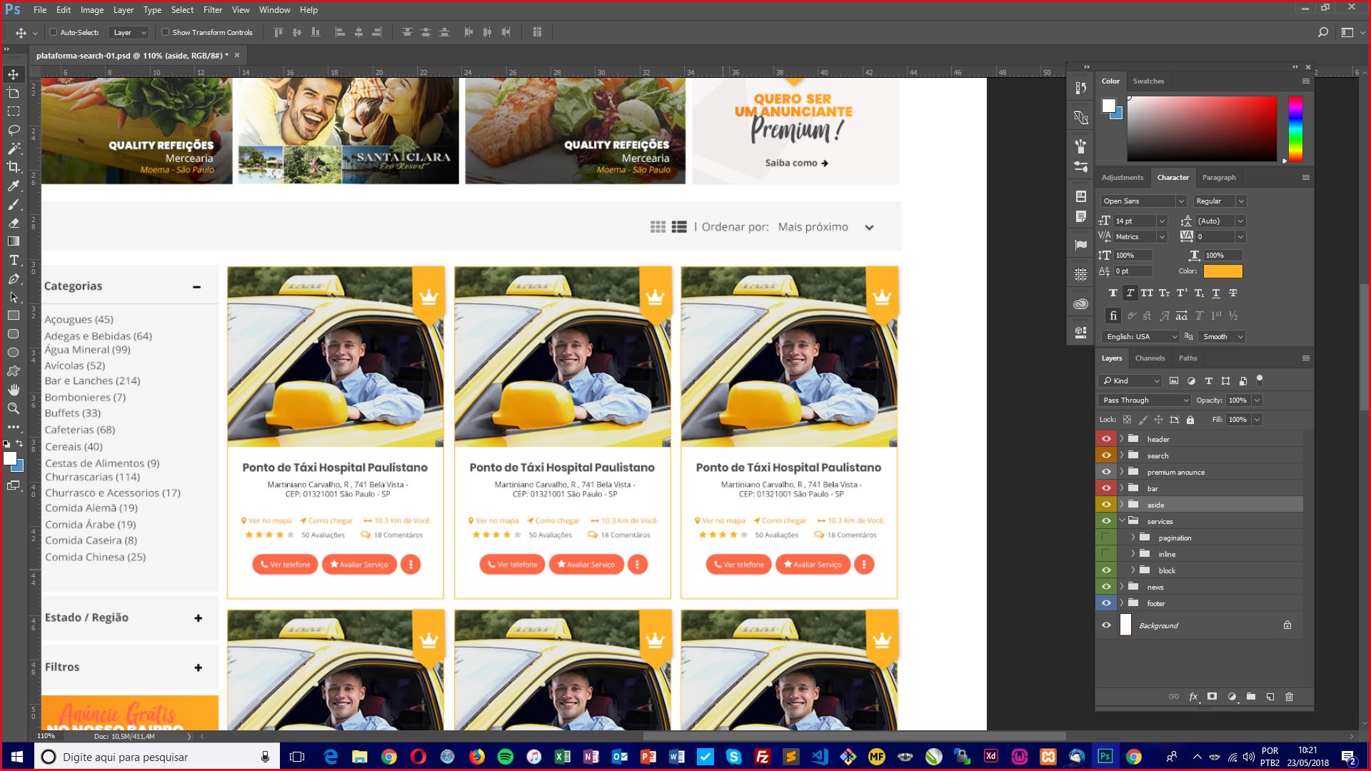
and that a grid mode outline: inserir a descrição da imagem aqui

follows my code:

$(".button-thumb").click(function() {
  if ($(this).val() != "grid") {
    $("#list-grid").addClass("flex-column");
    $('#list').addClass('active');
    $('#grid').removeClass('active');
  } else {
    $("#list-grid").removeClass("flex-column");
    $('#grid').addClass('active');
    $('#list').removeClass('active');
  }

});
background-color: $light-gray;
padding: 15px;
.active {
  color: $orange;
}

button {
  cursor: pointer;
  border: 0;
  background-color: transparent;
  outline: none;
  color: $gray;
  @include transition(all, .2s);
  &:hover {
    color: $orange;
  }
}

label {
  margin: 0;
  font-family: 'Open Sans', sans-serif;
  color: $gray;
}

select {
  outline: none;
  border: 0;
  background-color: transparent;
  color: $gray;
}


}
<script src="https://ajax.googleapis.com/ajax/libs/jquery/2.1.1/jquery.min.js"></script>
<link rel="stylesheet" href="https://use.fontawesome.com/releases/v5.0.10/css/all.css" integrity="sha384-+d0P83n9kaQMCwj8F4RJB66tzIwOKmrdb46+porD/OvrJ+37WqIM7UoBtwHO6Nlg" crossorigin="anonymous">
<script src="https://stackpath.bootstrapcdn.com/bootstrap/4.1.1/js/bootstrap.min.js"></script>
<link rel="stylesheet" href="https://stackpath.bootstrapcdn.com/bootstrap/4.1.1/css/bootstrap.min.css" />
<div class="row mt-3">
  <div class="col-md-12 text-right">
    <div class="box-lists">
      <button id="list" class="button-thumb active" value="list"><i class="fas fa-list-ul"></i></button>
      <button id="grid" class="button-thumb" value="grid"><i class="fas fa-th"></i></button>
      <label for="select"> | Ordenar por:</label>
      <select id="select">
        <option value="">Mais Próximo</option>
        <option value="">Mais Distante</option>
        <option value="">Mais visitados</option>
        <option value="">Mais avaliados</option>
      </select>
    </div>
  </div>
</div>

<div class="row mt-3">
  <div class="col-md-8">
    <div id="list-grid" class="row flex-column">
      <div class="col-xs-2">
        <div class="card mb-3">
          <img class="card-img-top" src="http://via.placeholder.com/350x150" alt="Card image cap">
          <div class="card-body">
            <h5 class="card-title">Card title</h5>
            <p class="card-text">This is a wider card with supporting text below as a natural lead-in to additional content. This content is a little bit longer.</p>
            <p class="card-text"><small class="text-muted">Last updated 3 mins ago</small></p>
          </div>
        </div>
      </div>
    </div>
  </div>
</div>

in case I needed my cards to be the same as the first image plus when I clicked the Mogo grid button they were the same as the second image.

  • 1

    Young puts here the CSS tb, because the script doesn’t work without it. vlw

  • @hugocsl I added the css so I used SCSS ai no longer compiled to view it in the editor is the only css I made

2 answers

1

Confers:

<link rel="stylesheet" href="https://cdnjs.cloudflare.com/ajax/libs/font-awesome/4.7.0/css/font-awesome.min.css">

<style>
.column {
    float: left;
    width: 40%; // Alterar para 50% para tela cheia.
    padding: 10px;
}

.row:after {
    content: "";
    display: table;
    clear: both;
}
</style>

<button onclick="listView()"><i class="fa fa-bars"></i> Lista</button> 
<button onclick="gridView()"><i class="fa fa-th-large"></i> Grid</button> 

<div class="row">
  <div class="column" style="background-color:#aaa;">
    <h2>Coluna 1</h2>
    <p>Conteúdo 1</p>
  </div>
  <div class="column" style="background-color:#bbb;">
    <h2>Coluna 2</h2>
    <p>Conteúdo 2</p>
  </div>
</div>
<div class="row">
  <div class="column" style="background-color:#ccc;">
    <h2>Coluna 3</h2>
    <p>Conteúdo 3</p>
  </div>
  <div class="column" style="background-color:#ddd;">
    <h2>Coluna 4</h2>
    <p>Conteúdo 4</p>
  </div>
</div>

<script>
var elements = document.getElementsByClassName("column");

var i;

function listView() {
  for (i = 0; i < elements.length; i++) {
    elements[i].style.width = "100%";
  }
}

function gridView() {
  for (i = 0; i < elements.length; i++) {
    elements[i].style.width = "50%"; // Alterar para 50% para tela cheia.
  }
}
</script>

var elements = document.getElementsByClassName("column");

var i;

function listView() {
  for (i = 0; i < elements.length; i++) {
    elements[i].style.width = "100%";
  }
}

function gridView() {
  for (i = 0; i < elements.length; i++) {
    elements[i].style.width = "40%"; // Alterar para 50% para tela cheia.
  }
}
.column {
    float: left;
    width: 40%;
    padding: 10px;
}

.row:after {
    content: "";
    display: table;
    clear: both;
}
<link rel="stylesheet" href="https://cdnjs.cloudflare.com/ajax/libs/font-awesome/4.7.0/css/font-awesome.min.css">

<button onclick="listView()"><i class="fa fa-bars"></i> Lista</button> 
<button onclick="gridView()"><i class="fa fa-th-large"></i> Grid</button> 

<div class="row">
  <div class="column" style="background-color:#aaa;">
    <h2>Coluna 1</h2>
    <p>Conteúdo 1</p>
  </div>
  <div class="column" style="background-color:#bbb;">
    <h2>Coluna 2</h2>
    <p>Conteúdo 2</p>
  </div>
</div>
<div class="row">
  <div class="column" style="background-color:#ccc;">
    <h2>Coluna 3</h2>
    <p>Conteúdo 3</p>
  </div>
  <div class="column" style="background-color:#ddd;">
    <h2>Coluna 4</h2>
    <p>Conteúdo 4</p>
  </div>
</div>

Note that I formatted the Divs with the use of CSS, I used 40% in width because here in the run example was not showing in grid, but you can adapt it to your layout, fully responsive. Inside the DIV with the content, you insert the format according to its layout, with two columns, the first with "width 100%" when the div receives the css value. column and remove the value of "width" when the div has the value css ,column removed.

1

EDIT

Let’s keep it simple :)

I remade the example using my other answer and putting the Card inside. Note that the only thing I needed to do was to adjust the column width with the default class col-8 and when the grid is in the list I put the card with flex-direction: row

<!DOCTYPE html>
<html lang="en">
<head>
    <meta charset="utf-8" />
    <title>Page Title</title>
    <meta name="viewport" content="width=device-width, initial-scale=1">
    <link rel="stylesheet" type="text/css" media="screen" href="https://maxcdn.bootstrapcdn.com/bootstrap/4.0.0-beta.2/css/bootstrap.min.css" integrity="sha384-PsH8R72JQ3SOdhVi3uxftmaW6Vc51MKb0q5P2rRUpPvrszuE4W1povHYgTpBfshb" crossorigin="anonymous" />
    <link rel="stylesheet" type="text/css" media="screen" href="https://maxcdn.bootstrapcdn.com/font-awesome/4.7.0/css/font-awesome.min.css" />
<style>
    div[class^="col"] {
        box-sizing: border-box;
        border: 1px solid green;
        flex: 1;
    }
    .coluna {
        flex-direction: column;
    }
    .flex-column div > .card{
        flex-direction: row;
    }

</style>
</head>
<body>

    <button>coluna/linha</button>
    <div class="container">
        <div id="colunaX" class="row flex-column">
          <div class="col-8">
            <div class="card mb-3">
                <img class="card-img-top" src="http://via.placeholder.com/350x150" alt="Card image cap">
                <div class="card-body">
                    <h5 class="card-title">Card title</h5>
                    <p class="card-text">This is a wider card with supporting text below as a natural lead-in to additional content. This content is a little bit longer.</p>
                    <p class="card-text"><small class="text-muted">Last updated 3 mins ago</small></p>
                </div>
            </div>
          </div>
        </div>
      </div>


    <script src="https://code.jquery.com/jquery-3.2.1.slim.min.js"></script>
    <script src="https://cdnjs.cloudflare.com/ajax/libs/popper.js/1.12.3/umd/popper.min.js"></script>
    <script src="https://maxcdn.bootstrapcdn.com/bootstrap/4.0.0-beta.2/js/bootstrap.min.js"></script>
    <script src="https://maxcdn.bootstrapcdn.com/bootstrap/4.0.0-beta.3/js/bootstrap.bundle.min.js"></script>

    <script>
    $("button").click(function(){
        $("#colunaX").toggleClass("flex-column");
    });
    </script>
</body>
</html>


Young basically you solve with this css when your grid is in list form. I have not tested pq I have not compiled SCSS. OBS, I put a offset here to align on the right as it is in the layout col-md-8 offset-md-4

.card {
    flex-direction: row;
}

<!DOCTYPE html>
<html lang="en">
<head>
    <meta charset="utf-8" />
    <title>Page Title</title>
    <meta name="viewport" content="width=device-width, initial-scale=1">
    <link rel="stylesheet" type="text/css" media="screen" href="https://maxcdn.bootstrapcdn.com/bootstrap/4.0.0-beta.2/css/bootstrap.min.css"/>
    <link rel="stylesheet" type="text/css" media="screen" href="https://maxcdn.bootstrapcdn.com/font-awesome/4.7.0/css/font-awesome.min.css" />
<style>
.card {
    flex-direction: row;
}
</style>
</head>
<body>
    
<div class="row mt-3">
    <div class="col-md-12 text-right">
        <div class="box-lists">
            <button id="list" class="button-thumb active" value="list"><i class="fas fa-list-ul"></i></button>
            <button id="grid" class="button-thumb" value="grid"><i class="fas fa-th"></i></button>
            <label for="select"> | Ordenar por:</label>
            <select id="select">
                <option value="">Mais Próximo</option>
                <option value="">Mais Distante</option>
                <option value="">Mais visitados</option>
                <option value="">Mais avaliados</option>
        </select>
        </div>
    </div>
</div>

<div class="row mt-3">
    <div class="col-md-8 offset-md-4">
        <div id="list-grid" class="row flex-column">
            <div class="col-xs-2">
                <div class="card mb-3">
                    <img class="card-img-top" src="http://via.placeholder.com/350x150" alt="Card image cap">
                    <div class="card-body">
                        <h5 class="card-title">Card title</h5>
                        <p class="card-text">This is a wider card with supporting text below as a natural lead-in to additional content. This content is a little bit longer.</p>
                        <p class="card-text"><small class="text-muted">Last updated 3 mins ago</small></p>
                    </div>
                </div>
            </div>
        </div>
    </div>
</div>
    
    <script src="https://code.jquery.com/jquery-3.2.1.slim.min.js"></script>
    <script src="https://cdnjs.cloudflare.com/ajax/libs/popper.js/1.12.3/umd/popper.min.js"></script>
    <script src="https://maxcdn.bootstrapcdn.com/bootstrap/4.0.0-beta.2/js/bootstrap.min.js"></script>
    <script src="https://maxcdn.bootstrapcdn.com/bootstrap/4.0.0-beta.3/js/bootstrap.bundle.min.js"></script>

    <script>
    $(".button-thumb").click(function(){
        if($(this).val() != "grid"){
          $("#list-grid").addClass("flex-column");
          $('#list').addClass('active');
          $('#grid').removeClass('active');
        }else{
          $("#list-grid").removeClass("flex-column");
          $('#grid').addClass('active');
          $('#list').removeClass('active');
        }
        
    });
    </script>
</body>
</html>

  • I understand settled here, however when I click on the button that would be to put in grid mode they just do not stay they stay only in list mode when you did the example in that first topic worked smoothly because only had text now that you create the cards it does not want to work

  • It didn’t work fully, but the logic is correct, which probably doesn’t answer here in "Run" should be because it’s not loading the external script and css links, but in the console nothing accuses, but that’s right, I would choose to use good css practices to make this feature work as it reduces production time and code time.

  • so if you remove the cards I made and add only text you can test there you will see that it works smoothly the problem and that when I add the cards it does not work

  • @Kirito did an Edit on my answer look there. I preferred to start from the other answer to simplify things. See that it works normally with the card inside.

Browser other questions tagged

You are not signed in. Login or sign up in order to post.