1
I wonder if I can do that effect that click on the icon above and the thumbnail switch mode list to Mogo grid with bootstrap 4 I’m searching the internet some ready example but only bootstrap 3 find
1
I wonder if I can do that effect that click on the icon above and the thumbnail switch mode list to Mogo grid with bootstrap 4 I’m searching the internet some ready example but only bootstrap 3 find
1
Bootstrap 4’s default grid is in Flex, then you can switch between row and column using BS4 native classes and a few more CSS lines.
Since jQuery tb is BS4’s default I used it myself to make a toggleClass adding and removing the class flex-column (BS4 original class) and switch between row and column, but I needed to set flex:1 for the grid to be adjusted and responsive smoothly. (actually this is the only style you need, the rest of CSS I only did so you can better view the grid)
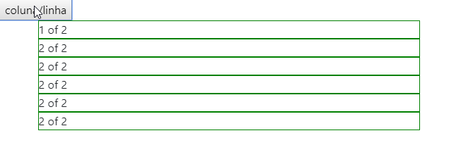
Code of the image above:
<!DOCTYPE html>
<html lang="en">
<head>
    <meta charset="utf-8" />
    <title>Page Title</title>
    <meta name="viewport" content="width=device-width, initial-scale=1">
    <link rel="stylesheet" type="text/css" media="screen" href="https://maxcdn.bootstrapcdn.com/bootstrap/4.0.0-beta.2/css/bootstrap.min.css" integrity="sha384-PsH8R72JQ3SOdhVi3uxftmaW6Vc51MKb0q5P2rRUpPvrszuE4W1povHYgTpBfshb" crossorigin="anonymous" />
    <link rel="stylesheet" type="text/css" media="screen" href="https://maxcdn.bootstrapcdn.com/font-awesome/4.7.0/css/font-awesome.min.css" />
<style>
    div[class^="col"] {
        height: 50px;
        box-sizing: border-box;
        border: 1px solid green;
        flex: 1;
    }
.coluna {
    flex-direction: column;
}

</style>
</head>
<body>
    <button>coluna/linha</button>
    <div class="container">
        <div id="colunaX" class="row flex-column">
          <div class="col-xs-2">
            1 of 2
          </div>
          <div class="col-xs-2">
            2 of 2
          </div>
          <div class="col-xs-2">
            2 of 2
          </div>
          <div class="col-xs-2">
            2 of 2
          </div>
          <div class="col-xs-2">
            2 of 2
          </div>
          <div class="col-xs-2">
            2 of 2
          </div>
        </div>
      </div>
    <script src="https://code.jquery.com/jquery-3.2.1.slim.min.js"></script>
    <script src="https://cdnjs.cloudflare.com/ajax/libs/popper.js/1.12.3/umd/popper.min.js"></script>
    <script src="https://maxcdn.bootstrapcdn.com/bootstrap/4.0.0-beta.2/js/bootstrap.min.js"></script>
    <script src="https://maxcdn.bootstrapcdn.com/bootstrap/4.0.0-beta.3/js/bootstrap.bundle.min.js"></script>

    <script>
    $("button").click(function(){
        $("#colunaX").toggleClass("flex-column");
    });
    </script>
</body>
</html>Browser other questions tagged twitter-bootstrap listview bootstrap-4 thumbnail
You are not signed in. Login or sign up in order to post.
Friend now in case I needed to style these contents thought to use the cards sera rolls ?
– Felipe Henrique
@Kirito Must roll, I believe by placing the card inside the grid
<div class="col-xs-2">will work. Maybe you need a CSS adjustment or other, but if you hold on just post another question and I’ll help you with that.– hugocsl
I’ll open a topic because with card not working
– Felipe Henrique
opened a topic https://answall.com/questions/301229/problemas-com-thumbnails-em-modo-lista-e-grid-com-bootstrap
– Felipe Henrique