Zoom effect with CSS

Asked

Viewed 2,147 times

5

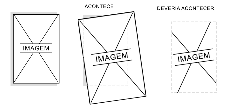
I have a div with an image in which I applied a zoom effect and a slight rotation! but this image must zoom and rotate within the limits of the DIV without overflowing but hide the parts that exceed the size of the div.

image explaining: inserir a descrição da imagem aqui

Code:

* {
    	margin: 0;
    	padding: 0;
    	border: 0;
	}
	body {
    	font-family: "Open Sans", sans-serif;
	}
    ul, ol, li {
        list-style: none;
    }
	
	.imagem {
		background: #ddd;
		width: 14%;
		height: auto;
		display: inline-grid;
		position: absolute;
    	left: 50%;
    	top: 50%;
    	transform: translate(-50%, -50%);
	}
	.imagem img {
		width: 100%;
        max-width:260px;
		border-radius: 10px;
		padding: 5%;
	}
	.imagem img {
	   width:100%;
		-webkit-transition: all .8s cubic-bezier(.190, 1.000, .220, 1.000);
			-moz-transition: all .8s cubic-bezier(.190, 1.000, .220, 1.000);
			 -ms-transition: all .8s cubic-bezier(.190, 1.000, .220, 1.000);
			  -o-transition: all .8s cubic-bezier(.190, 1.000, .220, 1.000);
				 transition: all .8s cubic-bezier(.190, 1.000, .220, 1.000);
	}
	.imagem:hover > img {
		-webkit-transition: all 0.5s ease;
		-moz-transition: all 0.5s ease;
		transition: all 0.5s ease;
		-moz-transform: scale(1.5) rotate(-5deg) ;
		-webkit-transform: scale(1.5) rotate(-5deg) ;
		-o-transform: scale(1.5) rotate(-5deg) ;
		-ms-transform: scale(1.5) rotate(-5deg) ;
		transform: scale(1.5) rotate(-5deg);
	}
<div class="imagem">
	<img alt="folder" src="https://i.imgur.com/7s6gp01.jpg"/>
</div>

  • Ever tried to put overflow: hidden; in its element?

  • Instead of scale, tried with the property zoom? It’s not so recommended, but it might work different than scale in the matter of not going outside the bounds of the div

2 answers

4


It is possible to solve this using padding and a pseudo-element ::after. You have to take the background color of the div image and use the pseudo-element as the color of backgroud. Then make an adjustment padding to the overflow:hidden do not cut image before time.

See how the result turned out. (I left the comments in the code)

* {
    margin: 0;
    padding: 0;
    border: 0;
}
body {
    font-family: "Open Sans", sans-serif;
}
ul, ol, li {
    list-style: none;
}

.imagem {
    width: 14%;
    height: auto;
    display: inline-grid;
    position: absolute;
    left: 50%;
    top: 50%;
    transform: translate(-50%, -50%);
    padding: 6px 0px 6px 6px; /* ajuste de padding para não cortar a imagem */
    overflow: hidden; /* esconde a imagem no :hover */
}

 /* elemento com a cor de fundo */
.imagem::after {
    content: "";
    position: absolute;
    left: -6px;
    width: 100%;
    height: 100%;
    background-color: #ddd;
    z-index: -1;
}
.imagem img {
    width: 100%;
    max-width:265px;

    -webkit-transition: all .8s cubic-bezier(.190, 1.000, .220, 1.000);
        -moz-transition: all .8s cubic-bezier(.190, 1.000, .220, 1.000);
            -ms-transition: all .8s cubic-bezier(.190, 1.000, .220, 1.000);
            -o-transition: all .8s cubic-bezier(.190, 1.000, .220, 1.000);
                transition: all .8s cubic-bezier(.190, 1.000, .220, 1.000);
}
.imagem:hover > img {
    -webkit-transition: all 0.5s ease;
    -moz-transition: all 0.5s ease;
    transition: all 0.5s ease;
    -moz-transform: scale(1.5) rotate(-5deg) ;
    -webkit-transform: scale(1.5) rotate(-5deg) ;
    -o-transform: scale(1.5) rotate(-5deg) ;
    -ms-transform: scale(1.5) rotate(-5deg) ;
    transform: scale(1.5) rotate(-5deg);
}
<div class="imagem">
    <img alt="folder" src="https://i.imgur.com/7s6gp01.jpg"/>
</div>

  • solved, but how would I do the same with another structure in html?

  • 1

    @Arthur74 guy completely edited the question. Yesterday I was at my fiancé’s house on my mother-in-law’s notebooke and couldn’t do better hahah. But I was thinking about it and I got a much better result without having to touch the html, I just adjusted the padding and used a pseudo element ::after. Look there it became practically identical to image!

0

I resolved so:

	* {
    	margin: 0;
    	padding: 0;
    	border: 0;
	}
	body {
    	font-family: "Open Sans", sans-serif;
	}
    ul, ol, li {
        list-style: none;
    }
	
	.imagem {
		background: #ddd;
		width: 14%;
		height: auto;
		display: inline-grid;
		position: absolute;
    	left: 50%;
    	top: 50%;
    	transform: translate(-50%, -50%);
		overflow: hidden;
		border-radius: 10px;
	}
	.imagem img {
		width: 100%;
        max-width:255px;
	
		-webkit-transition: all .8s cubic-bezier(.190, 1.000, .220, 1.000);
			-moz-transition: all .8s cubic-bezier(.190, 1.000, .220, 1.000);
			 -ms-transition: all .8s cubic-bezier(.190, 1.000, .220, 1.000);
			  -o-transition: all .8s cubic-bezier(.190, 1.000, .220, 1.000);
				 transition: all .8s cubic-bezier(.190, 1.000, .220, 1.000);
	}
	.imagem:hover > img {
		-webkit-transition: all 0.5s ease;
		-moz-transition: all 0.5s ease;
		transition: all 0.5s ease;
		-moz-transform: scale(1.5) rotate(-5deg) ;
		-webkit-transform: scale(1.5) rotate(-5deg) ;
		-o-transform: scale(1.5) rotate(-5deg) ;
		-ms-transform: scale(1.5) rotate(-5deg) ;
		transform: scale(1.5) rotate(-5deg);
	}
<div class="imagem">
		<img alt="folder" src="https://i.imgur.com/7s6gp01.jpg"/>
	</div>

Browser other questions tagged

You are not signed in. Login or sign up in order to post.