2
With that code, I can keep the image right:
<a class="navbar-brand navbar-right"><img src="~/Images/ache.jpg" /></a>
But this image is inside a menu bar. I have an image and I redeemed it to be the same height as the bar (Heigth). Well, when this happens, the image positions below the top of the bar, that is, it gets a part out of the bar (down). I looked for some other class that could be used together with the positioning on the right to fix it at the top of the bar, but I couldn’t. I used that navbar-fixed-top but it didn’t work. Does anyone have an idea on how to use it? Use bootstrap 3, mvc 5.
All my master is there
<!DOCTYPE html>
<html>
<head>
<meta charset="utf-8" />
<meta name="viewport" content="width=device-width, initial-scale=1.0">
<title></title>
@Styles.Render("~/bundles/css")
@Scripts.Render("~/bundles/modernizr")
@Scripts.Render("~/Scripts/Util.js")
</head>
<body>
<div class="navbar navbar-inverse navbar-fixed-top">
<div class="container">
<a class="navbar-brand navbar-right"><img src="~/Images/ache.jpg" /></a>
<div class="navbar-header">
<button type="button" class="navbar-toggle" data-toggle="collapse" data-target=".navbar-collapse">
<span class="icon-bar"></span>
<span class="icon-bar"></span>
<span class="icon-bar"></span>
<span class="icon-bar"></span>
</button>
@*@Html.ActionLink("Pedidos", "Index", "Home", null, new { @class = "navbar-brand" })*@
</div>
<div class="navbar-collapse collapse">
<ul class="nav navbar-nav">
</ul>
</div>
</div>
</div>
<div class="container body-content">
@RenderBody()
<hr />
<footer>
<p>© @DateTime.Now.Year - Laboratórios</p>
</footer>
</div>
@Scripts.Render("~/bundles/jquery")
@Scripts.Render("~/bundles/bootstrap")
@RenderSection("scripts", required: false)
</body>
</html>
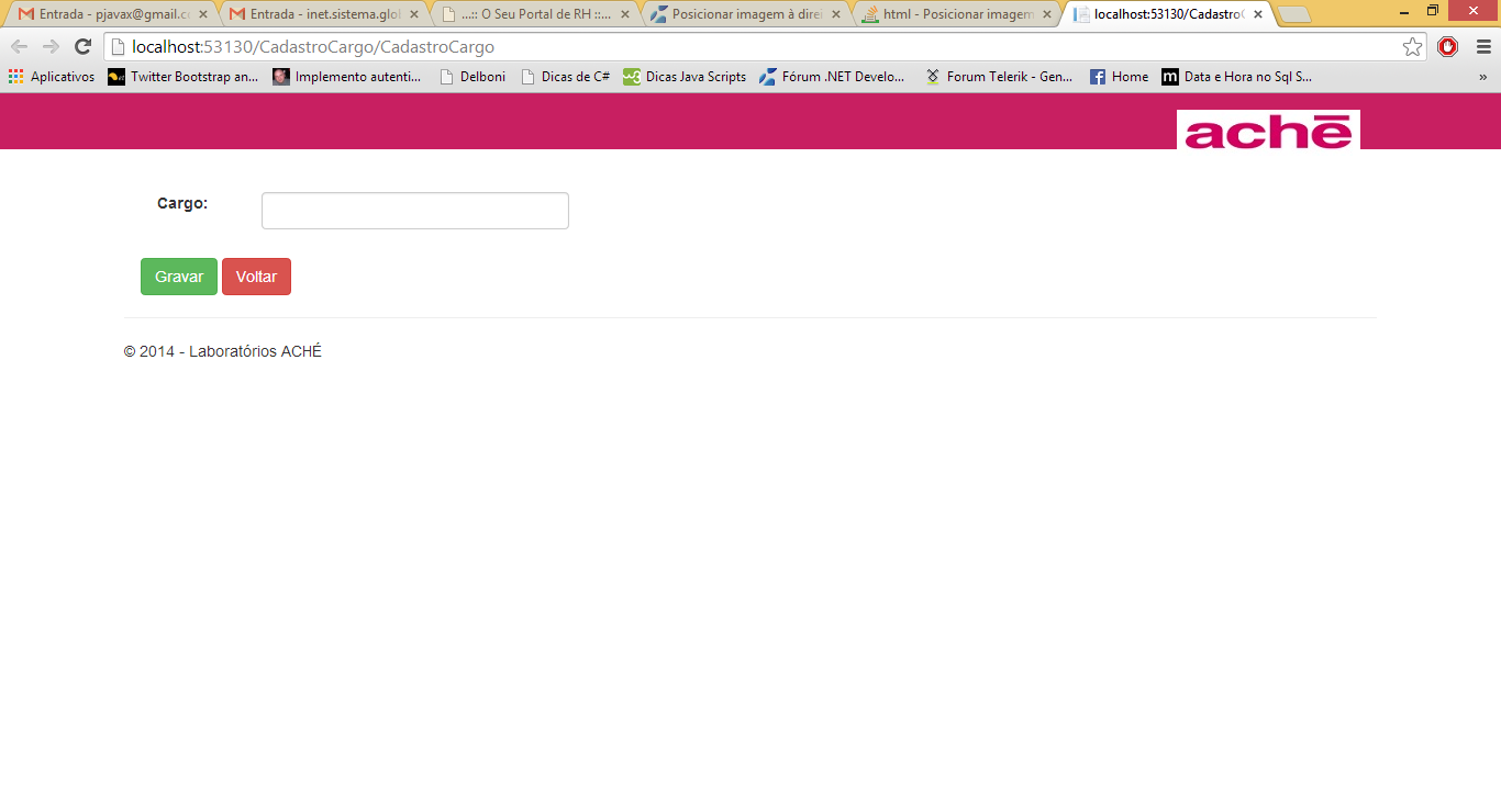
I tested several things and did not work. I gave a float and also not. See the screenshot below.
Guys, can’t see where I change the tag. See the navbars.Less . css, I think that’s the layout . css.
.navbar {
  position: relative;
  min-height: @navbar-height; // Ensure a navbar always shows (e.g., without a .navbar-brand in collapsed mode)
  margin-bottom: @navbar-margin-bottom;
  border: 1px solid transparent;

  // Prevent floats from breaking the navbar
  &:extend(.clearfix all);

  @media (min-width: @grid-float-breakpoint) {
    border-radius: @navbar-border-radius;
  }
}


// Navbar heading
//
// Groups `.navbar-brand` and `.navbar-toggle` into a single component for easy
// styling of responsive aspects.

.navbar-header {
  &:extend(.clearfix all);

  @media (min-width: @grid-float-breakpoint) {
    float: left;
  }
}


// Navbar collapse (body)
//
// Group your navbar content into this for easy collapsing and expanding across
// various device sizes. By default, this content is collapsed when <768px, but
// will expand past that for a horizontal display.
//
// To start (on mobile devices) the navbar links, forms, and buttons are stacked
// vertically and include a `max-height` to overflow in case you have too much
// content for the user's viewport.

.navbar-collapse {
  max-height: @navbar-collapse-max-height;
  overflow-x: visible;
  padding-right: @navbar-padding-horizontal;
  padding-left:  @navbar-padding-horizontal;
  border-top: 1px solid transparent;
  box-shadow: inset 0 1px 0 rgba(255,255,255,.1);
  &:extend(.clearfix all);
  -webkit-overflow-scrolling: touch;

  &.in {
    overflow-y: auto;
  }

  @media (min-width: @grid-float-breakpoint) {
    width: auto;
    border-top: 0;
    box-shadow: none;

    &.collapse {
      display: block !important;
      height: auto !important;
      padding-bottom: 0; // Override default setting
      overflow: visible !important;
    }

    &.in {
      overflow-y: visible;
    }

    // Undo the collapse side padding for navbars with containers to ensure
    // alignment of right-aligned contents.
    .navbar-fixed-top &,
    .navbar-static-top &,
    .navbar-fixed-bottom & {
      padding-left: 0;
      padding-right: 0;
    }
  }
}


// Both navbar header and collapse
//
// When a container is present, change the behavior of the header and collapse.

.container,
.container-fluid {
  > .navbar-header,
  > .navbar-collapse {
    margin-right: -@navbar-padding-horizontal;
    margin-left:  -@navbar-padding-horizontal;

    @media (min-width: @grid-float-breakpoint) {
      margin-right: 0;
      margin-left:  0;
    }
  }
}


//
// Navbar alignment options
//
// Display the navbar across the entirety of the page or fixed it to the top or
// bottom of the page.

// Static top (unfixed, but 100% wide) navbar
.navbar-static-top {
  z-index: @zindex-navbar;
  border-width: 0 0 1px;

  @media (min-width: @grid-float-breakpoint) {
    border-radius: 0;
  }
}

// Fix the top/bottom navbars when screen real estate supports it
.navbar-fixed-top,
.navbar-fixed-bottom {
  position: fixed;
  right: 0;
  left: 0;
  z-index: @zindex-navbar-fixed;

  // Undo the rounded corners
  @media (min-width: @grid-float-breakpoint) {
    border-radius: 0;
  }
}
.navbar-fixed-top {
  top: 0;
  border-width: 0 0 1px;
}
.navbar-fixed-bottom {
  bottom: 0;
  margin-bottom: 0; // override .navbar defaults
  border-width: 1px 0 0;
}


// Brand/project name

.navbar-brand {
  float: left;
  padding: @navbar-padding-vertical @navbar-padding-horizontal;
  font-size: @font-size-large;
  line-height: @line-height-computed;
  height: @navbar-height;

  &:hover,
  &:focus {
    text-decoration: none;
  }

  @media (min-width: @grid-float-breakpoint) {
    .navbar > .container &,
    .navbar > .container-fluid & {
      margin-left: -@navbar-padding-horizontal;
    }
  }
}


// Navbar toggle
//
// Custom button for toggling the `.navbar-collapse`, powered by the collapse
// JavaScript plugin.

.navbar-toggle {
  position: relative;
  float: right;
  margin-right: @navbar-padding-horizontal;
  padding: 9px 10px;
  .navbar-vertical-align(34px);
  background-color: transparent;
  background-image: none; // Reset unusual Firefox-on-Android default style; see https://github.com/necolas/normalize.css/issues/214
  border: 1px solid transparent;
  border-radius: @border-radius-base;

  // We remove the `outline` here, but later compensate by attaching `:hover`
  // styles to `:focus`.
  &:focus {
    outline: none;
  }

  // Bars
  .icon-bar {
    display: block;
    width: 22px;
    height: 2px;
    border-radius: 1px;
  }
  .icon-bar + .icon-bar {
    margin-top: 4px;
  }

  @media (min-width: @grid-float-breakpoint) {
    display: none;
  }
}


// Navbar nav links
//
// Builds on top of the `.nav` components with its own modifier class to make
// the nav the full height of the horizontal nav (above 768px).

.navbar-nav {
  margin: (@navbar-padding-vertical / 2) -@navbar-padding-horizontal;

  > li > a {
    padding-top:    10px;
    padding-bottom: 10px;
    line-height: @line-height-computed;
  }

  @media (max-width: @grid-float-breakpoint-max) {
    // Dropdowns get custom display when collapsed
    .open .dropdown-menu {
      position: static;
      float: none;
      width: auto;
      margin-top: 0;
      background-color: transparent;
      border: 0;
      box-shadow: none;
      > li > a,
      .dropdown-header {
        padding: 5px 15px 5px 25px;
      }
      > li > a {
        line-height: @line-height-computed;
        &:hover,
        &:focus {
          background-image: none;
        }
      }
    }
  }

  // Uncollapse the nav
  @media (min-width: @grid-float-breakpoint) {
    float: left;
    margin: 0;

    > li {
      float: left;
      > a {
        padding-top:    @navbar-padding-vertical;
        padding-bottom: @navbar-padding-vertical;
      }
    }

    &.navbar-right:last-child {
      margin-right: -@navbar-padding-horizontal;
    }
  }
}


// Component alignment
//
// Repurpose the pull utilities as their own navbar utilities to avoid specificity
// issues with parents and chaining. Only do this when the navbar is uncollapsed
// though so that navbar contents properly stack and align in mobile.

@media (min-width: @grid-float-breakpoint) {
  .navbar-left  { .pull-left(); }
  .navbar-right { .pull-right(); }
}


// Navbar form
//
// Extension of the `.form-inline` with some extra flavor for optimum display in
// our navbars.

.navbar-form {
  margin-left: -@navbar-padding-horizontal;
  margin-right: -@navbar-padding-horizontal;
  padding: 10px @navbar-padding-horizontal;
  border-top: 1px solid transparent;
  border-bottom: 1px solid transparent;
  @shadow: inset 0 1px 0 rgba(255,255,255,.1), 0 1px 0 rgba(255,255,255,.1);
  .box-shadow(@shadow);

  // Mixin behavior for optimum display
  .form-inline();

  .form-group {
    @media (max-width: @grid-float-breakpoint-max) {
      margin-bottom: 5px;
    }
  }

  // Vertically center in expanded, horizontal navbar
  .navbar-vertical-align(@input-height-base);

  // Undo 100% width for pull classes
  @media (min-width: @grid-float-breakpoint) {
    width: auto;
    border: 0;
    margin-left: 0;
    margin-right: 0;
    padding-top: 0;
    padding-bottom: 0;
    .box-shadow(none);

    // Outdent the form if last child to line up with content down the page
    &.navbar-right:last-child {
      margin-right: -@navbar-padding-horizontal;
    }
  }
}


// Dropdown menus

// Menu position and menu carets
.navbar-nav > li > .dropdown-menu {
  margin-top: 0;
  .border-top-radius(0);
}
// Menu position and menu caret support for dropups via extra dropup class
.navbar-fixed-bottom .navbar-nav > li > .dropdown-menu {
  .border-bottom-radius(0);
}


// Buttons in navbars
//
// Vertically center a button within a navbar (when *not* in a form).

.navbar-btn {
  .navbar-vertical-align(@input-height-base);

  &.btn-sm {
    .navbar-vertical-align(@input-height-small);
  }
  &.btn-xs {
    .navbar-vertical-align(22);
  }
}


// Text in navbars
//
// Add a class to make any element properly align itself vertically within the navbars.

.navbar-text {
  .navbar-vertical-align(@line-height-computed);

  @media (min-width: @grid-float-breakpoint) {
    float: left;
    margin-left: @navbar-padding-horizontal;
    margin-right: @navbar-padding-horizontal;

    // Outdent the form if last child to line up with content down the page
    &.navbar-right:last-child {
      margin-right: 0;
    }
  }
}

// Alternate navbars
// --------------------------------------------------

// Default navbar
.navbar-default {
  background-color: @navbar-default-bg;
  border-color: @navbar-default-border;

  .navbar-brand {
    color:@navbar-default-brand-color;
    &:hover,
    &:focus {
      color: @navbar-default-brand-hover-color;
      background-color: @navbar-default-brand-hover-bg;
    }
  }

  .navbar-text {
    color: @navbar-default-color;
  }

  .navbar-nav {
    > li > a {
      color: @navbar-default-link-color;

      &:hover,
      &:focus {
        color: @navbar-default-link-hover-color;
        background-color: @navbar-default-link-hover-bg;
      }
    }
    > .active > a {
      &,
      &:hover,
      &:focus {
        color: @navbar-default-link-active-color;
        background-color: @navbar-default-link-active-bg;
      }
    }
    > .disabled > a {
      &,
      &:hover,
      &:focus {
        color: @navbar-default-link-disabled-color;
        background-color: @navbar-default-link-disabled-bg;
      }
    }
  }

  .navbar-toggle {
    border-color: @navbar-default-toggle-border-color;
    &:hover,
    &:focus {
      background-color: @navbar-default-toggle-hover-bg;
    }
    .icon-bar {
      background-color: @navbar-default-toggle-icon-bar-bg;
    }
  }

  .navbar-collapse,
  .navbar-form {
    border-color: @navbar-default-border;
  }

  // Dropdown menu items
  .navbar-nav {
    // Remove background color from open dropdown
    > .open > a {
      &,
      &:hover,
      &:focus {
        background-color: @navbar-default-link-active-bg;
        color: @navbar-default-link-active-color;
      }
    }

    @media (max-width: @grid-float-breakpoint-max) {
      // Dropdowns get custom display when collapsed
      .open .dropdown-menu {
        > li > a {
          color: @navbar-default-link-color;
          &:hover,
          &:focus {
            color: @navbar-default-link-hover-color;
            background-color: @navbar-default-link-hover-bg;
          }
        }
        > .active > a {
          &,
          &:hover,
          &:focus {
            color: @navbar-default-link-active-color;
            background-color: @navbar-default-link-active-bg;
          }
        }
        > .disabled > a {
          &,
          &:hover,
          &:focus {
            color: @navbar-default-link-disabled-color;
            background-color: @navbar-default-link-disabled-bg;
          }
        }
      }
    }
  }


  // Links in navbars
  //
  // Add a class to ensure links outside the navbar nav are colored correctly.

  .navbar-link {
    color: @navbar-default-link-color;
    &:hover {
      color: @navbar-default-link-hover-color;
    }
  }

}

// Inverse navbar

.navbar-inverse {
  background-color: #c81f61;//@navbar-inverse-bg;
  border-color: #c81f61;//@navbar-inverse-border;

  .navbar-brand {
    color: @navbar-inverse-brand-color;
    &:hover,
    &:focus {
      color: @navbar-inverse-brand-hover-color;
      background-color: @navbar-inverse-brand-hover-bg;
    }
  }

  .navbar-text {
    color: @navbar-inverse-color;
  }

  .navbar-nav {
    > li > a {
      color: @navbar-inverse-link-color;

      &:hover,
      &:focus {
        color: @navbar-inverse-link-hover-color;
        background-color: @navbar-inverse-link-hover-bg;
      }
    }
    > .active > a {
      &,
      &:hover,
      &:focus {
        color: @navbar-inverse-link-active-color;
        background-color: @navbar-inverse-link-active-bg;
      }
    }
    > .disabled > a {
      &,
      &:hover,
      &:focus {
        color: @navbar-inverse-link-disabled-color;
        background-color: @navbar-inverse-link-disabled-bg;
      }
    }
  }

  // Darken the responsive nav toggle
  .navbar-toggle {
    border-color: @navbar-inverse-toggle-border-color;
    &:hover,
    &:focus {
      background-color: @navbar-inverse-toggle-hover-bg;
    }
    .icon-bar {
      background-color: @navbar-inverse-toggle-icon-bar-bg;
    }
  }

  .navbar-collapse,
  .navbar-form {
    border-color: darken(@navbar-inverse-bg, 7%);
  }

  // Dropdowns
  .navbar-nav {
    > .open > a {
      &,
      &:hover,
      &:focus {
        background-color: @navbar-inverse-link-active-bg;
        color: @navbar-inverse-link-active-color;
      }
    }

    @media (max-width: @grid-float-breakpoint-max) {
      // Dropdowns get custom display
      .open .dropdown-menu {
        > .dropdown-header {
          border-color: @navbar-inverse-border;
        }
        .divider {
          background-color: @navbar-inverse-border;
        }
        > li > a {
          color: @navbar-inverse-link-color;
          &:hover,
          &:focus {
            color: @navbar-inverse-link-hover-color;
            background-color: @navbar-inverse-link-hover-bg;
          }
        }
        > .active > a {
          &,
          &:hover,
          &:focus {
            color: @navbar-inverse-link-active-color;
            background-color: @navbar-inverse-link-active-bg;
          }
        }
        > .disabled > a {
          &,
          &:hover,
          &:focus {
            color: @navbar-inverse-link-disabled-color;
            background-color: @navbar-inverse-link-disabled-bg;
          }
        }
      }
    }
  }

  .navbar-link {
    color: @navbar-inverse-link-color;
    &:hover {
      color: @navbar-inverse-link-hover-color;
    }
  }

}
Post all the html content of this part of the bar to know how you set up the structure, so it is easier to understand what is being interpreted by the browser and we can give you a more effective answer
– Ademir Mazer Jr - Nuno
Yes, pass the CSS too
– Dtag
I did the editing. CSS is pure bootstrap, no customization on my part.
– pnet
I posted the image of the screen. The logo ACHE is further down.
– pnet