1
I am using bootstrap 4.1, previously I tried to use the class h-100, and unsuccessfully, even Chrome Developer tools indicating that height:100% was applied to the elements. I decided to use a class as the min-height and height attributes and also ends up in the same error.
The css class is this
.maximo{
    min-height:100%;
    height:100%;
}
The html code is this
<div class="container-fluid maximo" th:fragment="aaa">
<div class="row h-100 maximo">
<nav class="col bg-dark navbar-dark sidebar navbar-expand-sm maximo">
<a class="navbar-brand" href="#">Planejar Melhor</a>
<button class="navbar-toggler" type="button" data-toggle="collapse" data-target="#navbarSupportedContent" aria-controls="navbarSupportedContent" aria-expanded="false" aria-label="Toggle navigation">
<span class="navbar-toggler-icon"></span>
</button>
<div class="sidebar-sticky navbar-collapse collapse maximo" id="navbarSupportedContent">
<ul class="nav flex-column maximo">
<li class="nav-item">
<a class="nav-link active" href="#">
Info
</a>
</li>
<li class="nav-item">
<a class="nav-link" href="#">
Simulações
</a>
</li>
<li class="nav-item">
<a class="nav-link" href="#">
Contas
</a>
</li>
</ul>
</div>
</nav>
<main role="main" class="col-md-9 ml-sm-auto col-lg-10 pt-3 px-4 maximo">
<div class="d-flex justify-content-between flex-wrap flex-md-nowrap align-items-center pb-2 mb-3 border-bottom maximo">
<h1 class="h2">Ínicio</h1>
<div class="btn-toolbar mb-2 mb-md-0">
<button class="btn btn-sm btn-outline-secondary dropdown-toggle">
Periodo
</button>
</div>
</div>
</main>
</div>
</div>
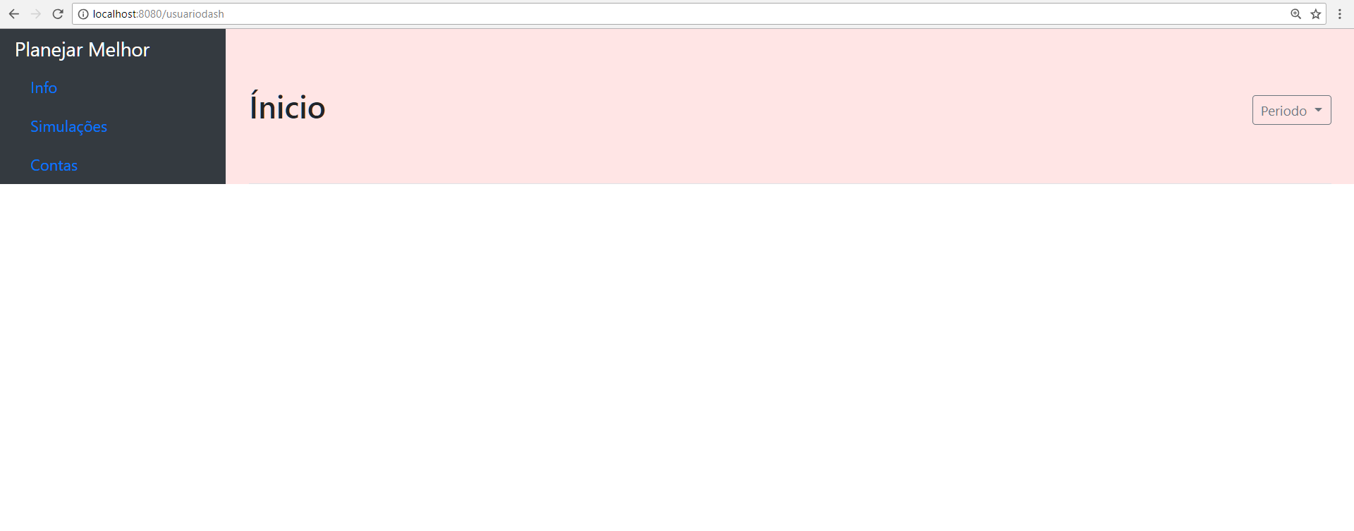
Imagem
[![inserir a descrição da imagem aqui][1]][1]
[1]: https://i.stack.imgur.com/rBjJm.png
Edit:
    <div class="row h-100 mh-100">
        <nav class="col bg-dark navbar-dark sidebar navbar-expand-sm mh-100">
            <a class="navbar-brand" href="#">Planejar Melhor</a>
            <button class="navbar-toggler" type="button" data-toggle="collapse" data-target="#navbarSupportedContent" aria-controls="navbarSupportedContent" aria-expanded="false" aria-label="Toggle navigation">
                <span class="navbar-toggler-icon"></span>
            </button>
            <div class="sidebar-sticky navbar-collapse collapse maximo" id="navbarSupportedContent">
                <ul class="nav flex-column maximo">
                    <li class="nav-item">
                        <a class="nav-link active" href="#">
                            Info
                        </a>
                    </li>
                    <li class="nav-item">
                        <a class="nav-link" href="#">
                            Simulações
                        </a>
                    </li>
                    <li class="nav-item">
                        <a class="nav-link" href="#">
                            Contas
                        </a>
                    </li>
                </ul>
            </div>
        </nav>

        <main role="main" class="col-md-9 ml-sm-auto col-lg-10 pt-3 px-4 mh-100">
            <div class="d-flex justify-content-between flex-wrap flex-md-nowrap align-items-center pb-2 mb-3 border-bottom h-100 mh-100">
                <h1 class="h2">Ínicio</h1>
                <div class="btn-toolbar mb-2 mb-md-0">
                    <button class="btn btn-sm btn-outline-secondary dropdown-toggle">
                        Periodo
                    </button>
                </div>
            </div>
        </main>
    </div>
</div>
Result (using colors to see the actual size)
puts position relative in this class to see
– Wees Smith
the column remains the same
– E.ss
there is another element before these? or just the body?
– Wees Smith
only the <body>
– E.ss
I found something to help you
– Wees Smith