Even using the Official Sticky Footer example you will need to make some CSS adjustments. https://getbootstrap.com/docs/4.1/examples/sticky-footer-navbar/
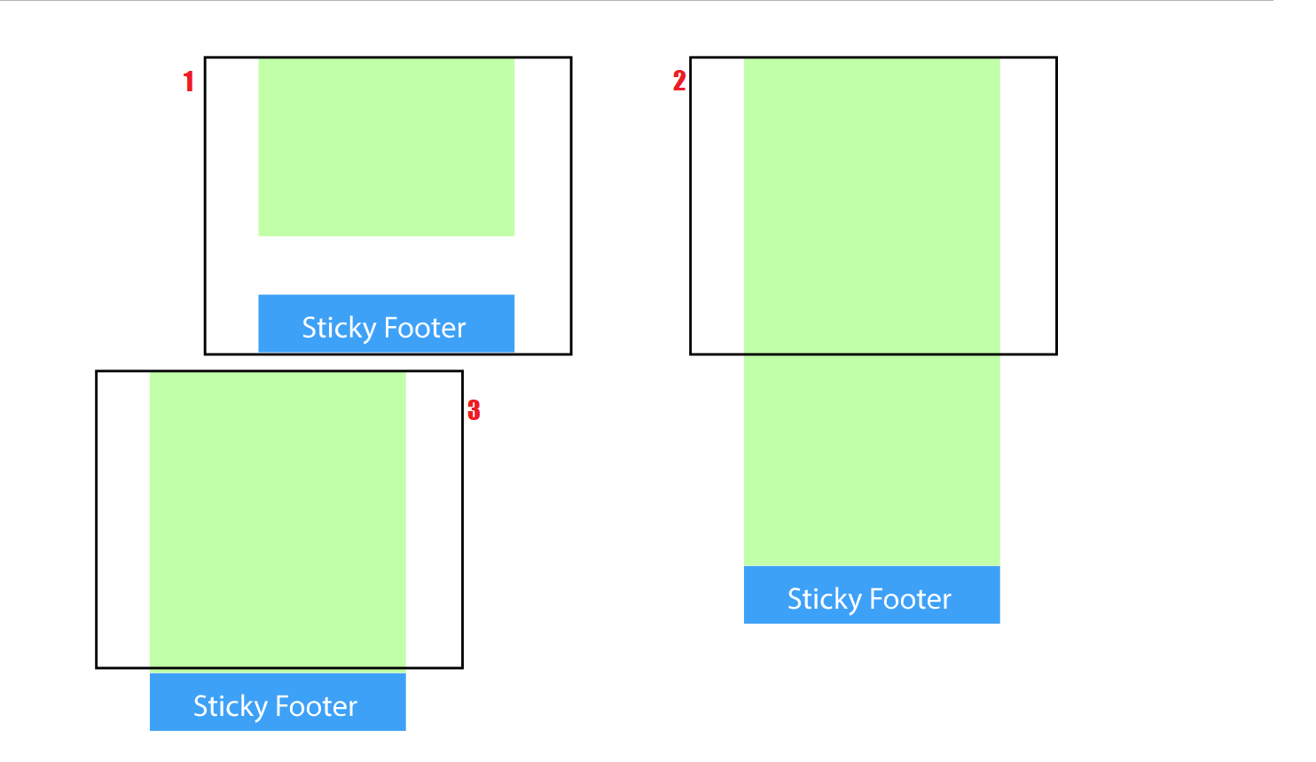
This template below I took directly in the documentation of BS4 and needed to make a simple adaptation of CSS to always leave the footer out of the page, for that you need to put in the bottom: the negative value for the height of the own footer. In the example the footer has height:60px, so I put bottom:-60px and it worked. The code has comments from the developers of Bootstrap itself and one that I made myself for you to know where to set the bottom negative
<!DOCTYPE html>
<html lang="en">
<head>
<meta charset="utf-8" />
<title>Page Title</title>
<meta name="viewport" content="width=device-width, initial-scale=1">
<link rel="stylesheet" type="text/css" media="screen" href="https://maxcdn.bootstrapcdn.com/bootstrap/4.0.0-beta.2/css/bootstrap.min.css" />
<link rel="stylesheet" type="text/css" media="screen" href="https://maxcdn.bootstrapcdn.com/font-awesome/4.7.0/css/font-awesome.min.css" />
<style>
/* Sticky footer styles
-------------------------------------------------- */
html {
position: relative;
min-height: 100%;
}
body {
/* Margin bottom by footer height */
margin-bottom: 60px;
}
.footer {
position: absolute;
/* 60px é a altura do próprio footer, por isso usando valor negativo ele fica para fora da página a própria altura */
bottom: -60px;
width: 100%;
/* Set the fixed height of the footer here */
height: 60px;
line-height: 60px; /* Vertically center the text there */
background-color: #f5f5f5;
}
/* Custom page CSS
-------------------------------------------------- */
/* Not required for template or sticky footer method. */
body > .container {
padding: 60px 15px 0;
}
.footer > .container {
padding-right: 15px;
padding-left: 15px;
}
code {
font-size: 80%;
}
</style>
</head>
<body cz-shortcut-listen="true">
<header>
<!-- Fixed navbar -->
<nav class="navbar navbar-expand-md navbar-dark fixed-top bg-dark">
<a class="navbar-brand" href="#">Fixed navbar</a>
<button class="navbar-toggler" type="button" data-toggle="collapse" data-target="#navbarCollapse" aria-controls="navbarCollapse" aria-expanded="false" aria-label="Toggle navigation">
<span class="navbar-toggler-icon"></span>
</button>
<div class="collapse navbar-collapse" id="navbarCollapse">
<ul class="navbar-nav mr-auto">
<li class="nav-item active">
<a class="nav-link" href="#">Home <span class="sr-only">(current)</span></a>
</li>
<li class="nav-item">
<a class="nav-link" href="#">Link</a>
</li>
<li class="nav-item">
<a class="nav-link disabled" href="#">Disabled</a>
</li>
</ul>
<form class="form-inline mt-2 mt-md-0">
<input class="form-control mr-sm-2" type="text" placeholder="Search" aria-label="Search">
<button class="btn btn-outline-success my-2 my-sm-0" type="submit">Search</button>
</form>
</div>
</nav>
</header>
<!-- Begin page content -->
<main role="main" class="container" style="
height: 380px;
background: red;
">
<h1 class="mt-5">Sticky footer with fixed navbar</h1>
<p class="lead">Pin a fixed-height footer to the bottom of the viewport in desktop browsers with this custom HTML and CSS. A fixed navbar has been added with <code>padding-top: 60px;</code> on the <code>body > .container</code>.</p>
<p>Back to <a href="../sticky-footer">the default sticky footer</a> minus the navbar.</p>
</main>
<footer class="footer">
<div class="container">
<span class="text-muted">Place sticky footer content here.</span>
</div>
</footer>
<!-- Bootstrap core JavaScript
================================================== -->
<!-- Placed at the end of the document so the pages load faster -->
<script src="https://code.jquery.com/jquery-3.2.1.slim.min.js"></script>
<script src="https://cdnjs.cloudflare.com/ajax/libs/popper.js/1.12.3/umd/popper.min.js"></script>
<script src="https://maxcdn.bootstrapcdn.com/bootstrap/4.0.0-beta.2/js/bootstrap.min.js"></script>
<script src="https://maxcdn.bootstrapcdn.com/bootstrap/4.0.0-beta.3/js/bootstrap.bundle.min.js"></script>
</body>
</html>
Defines the
containerwith the contents of the body withmin-height:100%so it will have at least 100% of the screen, and the footer out of that container, so it will always be below the screen– Wees Smith
Okay, I’m gonna try.
– Rafael Souza Calearo
The tip worked out?
– Wees Smith
No, now I don’t know if it’s because of other properties I have in my
<div>(<div class="container-fluid fundo-container">): CSS container background: . backdrop { background-image: url('./.../Assets/img/background.jpg'); background-position: center top; background-repeat: no-repeat; background-size: cover; -Webkit-background-size: cover; -Moz-background-size: cover; -o-background-size: cover; background-Attachment: Fixed; min-height: 100% } helping– Rafael Souza Calearo
lacked positioning, has q be relative, parents and children for height work
– Wees Smith
Okay, I’m gonna try.
– Rafael Souza Calearo
Look it didn’t work, I use the Bootstrap 4 I don’t know if there’s any interference and one more detail: when I use the
height: 100vhworks but Buga the content, does not get fluid the content when I resize the screen.– Rafael Souza Calearo
Let’s go continue this discussion in chat.
– Wees Smith