Position div relative to an image

Asked

Viewed 495 times

2

I’m making a kind of map in my application, where an image that grabs the whole screen has several buttons on it.

inserir a descrição da imagem aqui

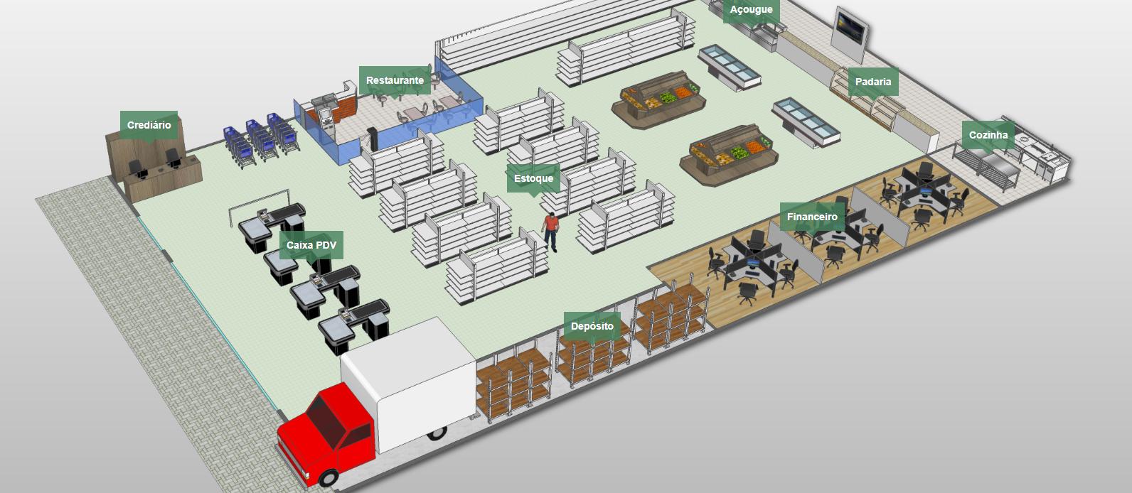
At the moment, I position the buttons this way:

.btn_padaria{
    left: 75.00%;
    top: 20.25%;
}

In mobile, I’m doing the same, only the background image is different, showing a perspective from above

inserir a descrição da imagem aqui

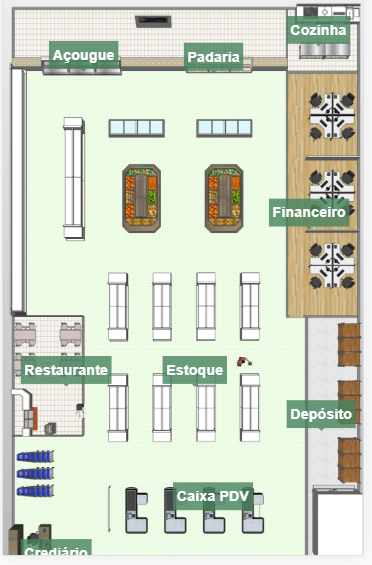
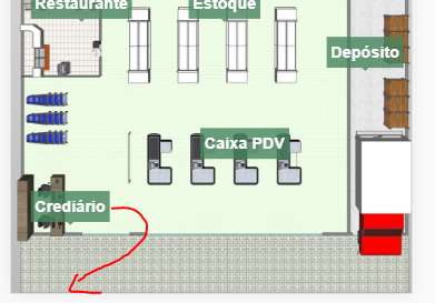
Only on mobile, the height of the image is bigger than the screen, so to see the "crediario" button would have to scroll the screen, but even if I put top:100% on this button, it is NOT yet at the end of the image but at the end of the screen.

inserir a descrição da imagem aqui

  • 1

    Reading diagonally... you can create an offset to compensate for the height and width of the screen. In a similar solution where precision was crucial I used the element canvasHtml5 to assist me with the positions of my subtitles.

  • I don’t need it to be 100% accurate, and I think the canvas is too much work for what I need. But I hadn’t thought of it yet, in case I don’t find a simpler solution I try with the same canvas.

2 answers

1


You can try putting position:absolute in the btn and put bottom:0 there he preaches at the end of the parent element, it is important the father to have position:relative for btn to be related to it.

See a simple example of positioning. Note that the parent div is 120vh, or 20% higher than the visible screen height.

html, body {
    width: 100%;
    height: 100%;
    margin: 0;
    padding: 0;
}
div {
    width: 100%;
    height: 120vh;
    background-color: #f00;
    position: relative;
}
.btn {
    width: 100px;
    height: 50px;
    background-color: #fff;
    position: absolute;
    bottom: 5px;
    left: 5px;
}
<div>
    <div class="btn">btn</div>
</div>

  • 1

    It worked on mobile, I’m trying on Desktop now!! Thanks!

  • 1

    @Otaviosouzarocha any problem tells me. I used the measure in PX, but you can use in % too! Only put in PX pq is glued in the corner so in this case it does not make much difference, but as I said can use type 1% or 2% if you prefer in the bottom / left

0

I managed to solve in a more "precise way"

I basically used Javascript to take the width of the screen and the image and then subtract (screen - image). After having done this I have the pixel size of the space that is left on the screen. I divide by two, because the image is centered.

Now just take the image dimensions, divide by 100, multiply by the percentage that the button (div) will be on the image and, finally, add the remaining value.

  var wid = document.getElementById('img-planta').clientWidth; /*Pega a largura da imagem*/
  var hei = document.getElementById('img-planta').clientHeight; /*Pega a altura da imagem*/
  var w = window.innerWidth; /*Pega a largura da janela*/
  var h = window.innerHeight; /*Pega a altura da janela*/

  var posWid;
  var posHei;
  var auxWid;
  var auxHei;

  auxWid = (w-wid)/2; /*Acha o valor em pixels das sobrar na largura*/
  auxHei = (h-hei)/2; /*Acha o valor em pixels das sobrar na altura*/

  posWid = (wid/100) * 50 + auxWid; /*Calcula o valor em pixel que será aplicado no style left para posicionar o botão*/
  posHei = (hei/100) * 70 + auxHei ; /*Calcula o valor em pixel que será aplicado no style top para posicionar o botão*/
  document.getElementById('btn_deposito').style.left = posWid + "px"; /*Seta o style da div*/
  document.getElementById('btn_deposito').style.top = posHei + "px";/*Seta o style da div*/

Browser other questions tagged

You are not signed in. Login or sign up in order to post.