3
i want to align the text vertically in div, but I wonder if it is possible to do it without changing the css because I am using the https://maxcdn.bootstrapcdn.com/bootstrap/4.0.0-beta.2/css/bootstrap.min.css
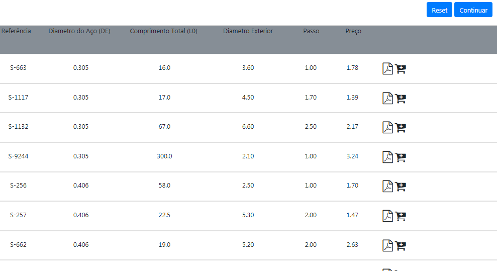
<div class="sticky-top">
<div class="container-fluid bg-secondary" style="height:70px;">
<div class="row">
<div class="col-md-1" style="text-align: center">Referência</div>
<div class="col-md-2" style="text-align: center">Diametro do Aço (DE)</div>
<div class="col-md-2" style="text-align: center">Comprimento Total (L0)</div>
<div class="col-md-2" style="text-align: center">Diametro Exterior</div>
<div class="col-md-1" style="text-align: center">Passo</div>
<div class="col-md-1" style="text-align: center">Preço</div>
<div class="col-md-3" style="text-align: center"></div>
</div>
</div>
</div>
this is my code, and this is the result:
Before I had a Jumbotron and the texts were aligned in the center,.
in this case it is not better to use a table
– Marcelo Batista
I recommend using a table to assemble, since graphically it is identical to one. Take a look at the documentation of the tables, I think will help you. Link: https://getbootstrap.com/docs/4.1/content/tables/
– brnTwp