2
Look at the picture;
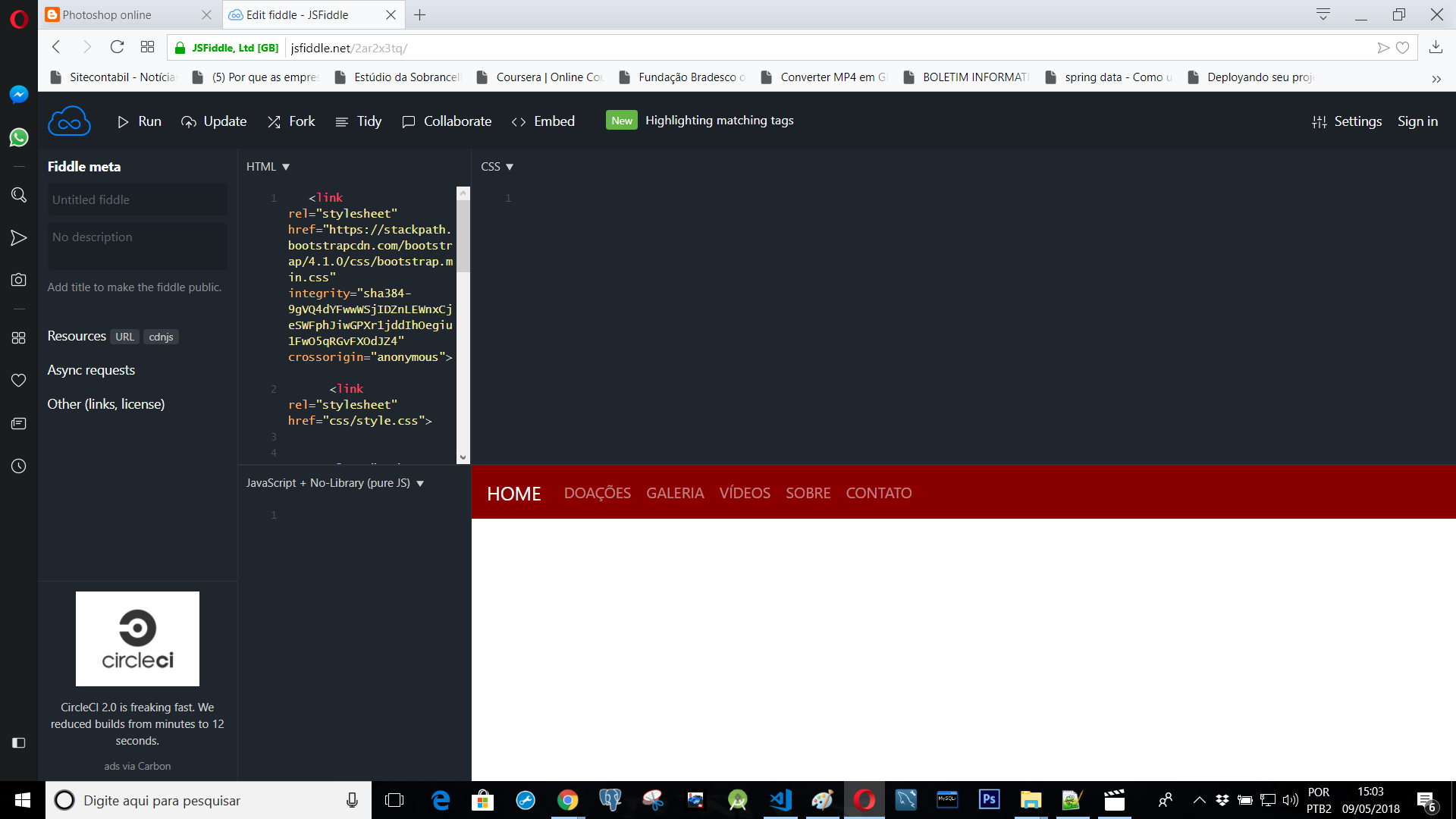
How do I get this menu to be in the middle of the screen? The difficulty is because I’m using Bootstrap 4, I’ve tried everything.
I wanted it to look like this below;
www.esperancapaixao.com
2
Look at the picture;
How do I get this menu to be in the middle of the screen? The difficulty is because I’m using Bootstrap 4, I’ve tried everything.
I wanted it to look like this below;
www.esperancapaixao.com
2
Where is the list of menus, if you go to see the source code see that the ul has margin-right:auto !important, ie, it will touch to the left side. Then just add a style with the following code.
<ul class="navbar-nav mr-auto" style="margin: auto!important">
And to put the HOME next to the other menus, you will need to change it into the ul but it will make him disappear in sight mobile and appear next to the menus
1
In the official documentation the class is used justify-content-md-center to do this. So it is centralized only until MD screens. Link to the official examples https://getbootstrap.com/docs/4.0/examples/navbars/
OBS: How responsive it has to run as "Whole Page"

See how it looks in the example below:
<link rel="stylesheet" type="text/css" media="screen" href="https://maxcdn.bootstrapcdn.com/bootstrap/4.0.0-beta.2/css/bootstrap.min.css"/>

    <nav class="navbar navbar-expand-lg navbar-dark bg-dark">
        <button class="navbar-toggler" type="button" data-toggle="collapse" data-target="#navbarsExample08" aria-controls="navbarsExample08"
            aria-expanded="false" aria-label="Toggle navigation">
            <span class="navbar-toggler-icon"></span>
        </button>

        <div class="collapse navbar-collapse justify-content-md-center" id="navbarsExample08">
            <ul class="navbar-nav">
                <li class="nav-item active">
                    <a class="nav-link" href="#">Centered nav only
                        <span class="sr-only">(current)</span>
                    </a>
                </li>
                <li class="nav-item">
                    <a class="nav-link" href="#">Link</a>
                </li>
                <li class="nav-item">
                    <a class="nav-link disabled" href="#">Disabled</a>
                </li>
                <li class="nav-item dropdown">
                    <a class="nav-link dropdown-toggle" href="http://example.com" id="dropdown08" data-toggle="dropdown" aria-haspopup="true"
                        aria-expanded="false">Dropdown</a>
                    <div class="dropdown-menu" aria-labelledby="dropdown08">
                        <a class="dropdown-item" href="#">Action</a>
                        <a class="dropdown-item" href="#">Another action</a>
                        <a class="dropdown-item" href="#">Something else here</a>
                    </div>
                </li>
            </ul>
        </div>
    </nav>

    <script src="https://code.jquery.com/jquery-3.2.1.slim.min.js"></script>
    <script src="https://cdnjs.cloudflare.com/ajax/libs/popper.js/1.12.3/umd/popper.min.js"></script>
    <script src="https://maxcdn.bootstrapcdn.com/bootstrap/4.0.0-beta.2/js/bootstrap.min.js"></script>
<script src="https://maxcdn.bootstrapcdn.com/bootstrap/4.0.0-beta.3/js/bootstrap.bundle.min.js"></script>Browser other questions tagged twitter-bootstrap bootstrap-4
You are not signed in. Login or sign up in order to post.
VERY GOOD, THANK YOU.
– wladyband
@wladyband The fact that Home stay out of sight on mobile did no harm?
– I_like_trains