How to "break" div in two columns?

Asked

Viewed 9,890 times

3

I am using Wordpress, my Blog section is organized as follows:

Exemplo 1

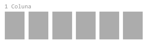
I’m simply using {display: flex; justify-content: space-between;} that in this case the result is like the first example. The result I want to achieve is:

Exemplo 2

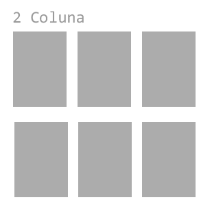
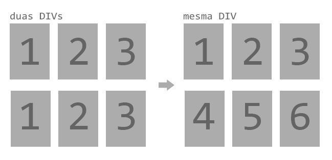
I did not create two Ivs for the content because they are Blog articles, that is, they should be in the order of posting. If I break in two Ivs the widget de artigos, which is standard Wordpress, would repeat on both Divs. Anyway, I would like the blog posts to be in order, in the same div and in two columns:

inserir a descrição da imagem aqui

I didn’t know exactly how to look for such an answer so if there is a duplicate, let me know. Thank you so much (:

  • Dude you are doing the Theme yourself? If possible put your html/css. You are using Boostrap??

  • 1

    @hugocsl so Hugo is actually a Heme from the WP community that I’m modifying myself...

2 answers

5


In the div parent, you would need to define two properties that define how elements should act when they need to do this line break.

The first would be flex-direction: row | row-reverse | column | column-reverse;. It informs what will be the direction in which the element "will grow".

The second would be flex-wrap: nowrap | wrap | wrap-reverse;. It tells how to break the element’s lines.

To facilitate, there is the shortened version of these two properties, which is the flex-flow, which you pass as first argument the direction and second the line break.

I quickly made a code that I think will help you. You can see working on the Codepen.

A very cool link to have as a reference is the CSS-Tricks, contains a detailed explanation of flexbox properties.

  • was exactly what I was needing, thank you very much!!

3

Here is a template that breaks the line every 3 items. All responsive using flex-box. I left the item-7 for you to see that it will break as the list grows. OBS: I made a comment in CSS on how to adjust the margins between a box and another if you want to change the distance.

Explanation: The property that makes the item line break is the flex-wrap:wrap, and it breaks 3 by 3 because each Bos has a width of 1/3, hence 3 .box add up to 100% and item 4 ends up being "played" to the bottom line. Official flex-box documentation: https://www.w3.org/TR/css-flexbox-1/

If you want the box item-7 stay aligned in the middle just put justify-content:center in the .wrapper

html, body {
    width: 100%;
    height: 100%;
    margin: 0;
    padding: 0;
}
.wrapper {
    display: flex;
    flex-wrap: wrap;
    width: 100%;
    background-color: red;
}
.box {
    box-sizing: border-box;
    padding: 1rem;
    margin: 1rem;
    background-color: silver;
    width: calc((100% / 3) - 2rem); /* calco para descontar a margem da largura do box se aumenta a marge tem que ajustar aqui tb */
}
<div class="wrapper">
    <div class="box">imte 1</div>
    <div class="box">imte 2</div>
    <div class="box">imte 3</div>
    <div class="box">imte 4</div>
    <div class="box">imte 5</div>
    <div class="box">imte 6</div>
    <div class="box">imte 7</div>
</div>

Browser other questions tagged

You are not signed in. Login or sign up in order to post.