navbar bootstrap with error

Asked

Viewed 195 times

1

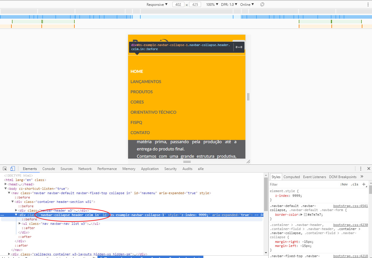
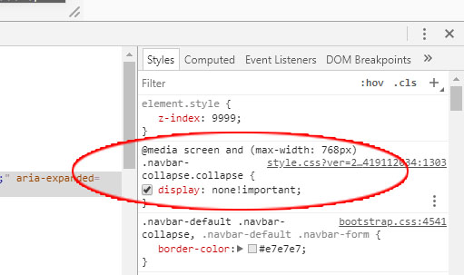
Good afternoon people, next, I put a navbar on my project in the mobile part he dick, I click on the bars the menu appears and then disappear, alone, has anyone ever gone through it? follows link from my project

http://renovetintas.com.br/demo/

if anyone can help me, I appreciate!

  • Provide javascript, html and css code for the part you’re doing the responsive part.

1 answer

1


No code can’t help you much.

But your mistake is in that tag

<div class="navbar-collapse header celm collapse in" id="bs-example-navbar-collapse-1" style="z-index: 9999;" aria-expanded="true">

Note that even when it is open . in the class .collapse remains in the element and makes it disappear. If you take the .collapse when she’s with the .in it will work.

inserir a descrição da imagem aqui


Notice when she gets the .collapse the Nav receives a display:none !important

inserir a descrição da imagem aqui

  • Thank you very much worked perfectly

  • @Marcosc.Anzolin glad it worked out! If my answer helped you in any way consider marking it as Accept, in this icon below the arrows on the left side of my answer :) so the site does not get open questions pending without response accepted.

Browser other questions tagged

You are not signed in. Login or sign up in order to post.