With the @media CSS you get it. Javascript is not necessary to solve this.
I have left comments in the CSS code below for ease of understanding. The operation is simple: all menu items with the class mobile will only appear when the screen is smaller than 360px.
.mobile {
    opacity: 0; /* Esconde no desktop. */
    height: 0;
}

@media only screen and (max-width: 360px) {
    .mobile {
        opacity: 1; /* Só aparece no mobile. */
        height: auto;
    }
}
<li class="drop-left"><a href="">Drop Left</a>
    <ul>
        <li><a href="#">How deep?</a>
            <ul>
                <li><a href="#">Item</a></li>
                <li><a href="#">Item</a></li>
                <li><a href="#">Item</a></li>
                <li><a href="#">Item</a></li>
                <li class="mobile"><a href="#">Item Mobile</a></li>
            </ul>
        </li>
    </ul>
</li>
Below you can read more about the @media of the CSS:
https://developer.mozilla.org/en-US/docs/Web/Guide/CSS/CSS_Media_queries
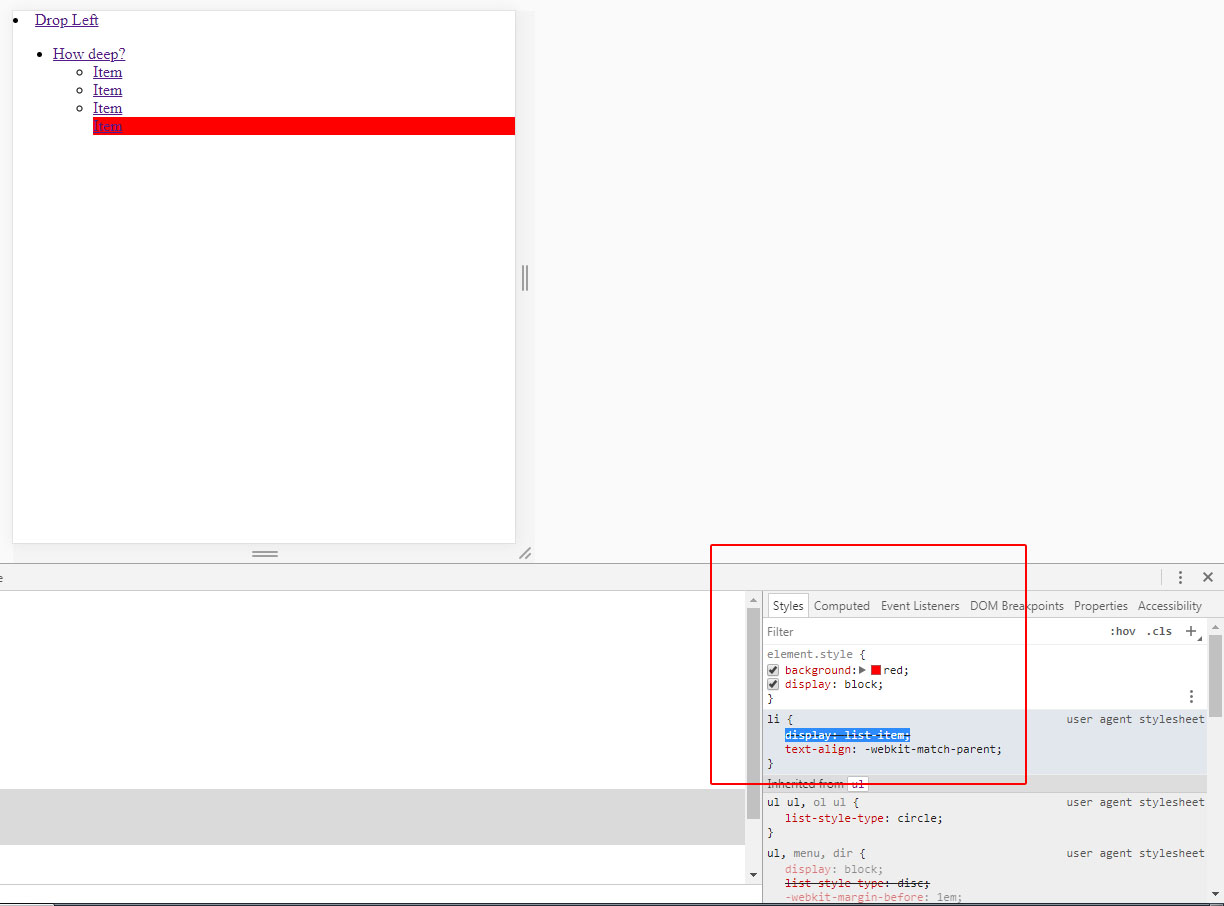
Observing: Not always the display: block is ideal as you cannot use it for example if the element has display: inline. In that case you should do display: none / dispaly: inline and not block.
See the image to better understand this observation. The element <li> by default has the display defined by user-agent chrome as display: list-item, soon, if you put the <li> with the property dispaly: block he will lose the list-style and is without the "ball" as you can notice in the image:
You are using jQuery?
– Luiz Felipe
I am not using jquery, only css to style my menu.
– Jean Alves