1
I am working on a college project and we are using Grid Layout to design an e-commerce for animals. A doubt arose during the creation process regarding the centralization of the content of grids in different resolutions and types of devices.
The simplified CSS code is:
#produtos-grid {
    grid-area: grid-produtos;
    display: grid;
    grid-template-areas:    "produtos-destaque-titulo"
                            "produtos-destaque"
    grid-row-gap: 10px;
}

#produtos-destaque-titulo-grid {
    grid-area: produtos-destaque-titulo;
}

#produtos-destaque-grid {
    grid-area: produtos-destaque;
    display: grid;
    grid-template-columns: repeat(auto-fit, minmax(225px, 350px));
    text-align: center;
    justify-content: center;
    margin: 0 0 20px 0;
    grid-row-gap: 1em;
}
We are still not adding the items directly from the database with php because the project is right at the beginning at this point and we didn’t have time to model everything, so the info was placed directly in HTML to test the positioning of the elements in the view. Again, the shorthand code is:
<main class="container" id="produtos-grid">

      <div id="produtos-destaque-titulo-grid">
        <h5 class="text-center">Mais Vendidos</h5>
        <hr>
      </div>

      <div id="produtos-destaque-grid">

        <div class="card bordered">
          <div>
            <a href="<?=base_url()?>/index.php/produto/visualizar/17">
              <img class="card-img-top" src="<?=base_url()?>/assets/imagens/produtos/cama-suiça-bege-bichinho-chic.jpg" alt="Imagem Produto">
            </a>
          </div>
          <div class="card-block">
            <h5 class="card-text">Cama Suiça Bege Bichinho Chic</h5>
            <p class="card-text">a partir de: R$ 51,90</p>
          </div>
        </div>

        <div class="card bordered">
          <div>
            <a href="<?=base_url()?>index.php/produto/visualizar/1">
              <img class="card-img-top" src="<?=base_url()?>/assets/imagens/produtos/racao-whiskas-gatos-castrados-carne.jpg" alt="Imagem Produto">
            </a>
          </div>
          <div class="card-block">
            <h5 class="card-text">Ração Whiskas Gatos Castrados Carne</h5>
            <p class="card-text">a partir de: R$ 11,99</p>
          </div>
        </div>

        <div class="card bordered">
          <div>
            <a href="<?=base_url()?>index.php/produto/visualizar/5">
              <img class="card-img-top" src="<?=base_url()?>/assets/imagens/produtos/brinquedo-cenoura-nylon-buddy-toys.jpg" alt="Imagem Produto">
            </a>
          </div>
          <div class="card-block">
            <h5 class="card-text">Brinquedo Cenoura Nylon Buddy Toys</h5>
            <p class="card-text">a partir de: R$ 37,90</p>
          </div>
        </div>

      </div>

</main>
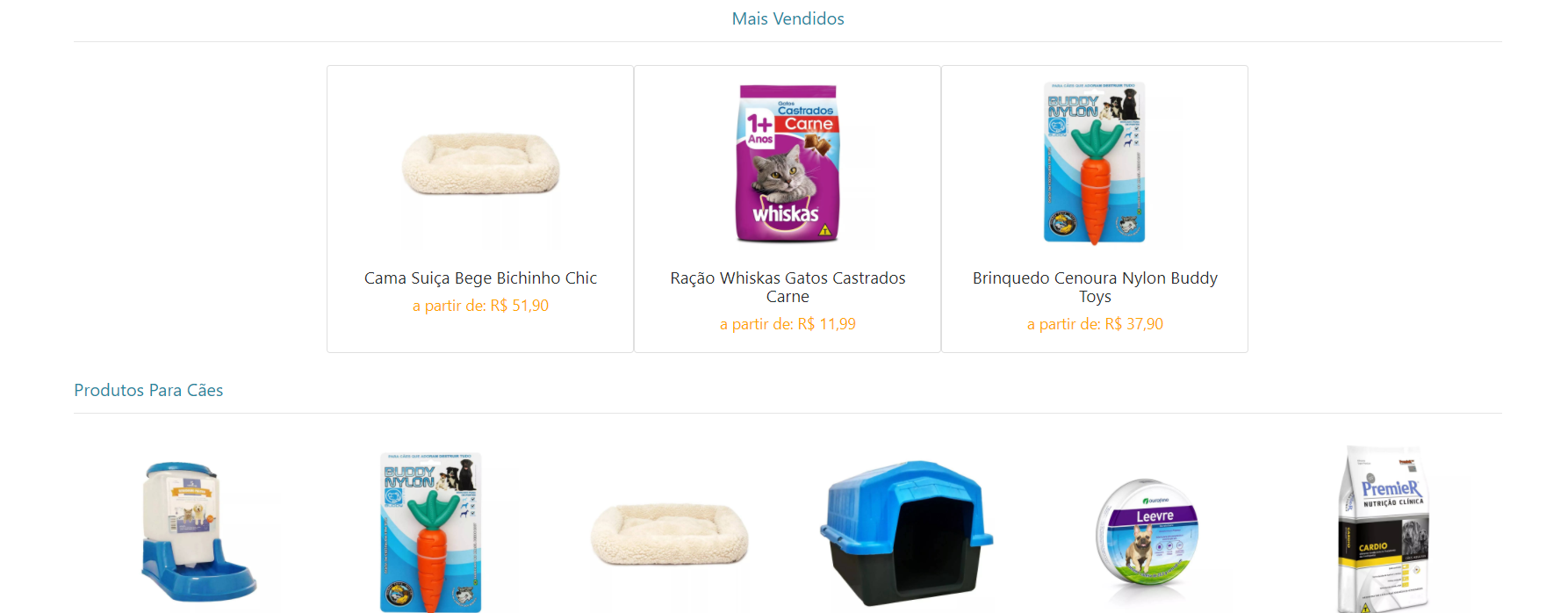
The code generates the following result when the display width property is equal to or above 1200px:
When the resolution is below 1200px, one of the images is played directly to the position below the others (2nd Grid Line), which is exactly what we want. The problem is that the image should be Centralized in the middle of the other two, not left.
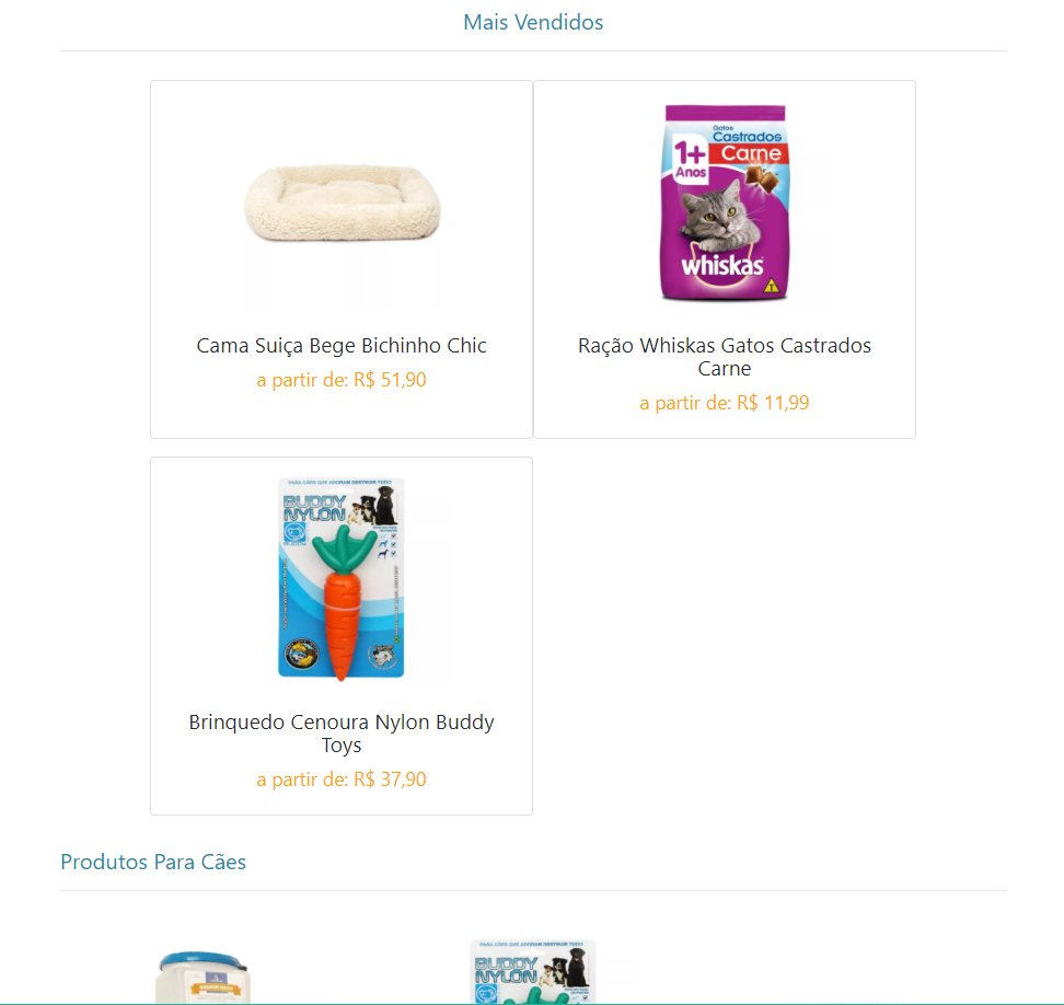
What solution can be used to center all grid items horizontally, independent of the Grid Line they are on?
Young if you put HTML help... Only with CSS complicates give you an accurate answer... Mainly pe vc is using "grid-template-areas" as we will know the structure of html, gets complicated
– hugocsl
Updated, for some reason I forgot to put the HTML and just added the CSS. The rest of the HTML is structured similar to the above, there is a grid for dog products, cats, medicines and others.
– Marcos de Andrade
Already tried to give a "margin: 0 auto;" in the product?
– DiegoSantos
@Diegosantos It was the first solution I tried, before I knew that Justify-Content existed, and I remember that it didn’t work. Honestly, I can’t remember exactly why it didn’t work, I just remember it went so wrong
– Marcos de Andrade
What is the css of the "bordered card"?
– DiegoSantos
It’s the Bootstrap 4 Card class with a simple edge around it. I use bootstrap 4 only in Banner and cards, I’m even thinking about taking it out and doing it later when I have some free time to eliminate the dependency
– Marcos de Andrade
Dude if you are using Bootstrap 4 you should use the Flexbox that is native to BS4 and solve this easy
– hugocsl
@hugocsl as said above, I am exactly in the process of removing bootstrap 4, and I don’t plan to use it in future projects, so I want to understand how to do this without using the bootstrap flexbox.
– Marcos de Andrade
Only with Grid and CSS you won’t be able to. Maybe with some Javascript solve, but only with Grid I think it can not, so I suggested the Flexbox, which even being used by BS4 is also widely used on the web without too many problems.
– hugocsl
I understand, I imagined that there was a solution to the problem using only the Grid. Thank you!
– Marcos de Andrade