Div’s with input and label on the same line

Asked

Viewed 22,863 times

2

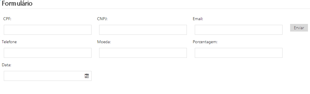
My situation: I have a form in which the fields are arranged vertically, and with the label aligned to the right and left, as shown in the image below:

meuform

I wish to leave at least 2 fields per line for further testing, and there is space on the page to do so. I have made the following changes:

Place display: inline-block, display: inline, float: left one at a time, on the Divs that contain the label and input (divXXX). In all cases, I was unsuccessful, the label is the most difficult to fit. I don’t understand CSS, it was just suggestions I found in researches. Some other solution?

Remarks: I am using Metroui CSS. It is not advisable to use <table> in my case, due to some company restrictions.

HTML

 <div class="conteudoConvenio">
    <div style="width: 100% !important;">
        <fieldset>
                <legend>Formulário</legend>
               <div id="divCPF">
                <label for="txtCPF">CPF:</label>
                <div class="input-control text size4">
                    <input class="text" type="text" name="txtCPF" id="txtCPF" autofocus data-rule-cpf="true" data-rule-required="true" data-inputmask="'mask' : '999.999.999-99'" />
                </div>
            </div>
            <div id="divCNPJ">
                <label for="txtCNPJ">
                    CNPJ:
                </label>
                <div class="input-control text size4">

                    <input class="text" type="text" name="txtCNPJ" id="txtCNPJ" autofocus data-rule-cnpj="true" data-rule-required="true" data-inputmask="'mask' : '99.999.999/9999-99'" />
                </div>
            </div>

           <div class="input-control">
                <input type="submit" class="btn btn-default" value="Enviar" id="btnEnviar" />
            </div>
        </fieldset>
    </div>
</div>

CSS

body {
font-size: .85em;
font-family: "Segoe UI", Verdana, Helvetica, Sans-Serif;
color: #232323;
background-color: #fff;
}

div[class^=input-control], #btnEnviar{
margin: 7px;
}

.divTotal{
width: 30%;
float: left;
}  

label[for^=txt] {
text-align: right;
float: left;
width: 10%;
display: inline-block !important;
}

.help-block{
white-space:nowrap;
color: #e51400;
}

.conteudoConvenio {
/*width: 620px !important;
overflow-y:scroll;
overflow-x:hidden;
max-height: 80% !important;*/
width:80% !important;
position: relative;
left: 210px;
bottom: 90px;
}

EDIT: With the response of Felipe Stoker, I was able to leave the Divs in the same line, but the label was again on top as shown in the image below. I tried to change the width of the fields but no progress.

error2

  • Maybe it’s easier to do what you want using tables: divCPF turn trs, label goes on one td and input on the other.

  • Hello @hugomg, thanks for the reply, but it is not something advisable in my case due to restrictions and company customs. I inserted this remark into the question.

2 answers

3


Let me get this straight. Here’s what you can do. Create a div that will count the amount of fields you want and set a maximum width for it, type:

Inside that div, I would create two more Ive daughters, put the same width for them, put float:left, so she’d throw it aside. Ready, inside the daughters Ivs you can put the input and label, just take care of the width of each element.

Example:

 <div class="campoTotal">
    <div class="filho">
        <label></label>
        <input></input>
    </div>
    <div class="filho">
        <label></label>
        <input></input>
    </div>
</div>
  • Hello @Felipestoker. Thanks for the reply, just left to get the label question right, I edited my question. If I can help, I appreciate

  • Oops. Dude, you don’t have your whole CSS there. See if you have float:left in the div that has the input, if there is, it may be a matter of width, both in the div and in the input

  • Hello @Felipestoker. I added the rest of the missing CSS. In the div that has the input I’m applying the rule div[class^=input-control], #btnEnviar { margin: 7px; }. I am using `float: left;" only in other rules. I’m sorry, I don’t have a handle on this, but if you can tell me if there’s something wrong with the code I updated, I’d appreciate it.

  • I managed to solve the problem, I just took the time to understand your answer correctly and I got to where I wanted, thank you!

  • I couldn’t read your answer in time. But I’m glad you did. The idea is always to create a main div and touch the width so that they stand side by side, and never forget the float:left.

  • Thank you Felipe, I’ll keep that in mind...

Show 1 more comment

2

Hello, follow my proposal to do this:

HTML

<form>
    <div class="content">
        <div class="blc">
           <label>Input Label
             <input type="text" placeholder="" />
           </label>
        </div>
        <div class="blc">
           <label>Input Label
             <input type="text" placeholder="" />
           </label>
        </div>
        <div class="blc">
           <label>Input Label
             <input type="text" placeholder="" />
           </label>
        </div>
    </div>
</form>

CSS

form .content { width:100%; }
form .content .blc { position:relative;float:left;width:33.33333%; }
label { display:block; }
input[type="text"] { display:block; }

Here can be viewed and changed online: http://jsfiddle.net/8dxab5oh/

Browser other questions tagged

You are not signed in. Login or sign up in order to post.