Background Reponsivo

Asked

Viewed 247 times

2

I’m having doubts about how it makes the background responsive.

This is the Background. inserir a descrição da imagem aqui

This is how it’s getting at 1024px Wide. inserir a descrição da imagem aqui

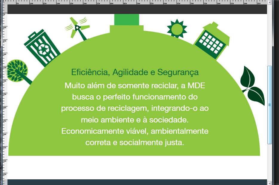
I am putting in the Background-Size 100% Width, I wish that when the Background decreases its own height the container could also be the same height so as not to keep this white space as it is in the image.

Grateful staff.

  • tries to put a padding-bottom: 100% in the div that is that bg and does not set height.

  • Hello Gustavo, thank you for your attention. .

3 answers

1

0

0

If the goal is to display this image in different Vices, use media queries. Here below an example to be used a large image pro desktop and other custom made for phones. In addition to displaying a more legible image the image has a lower weight for 3G Ternets.

<!DOCTYPE html>
<html lang="en">
    <head>
        <meta charset="utf-8">
        <title></title>
        <style>
        #image { 
            background-image: url(largeimage.jpg); no-repeat center center fixed; 
            background-size: cover;


        }
        @media only screen and (max-width: 320px) {
            #image { 
                background-image: url(smallimage.jpg); 
            }
        }
        </style>
    </head>
    <body>
        <div id="image"></div>
    </body>
</html>

Browser other questions tagged

You are not signed in. Login or sign up in order to post.