If what you want is just the bootstrap speaker system, you can enter the bootstrap site and download a style just with this feature, and with just a few modifications you can make it 100% compatible with the primefaces. Follow the example, this bootstrap I adapted for my project:
/*
  Bootstrap v3.3.1 (http://getbootstrap.com)
*/
/*
NOTE:
This file has Normalize.css Removed.
It still requires a "reset.css", so we’re using this...
https://github.com/nathansmith/unsemantic/blob/master/assets/stylesheets/reset.css
*/
- {
-Webkit-box-Sizing: border-box;
-Moz-box-Sizing: border-box;
box-Sizing: border-box;
}
*:before,
*:after {
-Webkit-box-Sizing: border-box;
-Moz-box-Sizing: border-box;
box-Sizing: border-box;
}
.container {
margin-right: auto;
margin-left: auto;
padding-left: 15px;
padding-right: 15px;
}
@media (min-width: 768px) {
. container {
width: 750px;
}
}
@media (min-width: 992px) {
. container {
width: 970px;
}
}
@media (min-width: 1200px) {
. container {
width: 1170px;
}
}
.container-Fluid {
margin-right: auto;
margin-left: auto;
}
.Row {
margin-left: -15px;
margin-right: -15px;
}
.col-Xs-1,
col.Sm-1,
col.Md-1,
col-lg-1,
col-Xs-2,
col-Sm-2,
col-Md-2,
.col-lg-2,
col-Xs-3,
col-Sm-3,
col-Md-3,
.col-lg-3,
col.Xs-4,
col.Sm-4,
col.Md-4,
col-lg-4,
col.Xs-5,
col.Sm-5,
col.Md-5,
col.lg-5,
col-Xs-6,
col.Sm-6,
col-Md-6,
col.lg-6,
col-Xs-7,
col-Sm-7,
col-Md-7,
col-lg-7,
col-Xs-8,
col.Sm-8,
col-Md-8,
col-lg-8,
col.Xs-9,
col.Sm-9,
col.Md-9,
col-lg-9,
col-Xs-10,
col-Sm-10,
col-Md-10,
.col-lg-10,
col-Xs-11,
col-Sm-11,
col-Md-11,
.col-lg-11,
col-Xs-12,
col.Sm-12,
col-Md-12,
.col-lg-12 {
position: relative;
min-height: 1px;
padding: 2px 4px 4px;
}
.col-Xs-1,
col-Xs-2,
col-Xs-3,
col.Xs-4,
col.Xs-5,
col-Xs-6,
col-Xs-7,
col-Xs-8,
col.Xs-9,
col-Xs-10,
col-Xs-11,
col-Xs-12 {
float: left;
}
.col-Xs-12 {
width: 100%;
}
.col-Xs-11 {
width: 91.66666667%;
}
.col-Xs-10 {
width: 83.33333333%;
}
.col-Xs-9 {
width: 75%;
}
.col-Xs-8 {
width: 66.66666667%;
}
.col-Xs-7 {
width: 58.33333333%;
}
.col-Xs-6 {
width: 50%;
}
.col-Xs-5 {
width: 41.66666667%;
}
.col-Xs-4 {
width: 33.33333333%;
}
.col-Xs-3 {
width: 25%;
}
.col-Xs-2 {
width: 16.66666667%;
}
.col-Xs-1 {
width: 8.333333%;
}
.col-Xs-pull-12 {
right: 100%;
}
.col-Xs-pull-11 {
right: 91.66666667%;
}
.col-Xs-pull-10 {
right: 83.33333333%;
}
.col-Xs-pull-9 {
right: 75%;
}
.col-Xs-pull-8 {
right: 66.66666667%;
}
.col-Xs-pull-7 {
right: 58.33333333%;
}
.col-Xs-pull-6 {
right: 50%;
}
.col-Xs-pull-5 {
right: 41.66666667%;
}
.col-Xs-pull-4 {
right: 33.33333333%;
}
.col-Xs-pull-3 {
right: 25%;
}
.col-Xs-pull-2 {
right: 16.66666667%;
}
.col-Xs-pull-1 {
right: 8.33333333%;
}
.col-Xs-pull-0 {
right: auto;
}
.col-Xs-push-12 {
left: 100%;
}
.col-Xs-push-11 {
left: 91.66666667%;
}
.col-Xs-push-10 {
left: 83.33333333%;
}
.col-Xs-push-9 {
left: 75%;
}
.col-Xs-push-8 {
left: 66.66666667%;
}
.col-Xs-push-7 {
left: 58.33333333%;
}
.col-Xs-push-6 {
left: 50%;
}
.col-Xs-push-5 {
left: 41.66666667%;
}
.col-Xs-push-4 {
left: 33.33333333%;
}
.col-Xs-push-3 {
left: 25%;
}
.col-Xs-push-2 {
left: 16.66666667%;
}
.col-Xs-push-1 {
left: 8.33333333%;
}
.col-Xs-push-0 {
left: auto;
}
.col-Xs-offset-12 {
margin-left: 100%;
}
.col-Xs-offset-11 {
margin-left: 91.66666667%;
}
.col-Xs-offset-10 {
margin-left: 83.33333333%;
}
.col-Xs-offset-9 {
margin-left: 75%;
}
.col-Xs-offset-8 {
margin-left: 66.666667%;
}
.col-Xs-offset-7 {
margin-left: 58.33333333%;
}
.col-Xs-offset-6 {
margin-left: 50%;
}
.col-Xs-offset-5 {
margin-left: 41.666667%;
}
.col-Xs-offset-4 {
margin-left: 33.33333333%;
}
.col-Xs-offset-3 {
margin-left: 25%;
}
.col-Xs-offset-2 {
margin-left: 16.666667%;
}
.col-Xs-offset-1 {
margin-left: 8.33333333%;
}
.col-Xs-offset-0 {
margin-left: 0%;
}
@media (min-width: 768px) {
. col-Sm-1,
. col-Sm-2,
. col-Sm-3,
. col-Sm-4,
. col-Sm-5,
. col-Sm-6,
. col-Sm-7,
. col-Sm-8,
. col-Sm-9,
. col-Sm-10,
. col-Sm-11,
. col-Sm-12 {
float: left;
}
.col-sm-12 {
    width: 100%;
}

.col-sm-11 {
    width: 91.66666667%;
}

.col-sm-10 {
    width: 83.33333333%;
}

.col-sm-9 {
    width: 75%;
}

.col-sm-8 {
    width: 66.66666667%;
}

.col-sm-7 {
    width: 58.33333333%;
}

.col-sm-6 {
    width: 50%;
}

.col-sm-5 {
    width: 41.66666667%;
}

.col-sm-4 {
    width: 33.33333333%;
}

.col-sm-3 {
    width: 25%;
}

.col-sm-2 {
    width: 16.66666667%;
}

.col-sm-1 {
    width: 8.33333333%;
}

.col-sm-pull-12 {
    right: 100%;
}

.col-sm-pull-11 {
    right: 91.66666667%;
}

.col-sm-pull-10 {
    right: 83.33333333%;
}

.col-sm-pull-9 {
    right: 75%;
}

.col-sm-pull-8 {
    right: 66.66666667%;
}

.col-sm-pull-7 {
    right: 58.33333333%;
}

.col-sm-pull-6 {
    right: 50%;
}

.col-sm-pull-5 {
    right: 41.66666667%;
}

.col-sm-pull-4 {
    right: 33.33333333%;
}

.col-sm-pull-3 {
    right: 25%;
}

.col-sm-pull-2 {
    right: 16.66666667%;
}

.col-sm-pull-1 {
    right: 8.33333333%;
}

.col-sm-pull-0 {
    right: auto;
}

.col-sm-push-12 {
    left: 100%;
}

.col-sm-push-11 {
    left: 91.66666667%;
}

.col-sm-push-10 {
    left: 83.33333333%;
}

.col-sm-push-9 {
    left: 75%;
}

.col-sm-push-8 {
    left: 66.66666667%;
}

.col-sm-push-7 {
    left: 58.33333333%;
}

.col-sm-push-6 {
    left: 50%;
}

.col-sm-push-5 {
    left: 41.66666667%;
}

.col-sm-push-4 {
    left: 33.33333333%;
}

.col-sm-push-3 {
    left: 25%;
}

.col-sm-push-2 {
    left: 16.66666667%;
}

.col-sm-push-1 {
    left: 8.33333333%;
}

.col-sm-push-0 {
    left: auto;
}

.col-sm-offset-12 {
    margin-left: 100%;
}

.col-sm-offset-11 {
    margin-left: 91.66666667%;
}

.col-sm-offset-10 {
    margin-left: 83.33333333%;
}

.col-sm-offset-9 {
    margin-left: 75%;
}

.col-sm-offset-8 {
    margin-left: 66.66666667%;
}

.col-sm-offset-7 {
    margin-left: 58.33333333%;
}

.col-sm-offset-6 {
    margin-left: 50%;
}

.col-sm-offset-5 {
    margin-left: 41.66666667%;
}

.col-sm-offset-4 {
    margin-left: 33.33333333%;
}

.col-sm-offset-3 {
    margin-left: 25%;
}

.col-sm-offset-2 {
    margin-left: 16.66666667%;
}

.col-sm-offset-1 {
    margin-left: 8.33333333%;
}

.col-sm-offset-0 {
    margin-left: 0%;
}
}
@media (min-width: 992px) {
. col-Md-1,
. col-Md-2,
. col-Md-3,
. col-Md-4,
. col-Md-5,
. col-Md-6,
. col-Md-7,
. col-Md-8,
. col-Md-9,
. col-Md-10,
. col-Md-11,
. col-Md-12 {
float: left;
}
.col-md-12 {
    width: 100%;
}

.col-md-11 {
    width: 91.66666667%;
}

.col-md-10 {
    width: 83.33333333%;
}

.col-md-9 {
    width: 75%;
}

.col-md-8 {
    width: 66.66666667%;
}

.col-md-7 {
    width: 58.33333333%;
}

.col-md-6 {
    width: 50%;
}

.col-md-5 {
    width: 41.66666667%;
}

.col-md-4 {
    width: 33.33333333%;
}

.col-md-3 {
    width: 25%;
}

.col-md-2 {
    width: 16.66666667%;
}

.col-md-1 {
    width: 8.33333333%;
}

.col-md-pull-12 {
    right: 100%;
}

.col-md-pull-11 {
    right: 91.66666667%;
}

.col-md-pull-10 {
    right: 83.33333333%;
}

.col-md-pull-9 {
    right: 75%;
}

.col-md-pull-8 {
    right: 66.66666667%;
}

.col-md-pull-7 {
    right: 58.33333333%;
}

.col-md-pull-6 {
    right: 50%;
}

.col-md-pull-5 {
    right: 41.66666667%;
}

.col-md-pull-4 {
    right: 33.33333333%;
}

.col-md-pull-3 {
    right: 25%;
}

.col-md-pull-2 {
    right: 16.66666667%;
}

.col-md-pull-1 {
    right: 8.33333333%;
}

.col-md-pull-0 {
    right: auto;
}

.col-md-push-12 {
    left: 100%;
}

.col-md-push-11 {
    left: 91.66666667%;
}

.col-md-push-10 {
    left: 83.33333333%;
}

.col-md-push-9 {
    left: 75%;
}

.col-md-push-8 {
    left: 66.66666667%;
}

.col-md-push-7 {
    left: 58.33333333%;
}

.col-md-push-6 {
    left: 50%;
}

.col-md-push-5 {
    left: 41.66666667%;
}

.col-md-push-4 {
    left: 33.33333333%;
}

.col-md-push-3 {
    left: 25%;
}

.col-md-push-2 {
    left: 16.66666667%;
}

.col-md-push-1 {
    left: 8.33333333%;
}

.col-md-push-0 {
    left: auto;
}

.col-md-offset-12 {
    margin-left: 100%;
}

.col-md-offset-11 {
    margin-left: 91.66666667%;
}

.col-md-offset-10 {
    margin-left: 83.33333333%;
}

.col-md-offset-9 {
    margin-left: 75%;
}

.col-md-offset-8 {
    margin-left: 66.66666667%;
}

.col-md-offset-7 {
    margin-left: 58.33333333%;
}

.col-md-offset-6 {
    margin-left: 50%;
}

.col-md-offset-5 {
    margin-left: 41.66666667%;
}

.col-md-offset-4 {
    margin-left: 33.33333333%;
}

.col-md-offset-3 {
    margin-left: 25%;
}

.col-md-offset-2 {
    margin-left: 16.66666667%;
}

.col-md-offset-1 {
    margin-left: 8.33333333%;
}

.col-md-offset-0 {
    margin-left: 0%;
}
}
@media (min-width: 1200px) {
. col-lg-1,
. col-lg-2,
. col-lg-3,
. col-lg-4,
. col-lg-5,
. col-lg-6,
. col-lg-7,
. col-lg-8,
. col-lg-9,
. col-lg-10,
. col-lg-11,
. col-lg-12 {
float: left;
}
.col-lg-12 {
    width: 100%;
}

.col-lg-11 {
    width: 91.66666667%;
}

.col-lg-10 {
    width: 83.33333333%;
}

.col-lg-9 {
    width: 75%;
}

.col-lg-8 {
    width: 66.66666667%;
}

.col-lg-7 {
    width: 58.33333333%;
}

.col-lg-6 {
    width: 50%;
}

.col-lg-5 {
    width: 41.66666667%;
}

.col-lg-4 {
    width: 33.33333333%;
}

.col-lg-3 {
    width: 25%;
}

.col-lg-2 {
    width: 16.66666667%;
}

.col-lg-1 {
    width: 8.33333333%;
}

.col-lg-pull-12 {
    right: 100%;
}

.col-lg-pull-11 {
    right: 91.66666667%;
}

.col-lg-pull-10 {
    right: 83.33333333%;
}

.col-lg-pull-9 {
    right: 75%;
}

.col-lg-pull-8 {
    right: 66.66666667%;
}

.col-lg-pull-7 {
    right: 58.33333333%;
}

.col-lg-pull-6 {
    right: 50%;
}

.col-lg-pull-5 {
    right: 41.66666667%;
}

.col-lg-pull-4 {
    right: 33.33333333%;
}

.col-lg-pull-3 {
    right: 25%;
}

.col-lg-pull-2 {
    right: 16.66666667%;
}

.col-lg-pull-1 {
    right: 8.33333333%;
}

.col-lg-pull-0 {
    right: auto;
}

.col-lg-push-12 {
    left: 100%;
}

.col-lg-push-11 {
    left: 91.66666667%;
}

.col-lg-push-10 {
    left: 83.33333333%;
}

.col-lg-push-9 {
    left: 75%;
}

.col-lg-push-8 {
    left: 66.66666667%;
}

.col-lg-push-7 {
    left: 58.33333333%;
}

.col-lg-push-6 {
    left: 50%;
}

.col-lg-push-5 {
    left: 41.66666667%;
}

.col-lg-push-4 {
    left: 33.33333333%;
}

.col-lg-push-3 {
    left: 25%;
}

.col-lg-push-2 {
    left: 16.66666667%;
}

.col-lg-push-1 {
    left: 8.33333333%;
}

.col-lg-push-0 {
    left: auto;
}

.col-lg-offset-12 {
    margin-left: 100%;
}

.col-lg-offset-11 {
    margin-left: 91.66666667%;
}

.col-lg-offset-10 {
    margin-left: 83.33333333%;
}

.col-lg-offset-9 {
    margin-left: 75%;
}

.col-lg-offset-8 {
    margin-left: 66.66666667%;
}

.col-lg-offset-7 {
    margin-left: 58.33333333%;
}

.col-lg-offset-6 {
    margin-left: 50%;
}

.col-lg-offset-5 {
    margin-left: 41.66666667%;
}

.col-lg-offset-4 {
    margin-left: 33.33333333%;
}

.col-lg-offset-3 {
    margin-left: 25%;
}

.col-lg-offset-2 {
    margin-left: 16.66666667%;
}

.col-lg-offset-1 {
    margin-left: 8.33333333%;
}

.col-lg-offset-0 {
    margin-left: 0%;
}
}
.clearfix:before,
clearfix:after,
container:before,
container:after,
.container-Fluid:before,
.container-Fluid:after,
.Row:before,
.Row:after {
content: "";
display: table;
}
.clearfix:after,
container:after,
.container-Fluid:after,
.Row:after {
clear: Both;
}
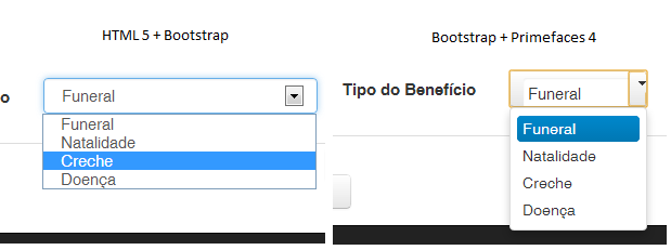
The section below is optional, but here I had to use to leave some components of the primefaces correctly rendered:
[class*="col"] .ui-selectonemenu-label{
    width:100% !important;
}
[class*="col"] .ui-selectonemenu{
    width:100% !important;
}
[class*="col"] input {
    width: 100%;
}
[class*="col"] button {
    width: 100%;
}
[class*="col"] .ui-autocomplete {
    width: 100%;
}
[class*="col"] textarea {
    width: 100%;
}
[class*="col"] .ui-autocomplete-input {
    width: calc(100% - 20px);
}
[class*="col"] .ui-autocomplete-dropdown {
    width: 20px;
}
There is a scheme to remove the bootstrap from the html tags by default and leave only as classes, but then you would have to put the classes you want manually. If it would be a good solution
– Guerra
So far, I don’t think there’s a -- in part because the Primefaces components are based on jQuery-UI.
– elias
You tried to disable the primefaces theme and import the bootstrap in hand?
– uaiHebert
Not @uaiHebert, what I’m doing to get around this problem is not importing any bootstrap class into the first faces component I’m going to use, so it gets the first faces design anyway...
– Vinícius França
GUYS!! THIS QUESTION HAS BECOME QUITE POPULAR, SO AFTER ALL THIS TIME I AM ADDING A SUGGESTION OF WHAT MAY BE THE CURRENT SOLUTION TO THE PROBLEM: USING BOOTFACES. I ask anyone interested to take a look at WWW.BOOTSFACES.NET
– Vinícius França