0
It is possible to convert the image below into css pure?
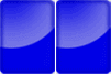
If yes, how could I do that? Someone has an example?
I also need you to have that room, just like in the picture.
0
It is possible to convert the image below into css pure?
If yes, how could I do that? Someone has an example?
I also need you to have that room, just like in the picture.
2
It is possible, yes! And I would say even simple. Just dismember the elements of the figure to find the complete solution.
You could start with:
<body>
  <div class="retangulo">
 </div>
</body>
And create the styles, first the rectangle:
 .retangulo {
display: block;
width: 50px;
height: 80px;
background-color: #0000ff;
border-radius: 10px;
}
Now we need to create this "light" that shades the shape. We changed the HTML to allocate the new element:
<body>
    <div class="retangulo">
      <div class="shade"></div>
    </div>
</body>
And CSS of the shadow I did so, it’s not exactly the same as the original, but I was just riding quickly:
.shade {
  position: relative;
  width: 80px;
  height: 80px;
  border-radius: 50px;
  left: -30px;
  top: -30px;
  background: radial-gradient(rgba(255,255,255,0), rgba(255,255,255,1));
  opacity: 0.3;
  overflow: hidden;
}
Adjust the CSS according to your needs!
Then just do the HTML to look exactly the same on the reference image.
Example:
.retangulo {
  display: block;
  width: 50px;
  height: 80px;
  background-color: #0000ff;
  border-radius: 10px;
}

.shade {
  position: relative;
  width: 80px;
  height: 80px;
  border-radius: 50px;
  left: -30px;
  top: -30px;
  background: radial-gradient(rgba(255,255,255,0), rgba(255,255,255,1));
  opacity: 0.3;
  overflow: hidden;
}
<body>
<div class="retangulo">
<div class="shade"></div>
</div>
</body>@Caique Romero Perfect, the problem is that I need to stay the two rectangles in one div only, not in two. It would be possible?
2
EDIT: (only one <div>) You can do it with just one div yes, following the same principle of using the element ::before and putting the backgrounde radial-gradient in each of them.
<div> and the other inside contente:"" of ::afterSee the example with only one div
html, body {
    width: 100%;
    height: 100%;
    margin: 20px;
    padding: 0;
}

.retangulo {
    display: block;
    width: 50px;
    height: 80px;
    background-color: #0000ff;
    background-image: radial-gradient(circle at top left, blue 0%,rgba(255,255,255,0.5) 60%, blue 61%);
    background-repeat: no-repeat;
    background-size: 150% 80%;
    background-position: top -10px left 0;
    border-radius: 5px;
    position: relative;
    box-shadow: 0 0 10px rgba(0,0,0,0.65) inset;
    font-size: 32px;
    font-family: 'Segoe UI', Tahoma, Geneva, Verdana, sans-serif;
    font-weight: bold;
    color: aliceblue;
    text-align: center;
    line-height: 80px;

}
.retangulo::before {
    content: "2";
    display: block;
    width: 50px;
    height: 80px;
    background-color: #0000ff;
    background-image: radial-gradient(circle at top left, blue 0%,rgba(255,255,255,0.5) 60%, blue 61%);
    background-repeat: no-repeat;
    background-size: 150% 80%;
    background-position: top -10px left 0;
    border-radius: 5px;
    position: absolute;
    left: 51px;
    box-shadow: 0 0 10px rgba(0,0,0,0.65) inset;
}
<div class="retangulo">1</div>To do yes young man, look at the result there. Pure CSS!
I used a box-shadow with inset to make the dark shading on the inside, and a pseudo element ::after to make the "glow" with a radial gradient background
html, body {
    width: 100%;
    height: 100%;
    margin: 20px;
    padding: 0;
}
.btn {
    width: 60px;
    height: 80px;
    box-shadow: 0 0 10px rgba(0, 0, 0, 0.75) inset;
    background-color: blue;
    border-radius: 6px;
    overflow: hidden;
    position: relative;
    float: left;
    margin-right: 2px;
}
.btn::after {
    content: "";
    border-radius: 50%;
    position: absolute;
    top: -70px;
    left: -50px;
    width: 120px;
    height: 120px;
    background-image: radial-gradient(blue 30%, azure);
    opacity: 0.65;
}
<div class="btn"></div>
<div class="btn"></div>Perfect, the problem is that I need to stay everything in a div only, not in two. It would be possible?
Wendler looks at the first part of my answer with the EDIT, to do with only one div yes!
Browser other questions tagged html css html5 css3
You are not signed in. Login or sign up in order to post.
When you say, "I also need you to have that room," what exactly do you mean?
– hugocsl
Wendler gives to make only one div yes! Look at the edition I made in my reply you will see how it turned out!
– hugocsl
@hugocsl Ball Show, just give me one more tip. How could I do to put two more numbers there, one in each rectangle, all in the same DIV. I tried to do separating classes, but gave problem because the second rectangle uses the position:Bsolute, so covers the text.
– Wendler
I made it with the next class:
.counter{color:#fff;font-family:Tahoma;font-size:60px;font-weight:700;letter-spacing:12px;line-height:63px;padding:0 0 0 6px;height:70px;margin-top:-1px;position:relative;width:105px}.– Wendler
Wendler doesn’t need it. Look at the edition I made in my code, which you’ll understand. I already put a number inside each Div, no need to use position or anything. If the answer solved your problem consider mark it as solved
✔so we keep the site organized.– hugocsl
@hugocsl Actually I had already tried something like this, problem is that it will not work, because the system generates the two numbers inside the div, there is no way I separate them.
– Wendler
Those numbers are always changed, it’s a regressive chronometer.
– Wendler
Another thing, I need it to be with class counter, exactly with this name, because the system looks for information through this class.
– Wendler
What you want is a different question. If you have any other questions, create a new question. This one I already answered, if you want something other than what you asked create another question because this is already getting quite messy and outside the scope of what was requested. brand that and opens another question that facilitates.
– hugocsl
Perfect, I asked a new question: https://answall.com/questions/282706/problema-com-atr%C3%Adbuto-position-css
– Wendler