4
What is the point of Density and the scaledDensity on Android?
What use can we give you?
4
What is the point of Density and the scaledDensity on Android?
What use can we give you?
2
I gave the following use to density once (scaledDensity i never used):
Imagine that you want to display an image prepared at runtime by you. Customize a figure, for example, and display it in a ImageView of certain size in Density-Independent pixels or dip (for example, 32x32 dip).
Your "painting canvas" begins with an instance of Bitmap of a certain width x height, but these dimensions are in pixels, not in dpi. In screens with resolution mdpi (where 1 pixel equals 1 pixel dip) keep the same sizes works, but on screens with resolution above mdpi one dip is larger than a pixel. If you work on a 32 x 32 pixel image and then play it on a ImageView, Android will scale the 32 x 32 pixels to 32 x 32 dip, which depending on the density of the screen will make the picture lose many details.
The solution is to start with a Bitmap bigger. How much bigger? It will depend on the density of the screen relative to a screen mdpi.
That’s where the field comes in DensityMetrics.density. He is a fractional value (float) which represents just how much more dense the screen of the apparatus is than a screen mdpi.
Let’s take as an example the Samsung Galaxy S4, which has a density of approximately 2.755. It means that the screen of the S4 is 2.755 times denser than a screen mdpi. A canvas mdpi is of the order of 160 pixels per inch. If we multiply 2,755 by 160 we will have approximately 441, which is the number of pixels per inch of S4. So if we want to correctly display the above image in an S4, this density will be what we use to increase the Bitmap, that is, it should be 32 x 2,755 pixels high (rounded to an integer value when necessary, of course) and the same as wide, ie 88 x 88 pixels. When the Bitmap already prepared by you is used to fill the ImageView, you will see that the image details have been kept.
Do you mean that the S4 has 1 Dip = 2.755 pixels? I have a tablet with 800x400 and a smartphone also with 800x400. The Tablet has 0.75 Dénsity and the smartphone has 1.5. What does that mean?
The tablet is certainly larger than the smartphone (in cm or inches), but its screens, although having different sizes, have the same number of pixels. That is, the pixels of the tablet are bigger than the pixels of the smartphone. You can occupy the same area with fewer tablet pixels or more smartphone pixels. So the density of the tablet screen (in pixels per inch let’s say) is lower and the smartphone’s higher.
If the area in question is an "ideal imaginary pixel" that allows a fluid view of the image at the normal distance of use of the device (which is precisely what the dip, see my comment in this question - the dip has the same physical size on any screen), the value of density will reflect the amount of actual pixels that fit into an "ideal pixel" or dip on the apparatus in question.
That is, S4 has 1 Dip = 2,755 pixels. And you can estimate the value of density of each apparatus dividing the screen density (in pixels per inch, also called dpi or ppi) by 160.
So on my tablet 1 Dip = 0.75 pixels and on my smartphone 1 Dip = 1.5 pixels? It’s just that I had to do the inches math and it doesn’t add up...
That’s right. What models of the devices and how much are the accounts?
The tablet {7.52'''}; O smartphone {4.08'''}; It should be 7'' and 5'' respectively.
It looks like it’s not hitting at all. I’m getting 1 Dip = 0.83 and 1.22 pixels respectively. The documentation says that density is an approximate value (Gross) and apparently you’re right. The way is to use xdpi and ydpi to calculate the horizontal and vertical densities respectively, which seem to be more accurate. I will change my answer.
They’re basically the same as xdpi and ydpi, give the default values practically... I’m screwed with this.
2
ABOUT PIXELS AND RELATIVITY
The pixel looks like a fixed unit when you write CSS codes, but in reality the physical size of the pixel varies according to the device. This means that 1px here on my monitor is different from the same 1px as yours. But it is not only the pixel size that can change from appliance to appliance. The amount of pixels that fit in the same area also varies. As the subject is kind of dense, let’s use a metaphor. Imagine taking a ruler and drawing with a permanent marker (It’s just imagination. Don’t go saying I had it made, huh?) a 1 inch square on an iPhone 3GS. Now draw the same square on an iPhone 4 that has high resolution screen (that the marketing team Mace decided to call Retina). Although imaginary squares are the same size, as the pixel density of a HD monitor is higher, we have tighter pixels in the same space. This marvel of technology allows much more beautiful, crisp and detailed images... But, as everything has a price, the iOS designer will have to create two images: one for "base" density and the other for double density. iOS? This article isn’t about Android? Yeah, buddy, I got some bad news. Apple phones are all standardized so if we were to separate all iPhones in the world according to the resolution there would only be two cells: normal and retina (HD). As Android is an open and democratic system there are several brands, each creating devices with the pixel density that is trendy at the moment and... Moral of the story: there are 6 density stacks for Android. Each one encompasses a certain range of dots per inch and is labeled with a charming acronym. It seems much more laborious at first. But all is not lost. The secret to creating a layout that will maintain consistency across different devices is in virtual pixels.
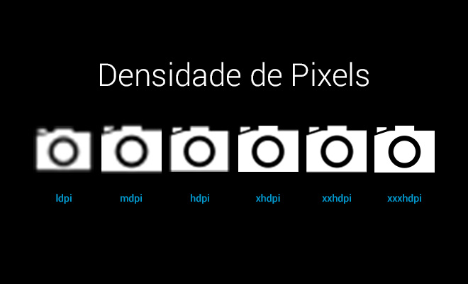
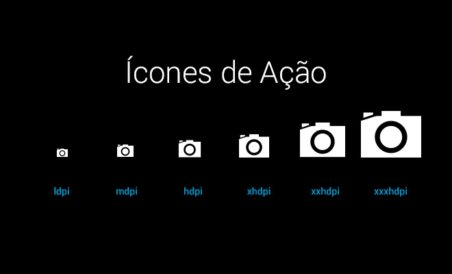
DENSITY CELLS
To simplify, we group the most common pixel density, measured in DPI (number of dots per inch), into categories with friendlier names. The bold column is the base resolution (MDPI).
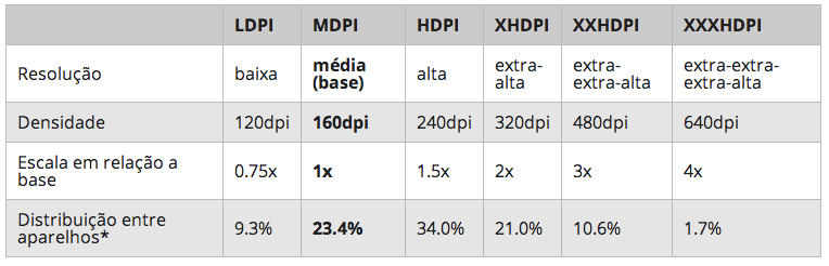
*According to a survey conducted in January 2014. These are the density categories or stacks. Not all devices fit perfectly into one of these categories, so we should always round to the nearest value. For example, a 242dpi device would still be classified as HDPI. I added LDPI to this table for you to know, but the system resizes the Assets to it automatically from HDPI.
AND SUCH VIRTUAL PIXELS?
DP (also called DIP) is an acronym for Density-Independent Pixels, i.e., Pixel Resolution Independent. It is an abstract measurement unit based on screen density and fundamental to create apps for Android. 1dp corresponds to 1px in a 160dpi resolution screen (the MDPI of our tablet, also known as Base Resolution). Using dp as a measure ensures that layout elements have the same physical size regardless of resolution. It doesn’t matter if in the same square fit 4px or only 1, they will always have the same physical size. Let’s go to a practical example. If you have a 32dp PNG icon (or 32px in MDPI base resolution) you will need the following versions to meet the other resolutions: 48px (HDPI), 64px (XHDPI), 96px (XXHDPI), and 128px (XXXHDPI). But, as you can see from the table, the vast majority of users (78.4%) focus on MDPI-XDHPI resolutions. That is, if you have to prioritize focus on these three tracks.
Remember when to convert the measures to always round the number if decimals appear. If you assume that 1px is the smallest unit of measurement possible there is no half pixel.
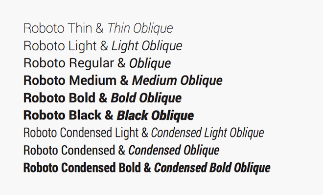
TYPOGRAPHY The standard typographic family of Android 4.4 is Roboto. The font can be downloaded for free via Google Fonts and comes with a number of different weights: thin, light, regular, medium, Bold and black and condensed versions.
SP
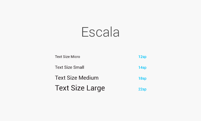
The typography of your layout should follow another measure: the SP (Scaled pixel). A SP corresponds to 1 dp in 100% scale. It seems the same thing, but it is not. The advantage of SP is that it is scalable. That is, the user can increase and decrease the size of the text in SP according to his preferences. 10sp would correspond to 11dp if the text size was in 110% scale. This flexibility is a question of accessibility since being able to resize the text is fundamental for people with vision difficulties. To summarize the drama of the units of measurement: - SP for printing. - DP for everything else. - End. To ensure readability the official documentation recommends some sizes for text:
Remember that if you have been using Photoshop you should convert the size according to the density you chose to work with. Let’s assume that your artboard is the XDPI (720x1280px). This means 1sp = 2px. That is, the text of 22sp will be 44px and so on. You can also implement custom fonts through a ttf file. But this option can make your app a little heavier.
source: http://tableless.com.br/design-de-aplicativos-para-android-parte-2/
Hello Igor, links may break after a while. Try to transcribe at least enough to resolve the OP of the link to your answer, to prevent it from being suspended because it is only by links. Any questions please visit [Answer]
Browser other questions tagged android
You are not signed in. Login or sign up in order to post.
Related question: http://answall.com/questions/295/d%C3%Bavida-sobre-px-dp-Dip-and-sp-no-android
– bfavaretto