How to leave the footer with relative position and at least at the bottom of the page?

Asked

Viewed 405 times

0

I am using in several pages the Sticky position of Html5 to give an effect in the menu of the site.

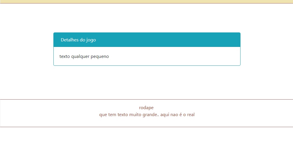
But there are pages that the internal content is very small, does not occupy even 150px high and it turns out that I can not use the footer with position fixed because it would cover a lot of content on the other pages, because it has a lot of information on it.

So what I’d like to do is sort of min-bottom as well as the min-height.

I use bootstrap 4 beta for the front end. Any tips?

nessa página preciso que

2 answers

2


I also have this problem. The solution I use is to use flexbox, a new CSS3 feature.

Basically, like this:

* {
  box-sizing: border-box;
  margin: 0;
  padding: 0;
}

html,
body {
  min-height: 100vh;
}

body {
  display: flex;
  flex-direction: column;
}

body > .main-content {
  flex-grow: 1;
}

/** Estilos opcionais. */

.main-header {
  background-color: #f1f1f1;
  border-bottom: solid 1px #ddd;
  padding: 20px;
}

.main-content {
  padding: 20px;
}

.main-footer {
  background-color: #333;
  border-top: #303030;
  padding: 20px;
  color: #fff;
}
<!DOCTYPE html>
<html>
  <body>
    <header class="main-header">
      Seu cabeçalho.
    </header>
    <div class="main-content">
      Seu conteúdo principal.
    </div>
    <footer class="main-footer">
      Seu footer.
    </footer>
  </body>
</html>

Otherwise, if I am not satisfied with the above proposal, I leave other options.

  • Vc tested if flex will not break the bootstrap grid?

  • Good morning, my friend. Yesterday I did not answer that I was studying yet, I will test today, but from what I saw in the documentation of bootstrap 4 itself incorporated flexbox. For example, it will work, yes, follow the link to someone who also uses: https://getbootstrap.com/docs/4.0/utilities/flex/ And thank you very much!

  • Tested. Your code only works by itself without the bootstrap classes, unfortunately, but with the bootstrap code it works if you use height: inherit inheriting the height 100% of the html and body. Thanks.

  • Hello. I think if the problem is overwritten CSS, you can use the directive ! important. To learn more, see here.

1

One option is to use jQuery so that the footer is always on bottom. If the height of the footer fit on the screen, it will always be on bottom, otherwise it will stay after, normally following the other elements.

Behold:

$(window).on("load resize", function(){
   let prev_h = $("#rodape").prev("*").outerHeight(true),
       prev_o = $("#rodape").prev("*").offset().top,
       foot_h = $("#rodape").outerHeight(true),
       prevoh = prev_h+prev_o,
       foot_m = 30; // margem superior do rodapé
       
   if(window.innerHeight - prevoh - foot_m < foot_h){
      $("#rodape").css({
         "top": prevoh+foot_m +"px",
         "bottom": ""
      });
   }else{
      $("#rodape").css({
         "top": "",
         "bottom": "0"
      });
   }
});
body{
   margin: 0;
}

#rodape{
   background: yellow;
   position: absolute;
}
<script src="https://ajax.googleapis.com/ajax/libs/jquery/2.1.1/jquery.min.js"></script>
<header>
   <div class="container">
      <div class="row">
         <h2>Header</h2>
         Malesuada fames ac turpis egestas integer. Mauris augue neque gravida in fermentum et sollicitudin. Ut tristique et egestas quis ipsum suspendisse ultrices gravida. Porttitor lacus luctus accumsan tortor. Et odio pellentesque diam volutpat. Gravida cum sociis natoque penatibus et magnis dis. Etiam non quam lacus suspendisse faucibus interdum posuere lorem ipsum. Cras pulvinar mattis nunc sed blandit libero volutpat.
      </div>
   </div>
</header>

<main>
   <div class="container">
     <div class="row justify-content-md-center">
       <div class="col col-lg-2">
         1 of 3
       </div>
       <div class="col-12 col-md-auto">
         Malesuada fames ac turpis egestas integer. Mauris augue neque gravida in fermentum et sollicitudin. Ut tristique et egestas quis ipsum suspendisse ultrices gravida. Porttitor lacus luctus accumsan tortor. Et odio pellentesque diam volutpat. Gravida cum sociis natoque penatibus et magnis dis. Etiam non quam lacus suspendisse faucibus interdum posuere lorem ipsum. Cras pulvinar mattis nunc sed blandit libero volutpat. Adipiscing diam donec adipiscing tristique risus nec feugiat in fermentum.
       </div>
       <div class="col col-lg-2">
         3 of 3
       </div>
     </div>
     <div class="row">
       <div class="col">
         1 of 3
       </div>
       <div class="col-12 col-md-auto">
         Variable width content
       </div>
       <div class="col col-lg-2">
         3 of 3
       </div>
     </div>
   </div>
</main>

<div id="rodape">
      <h2>Rodapé</h2>
      Malesuada fames ac turpis egestas integer. Mauris augue neque gravida in fermentum et sollicitudin. Ut tristique et egestas quis ipsum suspendisse ultrices gravida. Porttitor lacus luctus accumsan tortor. Et odio pellentesque diam volutpat. Gravida cum sociis natoque penatibus et magnis dis. Etiam non quam lacus suspendisse faucibus interdum posuere lorem ipsum. Cras pulvinar mattis nunc sed blandit libero volutpat. Adipiscing diam donec adipiscing tristique risus nec feugiat in fermentum. Morbi non arcu risus quis varius quam quisque. Tincidunt ornare massa eget egestas purus viverra. Eget mi proin sed libero enim sed faucibus. Fringilla est ullamcorper eget nulla facilisi etiam dignissim. Purus in massa tempor nec feugiat nisl pretium. Aliquam id diam maecenas ultricies mi eget mauris. Mauris sit amet massa vitae tortor condimentum. Vel quam elementum pulvinar etiam non quam lacus suspendisse. Et egestas quis ipsum suspendisse ultrices gravida dictum fusce. Non diam phasellus vestibulum lorem sed. Venenatis cras sed felis eget velit aliquet.
</div>

Browser other questions tagged

You are not signed in. Login or sign up in order to post.