Implementing Grid Bootstrap 4 and Sidenav

Asked

Viewed 1,414 times

1

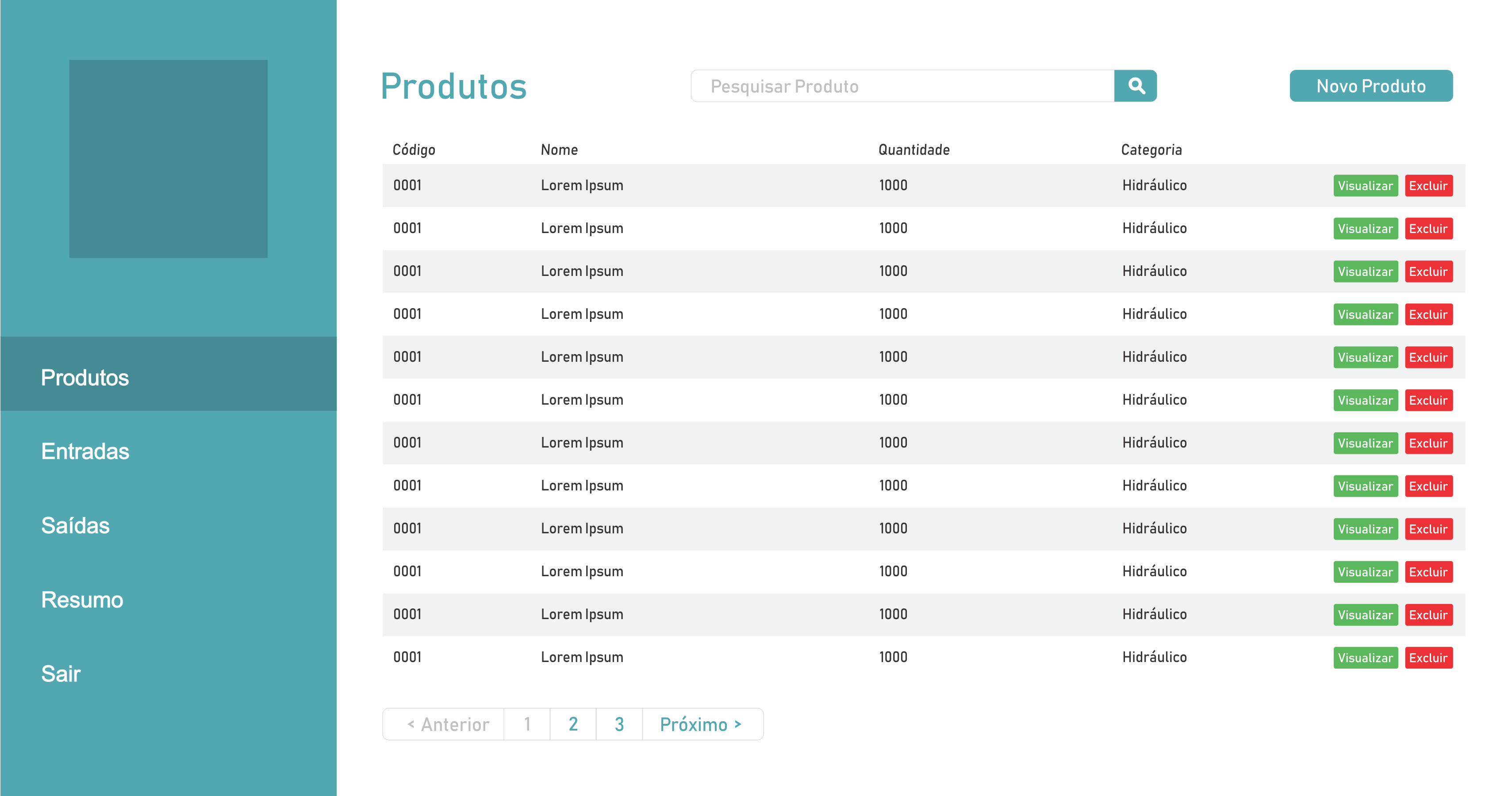
Hey there, fellas. I’m doing a little project and I’m having difficulty using grid and sidenav bootstrap, I want to make a fixed menu side, no responsiveness with 30% of the screen size and the other 70% I will implement tables and Forms, someone could help me?

The side menu I managed to make a part, I just don’t know if it’s correct.

inserir a descrição da imagem aqui

    <!-- Bootstrap CSS -->
    <link rel="stylesheet" href="css/bootstrap.css">
    <link rel="stylesheet" href="css/styles.css">

    <title>CRUD</title>
    <style>
        #sidebar-wrapper {
        left: -300px;
        width: 300px;
        background-color: #51A8B1;
        color: white;
        position: fixed;
        height: 100%;
        z-index: 1;
        }
        .sidebar-nav {
        position: fixed;
        top: 0;
        margin: 0;
        padding: 0;
        width: 300px;
        list-style: none;
        }
        .sidebar-nav li {
        font-size: 20px;
        text-indent: 55px;
        line-height: 70px;
        }
        .sidebar-nav li a {
        color: white;
        display: block;
        text-decoration: none;
        }
        .sidebar-nav li a:hover {
        background: #448B93;
        color: white;
        text-decoration: none;
        }
        .sidebar-nav li a:active, .sidebar-nav li a:focus {
        text-decoration: none;
        }

        #ufpb-logo{
        margin-top: 50px;
        margin-bottom: 50px;
        padding-left: 110px;
        }
        #sidebar-wrapper.sidebar-toggle {
        transition: all 0.3s ease-out;
        margin-left: -200px;
        }

        #main{
        padding-left: 70px;

        }
        @media (min-width: 768px) {
        #sidebar-wrapper.sidebar-toggle {
            transition: 0s;
            left: 200px;
        }
        }
    </style>
</head>
<body>
    <!--SideNav-->
    <div class="container">
        <div id="sidebar-wrapper" class="sidebar-toggle">
            <ul class="sidebar-nav">
                <div class="row" id="ufpb-logo">
                    <a href="#"><img width="111px" height="160" src="assets/img/ufpb2.png"/></a>
                </div>
                <li>
                    <a href="#item1">Produtos</a>
                </li>
                <li>
                    <a href="#item2">Entradas</a>
                </li>
                <li>
                    <a href="#item3">Saídas</a>
                </li>
                <li>
                    <a href="#item3">Resumo</a>
                </li>
                <li>
                    <a href="#item3">Sair</a>
                </li>
            </ul>
        </div>  
    </div>
    <!-- jQuery first, then Popper.js, then Bootstrap JS -->
    <script src="/js/jquery.min.js"></script>
    <script src="/js/popper.min.js"></script>
    <script src="/js/bootstrap.min.js"></script>
</body>

1 answer

0


Your code actually needs a few tweaks. Starting with the first div with the Container class. Actually you will not need it, by default Bootstrap puts some values in this class that are not interesting for your Layout.

Another thing. If you want part of the screen with 30% and the other with 70% doesn’t make sense you use values in PX.

I made this very basic model, trying to make the most of its code and only removing some values in PX, so I divided the screen with 30% in #sidebar and the other 70% in the <main> (have to do the respositividade part to be all right if you want)

#sidebar-wrapper {
background-color: #51A8B1;
color: white;
position: fixed;
height: 100%;
width: 30%;
z-index: 1;
}
.sidebar-nav {
position: fixed;
top: 0;
margin: 0;
padding: 0;
list-style: none;
width: 30%;
}
.sidebar-nav li {
font-size: 20px;
text-indent: 55px;
line-height: 70px;
}
.sidebar-nav li a {
color: white;
display: block;
text-decoration: none;
}
.sidebar-nav li a:hover {
background: #448B93;
color: white;
text-decoration: none;
}
.sidebar-nav li a:active, .sidebar-nav li a:focus {
text-decoration: none;
}

#ufpb-logo{
margin-top: 50px;
margin-bottom: 50px;
}
#sidebar-wrapper.sidebar-toggle {
transition: all 0.3s ease-out;
}

#main{
padding-left: 70px;

}
@media (min-width: 768px) {
#sidebar-wrapper.sidebar-toggle {
    transition: 0s;
}
}
main {
    background-color: tomato;
    width: 70%;
    margin-left: 30%;
    height: 100%;
    position: fixed;
}
<link rel="stylesheet" type="text/css" media="screen" href="https://maxcdn.bootstrapcdn.com/bootstrap/4.0.0-beta.2/css/bootstrap.min.css" integrity="sha384-PsH8R72JQ3SOdhVi3uxftmaW6Vc51MKb0q5P2rRUpPvrszuE4W1povHYgTpBfshb" crossorigin="anonymous" />

<div class="">
    <div id="sidebar-wrapper" class="sidebar-toggle">
        <ul class="sidebar-nav">
            <div class="row justify-content-center" id="ufpb-logo">
                <a href="#"><img width="111px" height="160" src="assets/img/ufpb2.png"/></a>
            </div>
            <li>
                <a href="#item1">Produtos</a>
            </li>
            <li>
                <a href="#item2">Entradas</a>
            </li>
            <li>
                <a href="#item3">Saídas</a>
            </li>
            <li>
                <a href="#item3">Resumo</a>
            </li>
            <li>
                <a href="#item3">Sair</a>
            </li>
        </ul>
    </div>
    <main>
        Seu conteudo
    </main>
</div>

OBS1: The code is not perfect, you can still use the classes of Bootstrap4 Flex for better layout, follow the official documentation link https://getbootstrap.com/docs/4.0/utilities/flex/

OBS2: With Bootstrap Grid you can not do one part with 30% and another with 70%, because it only works with multiples of 12. The closest you can get is using Col-4 and Col-8 having a 33% share and a 64% share approximately. See documentation link: https://v4-alpha.getbootstrap.com/layout/grid/

Browser other questions tagged

You are not signed in. Login or sign up in order to post.