Your code has some build errors, so it’s not responsive.
The first thing I noticed is that you fixed the size of the <span class="input-group-addon">, it causes some problems.
Another thing is that you’re not defining the grids to work his layout.
First you must define a <div class="row"> to mark the row and inside it you must define the columns through the <div class="col-lg-? col-md-? col-sm-? col-xs-?"> (The ? are only to represent the size of the columns, which is variable).
You also did not put the class .form-control in his <select>.
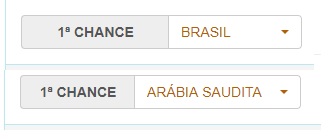
I made changes to your code.
See if that’s the way you’re looking:
/* Esse padding é apenas p/ melhorar a visualização da resposta */
body {
  padding-top: 15px;
}
<link type="text/css" rel="stylesheet" href="https://unpkg.com/[email protected]/dist/css/bootstrap.min.css">

<div class="container">
  <div class="row">
    <div class="col-md-4 col-sm-4 col-xs-12">
      <div class="input-group">
        <span class="input-group-addon">Escolha</span>
        <select class="form-control">
          <option>Laranja</option><option>Goiaba</option><option>Banana</option>
        </select>
      </div>
    </div>
    <div class="col-md-4 col-sm-4 col-xs-12">
      <span class="label label-success">Escolha uma fruta</span>
    </div>
  </div>
</div>
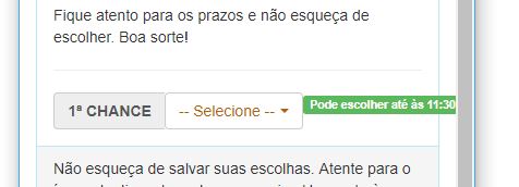
I don’t remember much of all bootstrap classes, but I think there is still to add the grid system classes, in addition you have put a
width: 110px;this makes the element stay fixed, is sure that this code is the same as the image, seems to lack some things– Costamilam
Really... I forgot to put the class . selectpicker of my SELECT. As for the size fixed, if not by it gets much bigger than the label... But putting the grid classes, it worked fine. Thank you very much.
– Walter Robynson