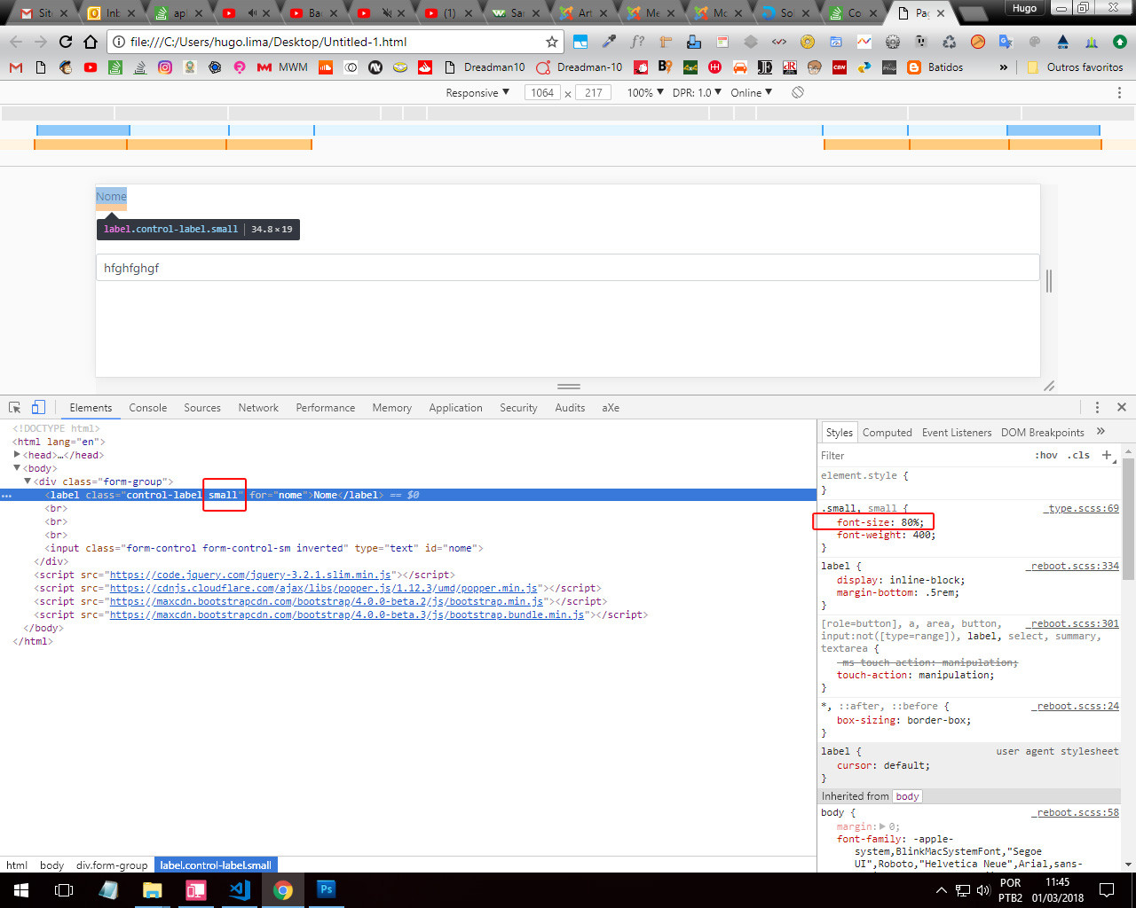
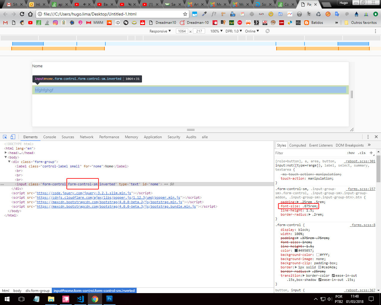
I tested using the Small in the Label and it worked. It may be that you are having some problem with override of classes with Bootstrap.
Anyway see that even with class Small working my problem will reverse. With Small the text of Label will get smaller than the text
Input. See the images to better understand (red squares).
So to solve the problem I advise to put a direct value in the class of Label See in the Example below, So everything is the same size.
<!DOCTYPE html>
<html lang="en">

<head>
    <meta charset="utf-8" />
    <meta name=c ontent=>
    <title>Page Title</title>
    <meta name="viewport" content="width=device-width, initial-scale=1">
    <link rel="stylesheet" type="text/css" media="screen" href="https://maxcdn.bootstrapcdn.com/bootstrap/4.0.0-beta.2/css/bootstrap.min.css"
        integrity="sha384-PsH8R72JQ3SOdhVi3uxftmaW6Vc51MKb0q5P2rRUpPvrszuE4W1povHYgTpBfshb" crossorigin="anonymous" />
    <link rel="stylesheet" type="text/css" media="screen" href="https://maxcdn.bootstrapcdn.com/font-awesome/4.7.0/css/font-awesome.min.css"/>
    <style>
        label {
            display: inline-block;
            margin-bottom: .5rem;
            font-size: .875rem;
        }
    </style>
</head>

<body>

    <div class="form-group">
        <label class="control-label" for="nome">Nome</label>
        <input class="form-control form-control-sm inverted" type="text" id="nome" value="Nome">
    </div>

    <script src="https://code.jquery.com/jquery-3.2.1.slim.min.js"></script>
    <script src="https://cdnjs.cloudflare.com/ajax/libs/popper.js/1.12.3/umd/popper.min.js"></script>
    <script src="https://maxcdn.bootstrapcdn.com/bootstrap/4.0.0-beta.2/js/bootstrap.min.js"></script>
    <script src="https://maxcdn.bootstrapcdn.com/bootstrap/4.0.0-beta.3/js/bootstrap.bundle.min.js"></script>
</body>

</html>
add the class in the div col-Sm-{value}.. this value goes from 1 to 12. 12 being the extension
– José Francisco
Any questions, please see this reference: https://www.w3schools.com/bootstrap/bootstrap_grid_system.asp
– José Francisco
https://getbootstrap.com/docs/4.0/layout/grid/
– Caique Romero
Dude, I didn’t really understand what you need, so is there any way to post a simple image? You that a small input type that only fits 2 or 3 characters is this? How so "input smaller than label" ?
– hugocsl
Guys, I don’t think I was very clear on the question. @Joséfrancisco Does not refer to the grid system. I meant the label font size and the font size inside the input.
– Luciano José da Silveira