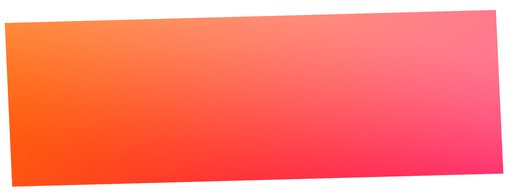
Young woman changing the linear-gradiente for radia-gradiente I was able to achieve a result very close to the image. I also used 4 colors and not 2, starting from the top of the box on the right.
The CSS of the gradient looks like this:
background-image: radial-gradient(circle at top right, #ff9bb4, #ff507b, #ff7a2d, #f55a00 );
See the result:
.box {
margin-top: 100px;
background-image: radial-gradient(circle at top right, #ff9bb4, #ff507b, #ff7a2d, #f55a00 );
width: 100%;
height: 300px;
-webkit-transform: skewY(-1.5deg);
-moz-transform: skewY(-1.5deg);
-ms-transform: skewY(-1.5deg);
-o-transform: skewY(-1.5deg);
transform: skewY(-1.5deg);
}
<div class="box">
      <div class="wrapper">
      </div>
 </div>
OBS: The wider the BOX but tenuous will be the degrade and transition of colors, the narrower the BOX, but noticeable will be the transition between one color and another.
EDIT: Variation with Two Gradients, one linear and another radial, one over the other with mix-blend-mode: overlay;.
According to your comment in my reply is the mix-blend-mode: overlay; that will give the tone "saturated" both at the top of the gradient and at the bottom. But to do this I needed to create another element above the gradient, because to use the bland-mode I needed to separate the backgrounds, you couldn’t use both in one element.
See how it looked in the Snippet below
.bgc {
    position: relative;
  background-image: radial-gradient(circle at top right, #ff9bb4, #ff507b, #ff7a2d, #f55a00 ) ;
  width: 100%;
  height: 300px;
  -webkit-transform: skewY(-1.5deg);
  -moz-transform: skewY(-1.5deg);
  -ms-transform: skewY(-1.5deg);
  -o-transform: skewY(-1.5deg);
  transform: skewY(-1.5deg);
}
.filtro {
    width: 100%;
    height: 300px;
    background-image: linear-gradient(rgba(255,255,255,0.2), rgba(255,255,255,0), rgba(0,0,0,0),rgba(0,0,0,0.4));
    background-size: cover;
    position: absolute;
    top: 0;
    right: 0;
    mix-blend-mode: overlay;
}
<div class="bgc">
    <div class="filtro"></div>
</div>
You can work the transparencies of the linear-gradiente, until you reach the has that you think ideal.
Young I edited my reply response according to your comment, with a saturation in colors using mix-Bland-mode, then look there
– hugocsl