HTML Css and Php Dynamic content in DIV

Asked

Viewed 472 times

1

I am developing a site and in it I created a service area where through CSS, HTML, PHP and Laravel I display the content dynamically, I do a foreach...

As I do not limit how many records the user can include he can include as many as he wants what generates me a Layout problem when it does not include 3 by 3, see in the image ...

inserir a descrição da imagem aqui

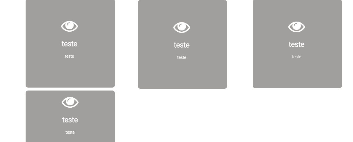
As you can see, there are only 4 registered records and the last one was at the bottom of the screen which eventually generated a white space on the right.

So I ask you: How do I adjust? Is there any way to get the size of the white space through javascript so I can help the Box via CSS?

HTML/ Blade code

   <section class="servicos">
        <div class="container"> 
            <div class="row text-center">
                    <h2><i class="fa fa-briefcase" aria-hidden="true"></i> &nbsp;S e r v i c o s </h2>
                    <hr>
             </div> 
        </div>

            <div class="col-xs-12">
                <div class="container">                     
                  @forelse($servicos as $dados_servicos)
                    <div class="col-xs-4">                                
                            <div class="box col-xs-12">                     
                                  <div class="icone text-center">    
                                      <i class="fa {{$dados_servicos->caminhoicone}} fa-4x" aria-hidden="true"></i>  
                                  </div>                                     
                                 <h3 class="text-center titulo">{{$dados_servicos->titulo}} </h3>
                                 <p class="texto">{!!$dados_servicos->post!!}  </p>                                     
                            </div>                                              
                    </div>
                    @empty
                    Nenhum Serviço Cadastrado
                    @endforelse            
                </div>
           </div>

        </section>

CSS

.servicos .box{

    border-radius: 3%;
    text-align: center;  
    margin-left: 6%;
    margin-top: 10px;
    width: 300px;
    height: 300px;
    background-color:#a09f9d;
    font-family: "Roboto-Light";
    float: left;
    /*background-color: rgba(255, 255, 255, .4);*/
    cursor: pointer;


}

.servicos .box:hover{  
    box-shadow: 15px 15px 15px 15px rgba(0, 0, 0, 0.3);
    transition: all 1.0s ease;
}


.servicos .box .icone{
    margin-top: 10px;
    color: white;

}

.servicos .box .titulo{

    color:white;
    font-family: "Roboto-Light";
    overflow: hidden;
    font-weight: bold;

}


.servicos .box .texto{
    position: relative;
    font-family: "Roboto-Light";
    color: white;   
    margin-top: 10px;
    overflow: hidden;

}
  • Diego you want to cover the size of the Gray Box and center it on the page, or you want it "Espiche" and occupy 100% of the remaining blank?

  • @hugocsl, if it is a single record I intend to centralize, but there may be cases of having 2 records as well

1 answer

1


Young girl follows an answer that can help you. You will have to mix the Bootstrap Grid with Flex-box.

I’ve done very little in CSS and HTML, but I need to do something... Just take a look because I left things commented in CSS

With this same only try 1 or 2 items in the bottom line they will always be in the middle of the page pay attention in these classes, because they that make the "magic" happen

.holder {
        /* essas são as classes de alinhamento dos boxes dentro do container */
        margin: 0 auto;
        display: flex;
        flex-wrap: wrap;
        justify-content: center;
        max-width: 970px; /* aqui vc define a largura máxima, no caso fiz para caber apenas 3 boxes, e conforme for diminuindo a tela vai ficar 2 por linha e finalmente 1 por linha. */
}

See below the Working Example! Show in "Whole Page" to see better the resposivity.

* {
            box-sizing: border-box;
        }
        html, body {
            width: 100%;
            height: 100%;
            margin: 0;
            padding: 0;
        }
        
        .col-box {
            box-sizing: border-box;
            padding: 10px 2px; /* aqui é o tamanho da borda entre um box e outro, depende vc vai ter que fazer ajustes finos para te atender melhor */
        }
        .holder {
            /* essas são as classes de alinhamento dos boxes dentro do container */
            margin: 0 auto;
            display: flex;
            flex-wrap: wrap;
            justify-content: center;
            max-width: 970px; /* aqui vc define a largura máxima, no caso fiz para caber apenas 3 boxes, e conforme for diminuindo a tela vai ficar 2 por linha e finalmente 1 por linha. */
        }
        
        .servicos .box{
        border-radius: 3%;
        text-align: center;  
        width: 300px;
        height: 300px;
        background-color:#a09f9d;
        font-family: "Roboto-Light";
        /*background-color: rgba(255, 255, 255, .4);*/
        cursor: pointer;
        }
        .servicos .box:hover{  
        box-shadow: 15px 15px 15px 15px rgba(0, 0, 0, 0.3);
        transition: all 1.0s ease;
        }
        .servicos .box .icone{
        margin-top: 10px;
        color: white;
        }
        .servicos .box .titulo{
        color:white;
        font-family: "Roboto-Light";
        overflow: hidden;
        font-weight: bold;
        }
        .servicos .box .texto{
        position: relative;
        font-family: "Roboto-Light";
        color: white;   
        margin-top: 10px;
        overflow: hidden;
        }
<link rel="stylesheet" type="text/css" media="screen" href="https://maxcdn.bootstrapcdn.com/bootstrap/3.3.7/css/bootstrap.min.css" />
    <link rel="stylesheet" type="text/css" media="screen" href="https://maxcdn.bootstrapcdn.com/bootstrap/3.3.7/css/bootstrap-theme.min.css" />
    <link rel="stylesheet" type="text/css" media="screen" href="https://maxcdn.bootstrapcdn.com/font-awesome/4.7.0/css/font-awesome.min.css" />
<section class="servicos">
            <div class="container">
                <div class="row text-center">
                    <h2>
                        <i class="fa fa-briefcase" aria-hidden="true"></i> &nbsp;S e r v i c o s </h2>
                    <hr>
                </div>
            </div>
        
            <div class="col-xs-12">
                @forelse($servicos as $dados_servicos)
        
                <div class="container holder">
        
                    <div class="col-box">
                        <div class="box">
                            <div class="icone text-center">
                                <i class="fa {{$dados_servicos->caminhoicone}} fa-4x" aria-hidden="true"></i>
                            </div>
                            <h3 class="text-center titulo">{{$dados_servicos->titulo}} </h3>
                            <p class="texto">{!!$dados_servicos->post!!} </p>
                        </div>
                    </div>
        
        
                    <!-- @empty Nenhum Serviço Cadastrado @endforelse -->
                </div>
            </div>
        
        </section>

  • hugocsl thanks friend!!! It worked perfectly!!! it was really what I needed! I didn’t know the Flex property, thanks for the tip and help!!! hugs

Browser other questions tagged

You are not signed in. Login or sign up in order to post.