0
What kind of measure is used when building a site, type width and height. If it is pixel, percentage, point, centimeter ?
0
What kind of measure is used when building a site, type width and height. If it is pixel, percentage, point, centimeter ?
3
About the width of the sites, they are usually defined by the @Medias, But don’t stick to magic numbers. I’ll give you several examples from my point of view.
First, there is an official recommendation of screen sizes and "Brackpoints" W3C, either PX, REM, EM or CM. (REM and EM measurements are based on the standard font-size of the root-element, usually 16px, then 1REM = 16px, and the EM is relative to the REM. here is more information about this: https://www.w3.org/TR/css-values-3/#lengths )
Here is the official documentation on Media Queries https://www.w3.org/TR/css3-mediaqueries/
Mozilla also does not make references to "Brackpoints" as well as Google. Follow official links with good practices.
Nor is there much consensus Frameworks most famous as Bootstrap, Materialize and Foundation for example... Each determines a different width for the Grid and screen widths.
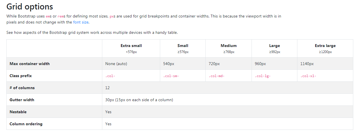
Bootstrap3 breakpoints
Bootstrap4 breakpoints
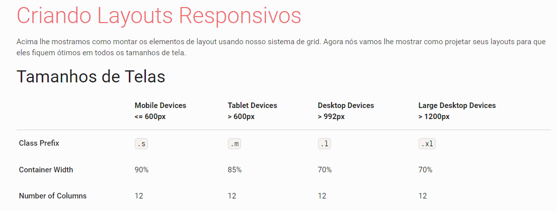
Materialize breakpoints
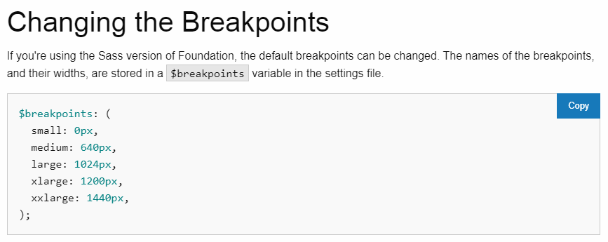
Foundation breakpoints
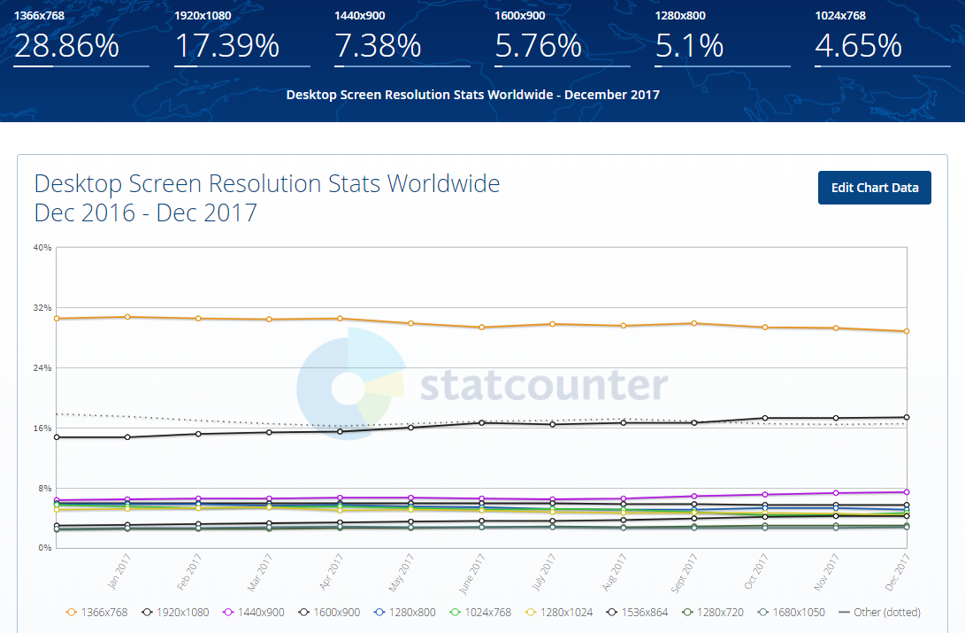
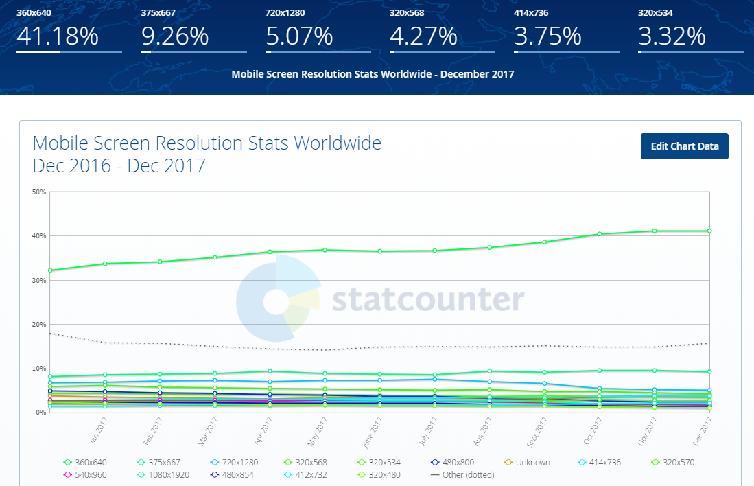
And to finish here is an excellent article about the most used screen sizes currently, the data are from December 2017. Article: https://www.hobo-web.co.uk/best-screen-size/
Telas Desktop
Telas Mobile
Telas Tabler
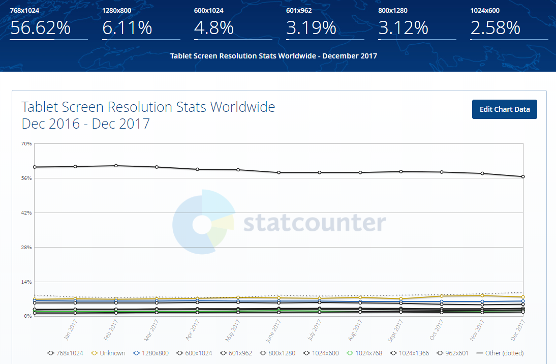
Source: http://gs.statcounter.com/screen-resolution-stats/tablet/worldwide
OBS: Always consider your target audience and user experience before you begin development!
2
It all depends on what your need is! The most common measurements are pixel, percentage, MS.
We use percentage when we want to develop an interface that will adapt in other resolutions, making the element to which the percentage has been added, flexible with the page size.
Pixel we use when we want something that is always this size, because regardless of the device size, the pixel is always the same size.
I leave below two articles that can help a lot in this discovery about the units!
https://tableless.com.br/unidade-pixels-em-rem/
https://www.w3.org/Style/Examples/007/units.pt_BR.html
I hope it helped!
Browser other questions tagged html css html5 css3 web-application
You are not signed in. Login or sign up in order to post.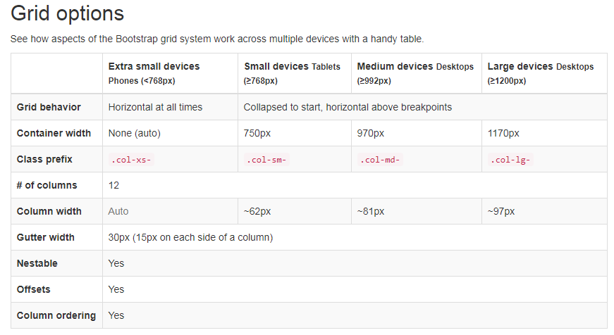
What is the measurement used by the device you will use to display the page?
– Woss