-1
I am developing a web application and put a side menu with <aside> and also a footer in my application, but the footer content does not go down but stays in the middle of the application screen.

<!doctype html>
<html lang="pt-br">
<head>
<meta charset="utf-8">
<title>Menu do site do Maujor — Etapa 5</title>
<meta name="viewport" content="width=device-width, initial-scale=1">
<link rel="stylesheet" href="css/css.css" type="text/css">
<link rel="stylesheet" href="css/font-awesome.css" type="text/css">
<link rel="stylesheet" href="https://cdnjs.cloudflare.com/ajax/libs/font-awesome/4.7.0/css/font-awesome.min.css">
<link rel="stylesheet" href="bootstrap/bootstrap.css">
<link rel="stylesheet" href="bootstrap/bootstrap.min.js">
<script src="https://maxcdn.bootstrapcdn.com/bootstrap/3.3.7/js/bootstrap.min.js"></script>
<style>
/* 2a. Etapa */
@charset "UTF-8";
/* Folha de estilos:
Autor: Maurício Samy Silva
Versões
Data: 26/04/2014 - Redesign do site
*/
/* =CSS Reset */
/* http://meyerweb.com/eric/tools/css/reset/
v2.0 | 20110126
License: none (public domain)
*/
@font-face {
font-family: 'Fixation';
src: url('css/Fixation.ttf') format('truetype');
font-style: normal;
font-weight: normal;
}
html, body, div, span, applet, object, iframe,
h1, h2, h3, h4, h5, h6, p, blockquote, pre,
a, abbr, acronym, address,
dl, dt, dd, ol, ul, li,
fieldset, form, label, legend,
table, caption, tbody, tfoot, thead, tr, th, td,
article, aside, canvas, details, embed,
figure, figcaption, footer, header, hgroup,
menu, nav, output, ruby, section, summary,
time, mark, audio, video {
margin: 0;
padding: 0;
border: 0;
font-size: 100%;
font: inherit;
vertical-align: baseline;
}
/* HTML5 display-role reset for older browsers */
article, aside, details, figcaption, figure,
footer, header, hgroup, menu, nav, section {
display: block;
}
body {
line-height: 1;
}
#busca{
width: 90%;
}
.footer_titulo{
font-family: 'Fixation';
font-weight: 700;
color: white;
}
.conteudo_footer{
font-family: 'Fixation';
font-weight: 700;
color: white;
}
.fale{
margin-top: 40px;
margin-left:40px;
font-family: 'Fixation';
font-weight: 700;
}
.entre{
margin-top: 40px;
margin-left: 160px;
font-family: 'Fixation';
font-weight: 700;
}
.imagem_header{
width: 35%;
}
.campo_busca{
margin-top: 40px;
margin-left: 160px;
border: 1px radius solid;
}
ol, ul {
list-style: none;
}
blockquote, q {
quotes: none;
}
blockquote:before, blockquote:after,
q:before, q:after {
content: '';
content: none;
}
table {
border-collapse: collapse;
border-spacing: 0;
}
/* Fim CSS Reset */
/* =GERAL */
*, html, body {
margin:0;
padding:0;
}
*, *:before, *:after {
-webkit-box-sizing: border-box;
-moz-box-sizing: border-box;
box-sizing: border-box;
}
.cf:before,
.cf:after {content: " ";display: table;}
.cf:after {clear: both;}
.cf {*zoom: 1;}
body {
margin-left:55px;
font: 62.5%/1.2 'Fixation';
}
/* Fim 2a. Etapa */
/* 3a. Etapa */
#lateral {
padding:0 50px 0 0;
-moz-transition: all 0.5s ease;
-webkit-transition: all 0.5s ease;
-o-transition: all 0.5s ease;
transition: all 0.5s ease;
font-size:1.2em;
background:rgb(44,62,80);
background-image: -moz-linear-gradient( 135deg, rgb(3,8,12), rgb(16,57,79) );
background-image: -webkit-linear-gradient( 135deg, rgb(3,8,12), rgb(16,57,79) );
background-image: -o-linear-gradient( 135deg, rgb(3,8,12), rgb(16,57,79) );
background-image: -ms-linear-gradient( 135deg, rgb(3,8,12), rgb(16,57,79) );
background-image: linear-gradient( 135deg, rgb(3,8,12), rgb(16,57,79) );
height:100%;
overflow:hidden;
width:370px;
position:fixed;
top:0;
left:-320px;
margin-top: 107px;
font-family: 'Fixation';
}
.teste{
border-bottom: 1px solid black;
width: 100%;
}
#lateral:before {
z-index:1000;
content: url(icone-menu.png);
font-size:4em;
color:white;
position:fixed;
left:4px;
top:45px;
}
#lateral:hover:before, #lateral:focus:before {
left:-500px
}
.botao_menu_celular{
display: none;
}
#lateral:hover, #lateral:focus, #lateral:active {
overflow-y:scroll;
-moz-transform: translate(320px, 0);
-webkit-transform: translate(320px, 0);
-o-transform: translate(320px, 0);
transform: translate(320px, 0);
padding-right:0;
}
/* Fim 3a. Etapa */
/* 4a. Etapa */
#lateral .box {
list-style-type:none;
margin-bottom:1em;;
padding-bottom:1em;
}
#lateral h3 {
display:inline-block;
font-weight:bold;
font-size:1.6em;
font-style:normal;
padding-bottom:0.2em;
margin: 2em 0 2em 0.81em;
color:rgb(255,255,255);
border-bottom: 4px solid rgb(155,155,155);
}
#menu {
font-style:italic;
position:relative;
font-size:1.0em;
margin:1em 0 1em -1em;
padding:0;
}
#menu li {margin:0;padding:0;}
#menu li a, #menu li a:link {
font-size:1.2em;
color:rgb(255,255,255);
text-decoration: none;
padding: 0.8em 0 0.8em 1em;
display: block;
-moz-transition: all 1.2s ease;
-webkit-transition: all 1.2s ease;
-o-transition: all 1.2s ease;
transition: all 1.2s ease;
}
#menu li a:hover {
color:rgb(255,255,255);
background-color:rgba(255,255,255,0.2);
-moz-transition: all 0.5s ease;
-webkit-transition: all 0.5s ease;
-o-transition: all 0.5s ease;
transition: all 0.5s ease;
}
/* Fim 4a. Etapa */
/* 5a. Etapa */
/* Fim 5a. Etapa */
@media (max-width: 1500px) {
.campo_busca{
margin-left:120px;
width: 80%;
}
.entre{
margin-left: 120px;
}
}
@media (max-width: 1200px) {
.campo_busca{
margin-left:120px;
width: 90%;
}
.entre{
margin-left: 120px;
}
}
@media (max-width: 900px) {
body {
background-color: red;
}
.imagem_header{
width: 60%;
}
.campo_busca{
margin-left: 60px;
width: 90%;
}
.entre{
margin-left: 40px;
}
/* Fim 5a. Etapa */
@media (max-width: 650px) {
.fale{
display: none;
}
.imagem_header{
width: 70%;
margin-left: 100px;
margin-top: -40px;
}
.campo_busca{
display: none;
}
.entre{
margin-left: 30px;
}
.botao_menu_celular{
display: block;
}
.botao_menu_celular{
background-color:white;
font-weight: 900;
height: 20px;
border: 1px solid white;
margin-top:40px;
}
}
</style>
</head>
<body>
<header>
<div class="container-fluid">
<div class="row">
<div class="col-xs-3 col-md-3">
<button type="button" class="botao_menu_celular">MENU</button><img src="imagens/bolos.JPG" class="imagem_header">
</div>
</div>
</div>
</header>
<div class=teste></div>
<aside>
<div id="lateral" onclick="return true" aria-haspopup="true">
<div id="menu">
<h3 class="link-titulo">Menu</h3>
<ul class="box">
<li><a href="#">Produtos</a></li>
<li><a href="#">Receitas</a></li>
<li ><a href="#">Fale Conosco</a></li>
<div class="col-sm-12">
<h2 class="footer_titulo">NEWSLETTER</h2>
<p class="conteudo_footer">Assine nossa mala direta e receba muitas ofertas por e-mail.</p>
<input type="text" id="campo_busca2"><button type="submit" onclick="" class="buscar_produto3"><i class="fa fa-search" action="" ></i></button><br><br>
</div>
<img src="imagens/bolos.JPG" class="imagem_header">
</ul>
</div> <!-- /#menu -->
</div> <!-- /#lateral -->
</aside>
<footer>
Conteudo do footer que era pra ficar embaixo
</footer>
</body>
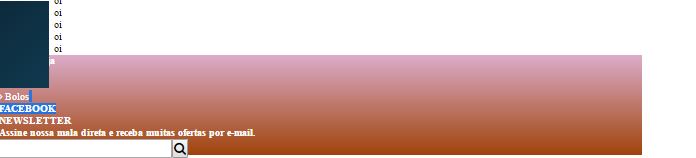
</html>When the scroll bar went down the menu was stopped,.
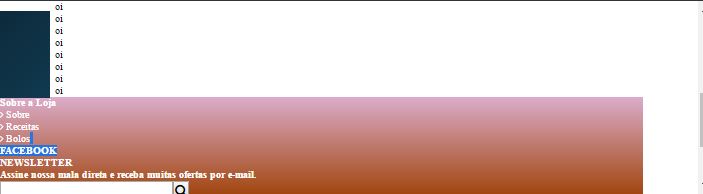
And do not overlap the footer when descending the scroll bar, and come up against the footer
Friend please put the code of your page in the question. Only the image does not help much to give you an accurate answer.
– hugocsl
the code is in the link
– User1999
Already tried to define the footer CSS as: position: Absolute; bottom: 0;
– LucasTonetto
it was positioned down but continued under the side menu
– User1999
I tried to decrease the height of the side menu so that when I finished the height of the menu, I saw the footer but I couldn’t do it
– User1999
Possible duplicate of How to keep my footer down?
– celsomtrindade