0
I need to create a responsive price list, but I don’t know how to start. I don’t know if I use list or table.
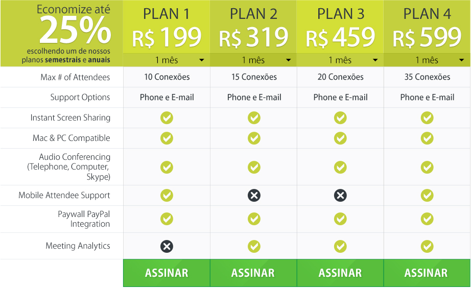
Below is an example of how it is to stay:
Does anyone have any idea?
0
I need to create a responsive price list, but I don’t know how to start. I don’t know if I use list or table.
Below is an example of how it is to stay:
Does anyone have any idea?
2
You could be adapting this model to your liking, using the same structure.
Good @Diegovieira, this had not seen yet. I will try to adapt it.
Friend try to minimize this code and make available in your reply so that it does not get lost due to being an external link.
It’s not my code, I just put it as a reference, however, I’ll leave a copy on my fiddle.
0
You can update the table width property to 100% where depending on the screen it would fit. And to avoid that by greatly reducing the screen the table gets very strange you can set a minimum size and can also set the maximum table size...
width: 100%;
min-width: 300px;
max-width: 960px;
Maybe this helps but if the other parts of your site are not responsive does not help at all the table be responsive.
Browser other questions tagged jquery html css responsive-layout table
You are not signed in. Login or sign up in order to post.
http://stackoverflow.com/search?q=%5Bcss%5D+Responsive+table+is%3Aq
– brasofilo