Your question is rather confusing and in some ways too broad, but I believe I can answer.
I can’t give you a verdict on using float or margin to position elements but use float brings as its main benefit the fact of allowing the block elements not to blast each other getting, literally, floating.
This was one of the most important (if not the largest) of the reasons why migrating table-based layouts to Tableless was made possible by the float it was possible to simulate collocation to provide the elements.
Position elements with margin it is not wrong, after all without margins it would not be possible to have positioning accuracy or provide an improved aesthetic appeal, such as stripping a layout of the edges of the screen.
On the question of padding you’re confusing height real tall residual.
Height real of an element is the one you manually define through the property height or the default behavior of a block element to accompany the text vertically.
Height residual is the one you see and assume to be the height of an element when you see it.
For example: Given a block element of 10 cm tall (height) with 5 cm spacing (padding). The element has a height real of 10 cm, but you see an element of 20 cm because of the height composed computed by box-model
I’m not saying that create height with padding be wrong. It’s a workaround valid mainly for line elements, which are not affected by the properties width and height.
What will really help you is an adapted translation of the link posted by @vrcca with some add-ons from external sources.
How elements are displayed?
Before we talk about the box model helps understand how elements are displayed.
Block elements always start on a new line, being stacked on top of each other and occupy any available width. They can nest inside each other and may involve line elements (inline) and are normally used as delimiters of large areas or content, such as paragraphs.
Line elements do not start in new lines, they follow the normal stream of the document, aligning one after the other and keep only the width necessary for its contents. These elements can also nestle within each other and even involve other elements provided that are not block elements. They are used to delimit small content areas, such as words or links.
The display of the elements, whether block, line or anything else is determined by the property display. Every element has a predefined value for that property and like any property, it can be overwritten.
There is a certain amount of possible values, but the most common are block, inline, inline-block and None.
Of these the most interesting is the inline-block which causes the element to behave like a block element at the same time as aligning with other elements, without piling or incising on new lines.
Box Model
Every HTML element can be considered a box that involves the HTML elements formed by margins, borders, spacing and the content itself, and can still have its own width and height.
Illustratively, we have:
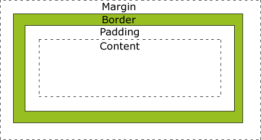
- Shores (margin): Fully transparent area that cleans the area around the edge
- Border (edge): Area around the content and its internal spacing (padding)
- spacing (padding): Area with or without color that clears the area around the contents
- Contents (content*): The content itself, with texts, images and the like.
Working with box-model
The most basic of the principles of box-model revolves around the width and height of the elements that can be determined by the property display, by the content of the element or when manually unlocking the width (width) and height (height) in the CSS.
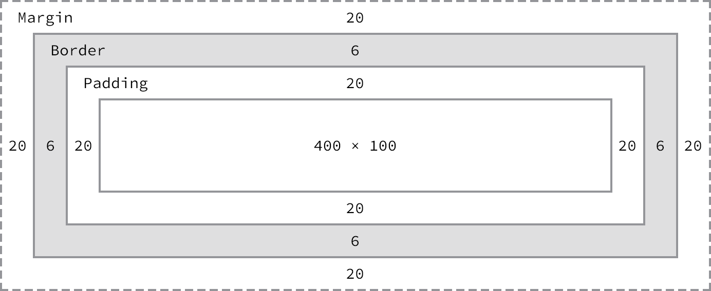
Let’s go to a little code:
div {
  border: 6px solid #949599;
  height: 100px;
  margin: 20px;
  padding: 20px;
  width: 400px;
}
And a visual aid:

(source: shayhowe.with)
As total dimensions of the element, according to the box-model is defined as follows::
Width
margin-right + border-right + padding-right + width + padding-left + border-left + margin-left
Height
margin-top + border-top + padding-top + height + padding-bottom + border-bottom + margin-bottom
In our example, our element would be 492px wide by 192px high.
And that’s why the box-model can be considered one of the most confusing parts of CSS because we explained to our element that it had 400px wide, but because of all the customization he ended up having 492px wide.
Width and Height
Every element has a width and a height. Every browser will render the elements with some dimension. Depending on how an element is displayed (display) standard values are sufficient but, if the element is important for any specific definition, prorpieces need to be defined.
Block elements have a width of 100% consuming all available horizontal space. Already line elements or those defined as inline-block expand or contract to accommodate the content.
Because they have no fixed size, line elements are not affected by the properties width and height
The height of the elements is defined by their contents, expanding or contracting vertically to accommodate them.
Margin and Balancing
Depending on the element, browsers can apply their own rules for margin and padding which makes it virtually impossible to work with box-model. That is why it is vital to use a CSS Reset. The most popular is the Eric Meyer.
Programmers of front-end more puritans will say that:
* { margin: 0; padding: 0; }
It’s enough, but I disagree. It’s okay that nowadays they don’t use many of the tags covered by this CSS Reset and that every byte saved counts, but I see this as a necessary evil.
As stated margin sets the invisible space around an element and serves for a specific and precise positioning of an element on the page.
Vertical margins (top and bottom) are not accepted by line elements, only by block elements.
And the padding is the internal spacing of an element. opposite to margin, padding may have background color if the element defined has a background defined.
Unlike margin, vertical spacing provided by padding works on line elements, but it should be noted that in excess it may cause an undue overlap on above or below elements.
Edges
The edges exist amid the margin and the padding and allow outlining the outline of an element and require a width, style and color to be defined.
They can exist in a box, i.e., on the four sides of the element or individually, through specific properties.
Box-Sizing
As seen, the box-model is an additive model, which makes the total width and height of an element be formed by the sum of these values, be they explicit or standard (of the browsers) with margins, spacings and edges.
CSS3 introduced the property box-Sizing which allows the box-model is calculated in different ways. This property accepts three possible values:
content-box
It is the default value that keeps the box-model in the additive model
padding box
When this value is set any padding defined to the element is not added to its height and width. Edges and edges, however, will continue to be added.
border-box
- This option complements the padding box as well as virtually ignoring any padding given to the element also do not add to the overall width and height the values of any possible defined edges.
As seen, no matter how we define the box-Sizing margins will always continue to be taken into account in the total calculations.
Personally, the border-box is that resource that we all dreamed of having not only because it makes math made much simpler and easier to understand, but because it allows much more effective control when working with relative units.
But, as not everything are flowers, it is not yet a feature supported by all browser and even for those that support still requires the triad of properties prefixed by -Webkit- (Chrome and safari), -Moz- (Firefox) and even -ms- (Internet Explorer)-
Sources:
Thank you for posting the article. Actually you didn’t add much. I already knew what I read. My problem is not understanding what they do but how to use them. Thank you.
– David
From the writing of your post I could abstract at least two questions, both answered or at least well commented before the larger portion of text (has a very subtle gray line dividing). Read again and you will see that I cite specific situations for margin, padding and float.
– Bruno Augusto