How to achieve this effect in a progress bar?

Asked

Viewed 1,697 times

2

How to do this effect on the text inside the progress bar where the text changes color according to bar fill, and when the bar reaches the text, only a part of the text changes color?

inserir a descrição da imagem aqui

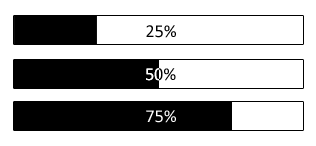
See that when you’re in 50% half of the text color turns white in contrast to the black background and the other half black in contrast to the white background. When the background below the text is white, the text is totally black and vice versa.

How to do this using CSS and Javascript for the bar to go from 0% to 100% in a given period of time, say, in 10 seconds?

The bar code would be this below, but can be changed at will so that you can achieve the desired effect:

#barra{
    display: block;
    width: 298px;
    height: 28px;
    line-height: 28px;
    text-align: center;
    color: #000;
    border: 1px solid #000;
    position: relative;
}

#progresso{
    display: block;
    width: 15%;
    height: 100%;
    background: #000;
    position: absolute;
    top: 0;
    left: 0;
}
<div id="barra">
   <div id="progresso">
   </div>
   <strong>15%</strong>
</div>

  • 2

    Related to Soen: https://stackoverflow.com/q/16981763/1452488

3 answers

5


I did only with CSS, I left the animation with 5 seconds, but the @keyframes I divided in 10 steps if you want to control the animation better with JS.

I left the animation with infinite looping, but I left a comment on css in case you want to make it stop when it completes 100%

html, body {
    width: 100%;
    height: 100%;
    margin: 0;
    padding: 0;
    display: flex;
}
h2{
    margin-left: 150px;
  }

.holder {
    position: relative;
    width: 350px; 
    background: white; 
    border: 1px solid #000; 
    color: #000;
    margin: auto;
}
.mask {
    position: absolute; 
    z-index: 10; 
    overflow: hidden; 
    width: 0%; 
    background-color: red; 
    white-space:nowrap; 
    color: #FFF;
    animation: load 5s linear infinite;
    /* animation-fill-mode: forwards; descomente se quiser que ela pare quando completar  (remova o "infinite" do animation acima)*/
}
@keyframes load {
    0% {
        width: 0%;
    }
    10% {
        width: 10%;
    }
    20% {
        width: 20%;
    }
    30% {
        width: 30%;
    }
    40% {
        width: 40%;
    }
    50% {
        width: 50%;
    }
    60% {
        width: 60%;
    }
    70% {
        width: 70%;
    }
    80% {
        width: 80%;
    }
    90% {
        width: 90%;
    }
    100% {
        width: 100%;
    }
}
<div class="holder">
    <div class="mask">
        <h2>100%</h2>
    </div>
    <h2>100%</h2>
</div>

Here’s an article from Google in Portuguese teaching how to control Animation with Javascript: https://developers.google.com/web/fundamentals/design-and-ux/animations/css-vs-javascript?hl=pt-br

Great animation article with js in English: https://css-tricks.com/controlling-css-animations-transitions-javascript/

  • It was cool....

  • @dvd Not as sophisticated as yours, but it breaks the rss branch. As I don’t know much about JS I usually try to do everything always with CSS first, abs

3

I got it using clip-path (used clip also, which is lagged, but to support older browsers) and creating two layers where the percentage text is displayed (<strong>). As the progress bar grows, it goes clipando the layer (div) where the text is black, revealing the white text that is a layer below. I put all the commented code to facilitate understanding. If anyone has a better or different way, it’s well-being.

I made an example with a smaller bar so you can visualize better:

function ini(){
         $("input").remove(); // apenas para excluir o botão de iniciar :P
   var tempo = 10; // tempo em segundos
   var barra_width = $("#barra").width(); // pego a largura da barra, sem a borda
   var barra_height = $("#barra").height(); // pego a altura da barra, sem a borda
   var progresso_px = barra_width/tempo; // quantos pixels a barra será incrementada pelo tempo
   var progresso_text = $("#barra strong"); // pego as strongs com as porcentagens
   var progresso_div = $("#progresso"); // pego a div do progresso
   
   var temporizador = setInterval(function(){ // crio um temporizador para trabalhar a cada 1 segundo

      var incremento = progresso_div.width()+progresso_px; // calculo o quanto em pixels deverá ser incrementado na largura do progresso
      progresso_div.css("width",incremento+"px");

      if(progresso_div.width() <= barra_width-progresso_px){ // enquanto a barra for menor ou igual ao contêiner menos 1 incremento
         var porcentagem = Math.ceil((progresso_div.width()*100)/barra_width); // calculo a porcentagem, arrendondando pra cima
         progresso_text.text(porcentagem+"%"); // aplico a porcentagem aos strongs
      }else{
         progresso_div.css("width","100%"); // aplico 100% à largura do progresso
         progresso_text.text("100%"); // seto 100% ao texto das strongs
         clearInterval(temporizador); // apagado o temporizador
         console.log("fim!"); // exibe no console a mensagem de que terminou
      }
      
      var barra_strong1 = $("#barra strong:eq(1)"); // pego a primeira strong, que é onde o texto é branco
      // recorto a barra onde o texto é preto, da esquerda para a direita,
      // acompanhando a porcentagem
      // "clip" para navegadores não compatíveis com clip-path
      barra_strong1.css({
          "clip":"rect(0px "+barra_width+"px "+barra_height+"px "+incremento+"px)",
          "clip-path":"inset(0 0 0 "+porcentagem+"%)",
          "-webkit-clip-path":"inset(0 0 0 "+porcentagem+"%)"
      });
   }, 1000);

}
#barra{
   display: block;
   width: 120px;
   height: 28px;
   color: #000;
   border: 1px solid #000;
   position: relative;
}

#progresso{
   display: block;
   background: #000;
   height: 100%;
   position: absolute;
   top: 0;
   left: 0;
}

/* aqui eu seto a cor branca para o primeiro strong*/
#barra *:nth-child(2){
   color: #fff;
}

#barra strong{
   position: absolute;
   display: flex;
   width: 100%;
   height: 100%;
   top: 0;
   left: 0;
   align-items: center;
   justify-content: center;
}
<script src="https://ajax.googleapis.com/ajax/libs/jquery/2.1.1/jquery.min.js"></script>
<div id="barra">
   <div id="progresso"></div>
   <strong>0%</strong>
   <strong>0%</strong>
</div>
<input type="button" value="Iniciar" onclick="ini()" />

-3

hello, great solutions. 1- Imagine a number to search unknown (78), initially the full bar filled, initial number (50), then the bar would be painted between 50-100, in a second attempt (90), then would be painted between 50-90, so successively until you type 78. 2- and as this difference became smaller , would change color, type 100 red, 50 yellow, 10 green, and when hit black thanks for your attention

Browser other questions tagged

You are not signed in. Login or sign up in order to post.