0
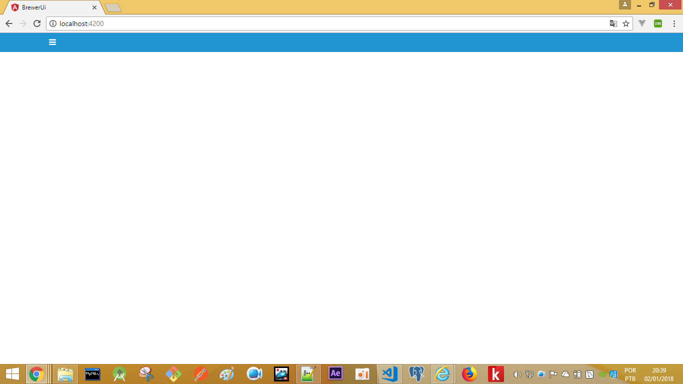
I’m trying to implement an interchangeable menu, see below:
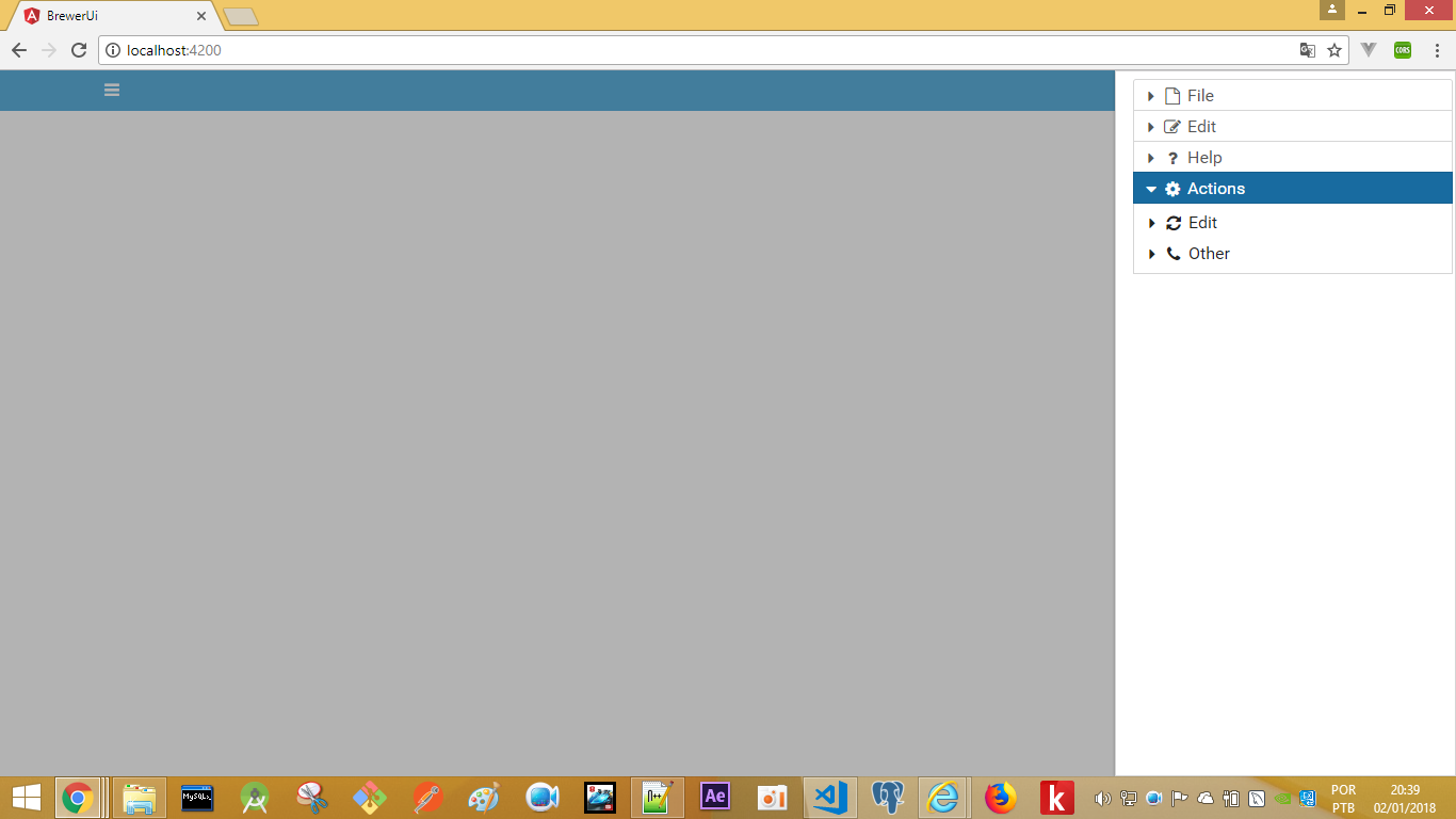
When you click on the three chopsticks it opened a vertical menu on the right side of the screen:
When you click on the three chopsticks, it goes back to hiding, but there’s a catch. When it is in a mobile format see how the application behaves.
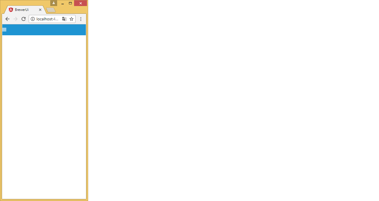
When you click on the three sticks it makes the menu icon disappear making the application unusual, as you can see below:

First solution would be to try to leave the menu below the icon of the three sticks, but I’ve done everything and it didn’t work. 2nd solution would be to create an event of the button that when clicking outside it goes back to the icon of the three chopsticks, or create a button in the menu itself to return to the icon of the three chopsticks.
This is the page:
<div class="navbar">
  <div class="container" >
      <a class="navbar-toggle" (click)="display = true" ><i class="fa fa-bars"></i></a>

        <p-sidebar [(visible)]="display" position="right">
          <p-panelMenu [model]="items" [style]="{'width':'300px'}" blockScroll="true" styleClass="ui-sidebar-md"></p-panelMenu>
        </p-sidebar>
  </div>
</div>
I made that attempt, but it didn’t work:
<div class="ui-g">
  <div class="ui-g-12">
    <div class="navbar">
      <div class="container" >
          <a class="navbar-toggle" (click)="display = true" ><i class="fa fa-bars"></i></a>

      </div>
    </div>
  </div>
</div>

<div class="ui-g">
  <div class="ui-g-12">
    <p-sidebar [(visible)]="display" position="right">
      <p-panelMenu [model]="items" [style]="{'width':'300px'}" blockScroll="true" styleClass="ui-sidebar-md"></p-panelMenu>
    </p-sidebar>
  </div>
  </div>
If you want to create the link in the Menu itself, remember to only show it when the screen has a maximum of 300 pixels or so. You’ll have to use @media in CSS for this. The 3-bar link and commonly called the Hamburger Menu, has a lot of tutorial around about it.
– hugocsl
Note: it is unusual to click on the "three sticks" there on the left and the menu come on the other side of the screen.
– Leandro Angelo
@Leandroangelo as you go?
– wladyband