1
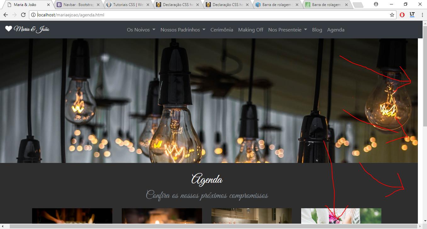
My dear, my site is popping on the sides generating a bottom scroll bar and next to the right edge is a whole white part.
I can’t see where the mistake is.
Here’s a print of what’s going on.
Follow my html and css code now:
/*.topo{
    position: relative;
    top: 0;
    left: 0;
    width: 100%;
    min-height: 450px;
    background-attachment: fixed;
    padding: 0;
}*/
html, body, main{ margin:0; height: 100%;width: 100%;}
header{
    background: url("img/love.jpg") no-repeat center top fixed;
    -webkit-background-size: cover;
    -moz-background-size: cover;
    -o-background-size: cover;
    background-size: cover;
    height: 70%;
}
.logo{
    font-family: 'Great Vibes', cursive;
}
.titulo-section {
    font-family: 'Great Vibes', cursive;
    font-size: 40px;
    text-align: center;
    position: relative;
    top: 30px;
}
.pos-h1{
    position: relative;
    top: 40px;
}
.rodape{
    position: relative;
    top: 0px;
    left: 0;
    width: 100%;
    min-height: 100px;
    background-color: #1f1f1f;
    color: rgb(255, 255, 255);
}
.nossos-momentos, .nossos-padrinhos, .making-off, .blog, .lista-de-presentes, .single{
    position: relative;
    top: 0px;
    left: 0;
    width: 100%;
    min-height: 600px;
    background-color: #ffffff;
    color: rgb(0, 0, 0);
}
.nossa-historia, .dedicatoria, .manual-dos-padrinhos, .cerimonia, .contribua, .agenda, .single-agenda{
    position: relative;
    top: 0px;
    left: 0;
    width: 100%;
    min-height: 600px;
    background-color: #2e2e2e;
    color: rgb(255, 255, 255);
}
.home{
    position: relative;
    top: 0;
    left: 0;
    width: 100%;
    min-height: 140px;
    background-color: #2e2e2e;
    color: rgb(255, 255, 255);
}
.titulo{
    width: 500px;
    height: 150px;
    border-radius: 500px;
    background-color: rgba(46, 46, 46, 0.5);
    color: rgb(255, 255, 255);
    position: absolute;
    box-shadow: 1px 1px 1px #000;
    margin-left: -250px;
    left: 50%;
    margin-top: 445px;
    font-family: 'Great Vibes', cursive;
    text-align: center;
}
<!doctype html>
<html lang="pt-br">
<head>
<title>Maria & João</title>
<!-- Required meta tags -->
<meta charset="utf-8">
<meta name="viewport" content="width=device-width, initial-scale=1, shrink-to-fit=no">
<!-- Bootstrap CSS -->
<link rel="stylesheet" href="https://maxcdn.bootstrapcdn.com/bootstrap/4.0.0-beta.2/css/bootstrap.min.css" integrity="sha384-PsH8R72JQ3SOdhVi3uxftmaW6Vc51MKb0q5P2rRUpPvrszuE4W1povHYgTpBfshb" crossorigin="anonymous">
<link rel="stylesheet" href="css/style.css">
<link href="https://fonts.googleapis.com/css?family=Great+Vibes" rel="stylesheet">
<link rel="stylesheet" href="jpagination/jpagination.min.css">
<link href="lightbox2/src/css/lightbox.css" rel="stylesheet">
</head>
<body>
<main>
<header class="bgParallax" data-speed="15">
<div class="content">
<nav class="navbar fixed-top navbar-expand-lg navbar-dark bg-dark">
<a class="navbar-brand logo" href="index.html"><i class="fas fa-heart"></i> Maria & João</a>
<button class="navbar-toggler" type="button" data-toggle="collapse" data-target="#navbarSupportedContent" aria-controls="navbarSupportedContent" aria-expanded="false" aria-label="Toggle navigation">
<span class="navbar-toggler-icon"></span>
</button>
<div class="collapse navbar-collapse" id="navbarSupportedContent">
<ul class="navbar-nav mx-auto">
<li class="nav-item dropdown">
<a class="nav-link dropdown-toggle" href="#" id="navbarDropdown" role="button" data-toggle="dropdown" aria-haspopup="true" aria-expanded="false">
Os Noivos
</a>
<div class="dropdown-menu" aria-labelledby="navbarDropdown">
<a class="dropdown-item" href="nossa-historia.html">Nossa História</a>
<a class="dropdown-item" href="nossos-momentos.html">Nossos Momentos</a>
<a class="dropdown-item" href="dedicatoria.html">Dedicatória</a>
</div>
</li>
<li class="nav-item dropdown">
<a class="nav-link dropdown-toggle" href="#" id="navbarDropdown" role="button" data-toggle="dropdown" aria-haspopup="true" aria-expanded="false">
Nossos Padrinhos
</a>
<div class="dropdown-menu" aria-labelledby="navbarDropdown">
<a class="dropdown-item" href="nossos-padrinhos.html">Nossos Padrinhos</a>
<a class="dropdown-item" href="manual-dos-padrinhos.html">Manual dos Padrinhos</a>
</div>
</li>
<li class="nav-item">
<a class="nav-link" href="cerimonia.html">Cerimônia</a>
</li>
<li class="nav-item">
<a class="nav-link" href="making-off.html">Making Off</a>
</li>
<li class="nav-item dropdown">
<a class="nav-link dropdown-toggle" href="nos-presentei.html" id="navbarDropdown" role="button" data-toggle="dropdown" aria-haspopup="true" aria-expanded="false">
Nos Presenteie
</a>
<div class="dropdown-menu" aria-labelledby="navbarDropdown">
<a class="dropdown-item" href="lista-de-presentes.html">Lista de Presentes</a>
<a class="dropdown-item" href="contribua.html">Contribua Com A Nossa Caixinha</a>
</div>
</li>
<li class="nav-item">
<a class="nav-link" href="blog.html">Blog</a>
</li>
<li class="nav-item">
<a class="nav-link" href="agenda.html">Agenda</a>
</li>
</ul>
</div>
</nav>
</div>
</header>
<style>
header{
background: url("img/age.jpg") no-repeat center top fixed;
-webkit-background-size: cover;
-moz-background-size: cover;
-o-background-size: cover;
background-size: cover;
}
</style>
<section id="agenda" class="agenda">
<h1 class="titulo-section">
Agenda<br>
<small class="text-muted">Confira os nossos próximos compromissos</small>
</h1>
<div class="container pos-h1">
<div class="row justify-content-center text-center">
<div class="col-6 col-md-3 item">
<a href="single-agenda.html">
<figure class="figure">
<img src="img/a-1.jpg" class="img-fluid" alt="Responsive image">
<figcaption class="figure-caption">
<h4 class="display-4">02/02</h4>
<h3 class="display-4">2018</h3>
<p>Despedida de Solteiro</p>
</figcaption>
</figure>
</a>
</div>
<div class="col-6 col-md-3 item">
<a href="single-agenda.html">
<figure class="figure">
<img src="img/a-2.jpg" class="img-fluid" alt="Responsive image">
<figcaption class="figure-caption">
<h4 class="display-4">02/02</h4>
<h3 class="display-4">2018</h3>
<p>Jantar com os padrinhos</p>
</figcaption>
</figure>
</a>
</div>
<div class="col-6 col-md-3 item">
<a href="single-agenda.html">
<figure class="figure">
<img src="img/a-3.jpg" class="img-fluid" alt="Responsive image">
<figcaption class="figure-caption">
<h4 class="display-4">02/02</h4>
<h3 class="display-4">2018</h3>
<p>Audição dos músicos</p>
</figcaption>
</figure>
</a>
</div>
<div class="col-6 col-md-3 item">
<a href="single-agenda.html">
<figure class="figure">
<img src="img/a-4.jpg" class="img-fluid" alt="Responsive image">
<figcaption class="figure-caption">
<h4 class="display-4">02/02</h4>
<h3 class="display-4">2018</h3>
<p>O Grande dia</p>
</figcaption>
</figure>
</a>
</div>
</div>
</div>
<br>
<div class="row justify-content-center"><ul class = "pagination" id = "pagination"></ul></div>
<br>
</section>
<footer>
<section id="rodape" class="rodape">
<br>
<div class="content">
<div class="row justify-content-center">
<div class="col-8 text-center">
<p>Copyright © 2017 Sites Para Casamentos - Todos os direitos reservados</p>
<p>Contato: 31 99271-6979 | [email protected]</p>
<p>facebook.com/sitesparacasamentos</p>
<p>www.sitesparacasamentos.com.br</p>
</div>
</div>
</div>
</section>
<!-- Optional JavaScript -->
<!-- jQuery first, then Popper.js, then Bootstrap JS -->
<script
src="https://code.jquery.com/jquery-3.2.1.min.js"
integrity="sha256-hwg4gsxgFZhOsEEamdOYGBf13FyQuiTwlAQgxVSNgt4="
crossorigin="anonymous"></script>
<script src="https://cdnjs.cloudflare.com/ajax/libs/popper.js/1.12.3/umd/popper.min.js" integrity="sha384-vFJXuSJphROIrBnz7yo7oB41mKfc8JzQZiCq4NCceLEaO4IHwicKwpJf9c9IpFgh" crossorigin="anonymous"></script>
<script src="https://maxcdn.bootstrapcdn.com/bootstrap/4.0.0-beta.2/js/bootstrap.min.js" integrity="sha384-alpBpkh1PFOepccYVYDB4do5UnbKysX5WZXm3XxPqe5iKTfUKjNkCk9SaVuEZflJ" crossorigin="anonymous"></script>
<script defer src="https://use.fontawesome.com/releases/v5.0.1/js/all.js"></script>
<script src="jpagination/jpagination.js"></script>
<script src="lightbox2/src/js/lightbox.js"></script>
<script>
$('header.bgParallax').each(function(){
var $obj = $(this);
$(window).scroll(function() {
var yPos = -($(window).scrollTop() / $obj.data('speed'));
var bgpos = '50% '+ yPos + 'px';
$obj.css('background-position', bgpos );
});
});
</script>
<script>
jQuery(document).ready(function(){generate('pagination', 4, 8)});
</script>
</footer>
</main>
</body>
</html>I await your help, thank you!
I tested here and the error persists.
– Everton Rodrigues