A column in several rows

Asked

Viewed 262 times

1

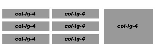
I already searched in documentation and could not get the expected result using bootstrap. The image illustrates better what I want to do

Resultado esperado

<div class="container">
    <div class="col-lg-4">
        <div class="content-section-b">
            <h4 class="cat-heading">@Html.ActionLink("Artigos", "Index", "Artigos")</h4>
            <hr class="section-heading-spacer">
            <div class="clearfix"></div>
                <h4 class="section-heading marginTop-0">@artigo.titulo</h4>
                <p class="lead" style="font-size:14px;">@artigo.descricao</p>
                <small><a href="#">Download Artigo</a></small>
        </div>
    </div>

    <div class="col-lg-4">
        <div class="content-section-b">
            <h4 class="cat-heading">@Html.ActionLink("Videos", "Index", "Videos")</h4>
            <hr class="section-heading-spacer">
            <div class="clearfix"></div>
            <h4 class="section-heading marginTop-0">
                @video.titulo
            </h4>
            <iframe width="300" height="200" src="//www.youtube.com/embed/@video.url" frameborder="0"></iframe>
        </div>
    </div>


    <div class="col-lg-4">
        <div class="content-section-b">
            <div class="list-group">
                <a href="#" class="list-group-item active">
                    Agenda
                </a>
                <div style="height:550px;overflow-y:auto">
                    <a href="#" class="list-group-item"><small>21/02/2015</small> - Dapibus ac facilisis in Dapibus ac facilisis in Dapibus ac facilisis in </a>
                    <a href="#" class="list-group-item"><small>21/02/2015</small> - Morbi leo risus</a>
                    <a href="#" class="list-group-item"><small>21/02/2015</small> - Porta ac consectetur ac</a>
                    <a href="#" class="list-group-item"><small>21/02/2015</small> - Vestibulum at eros</a>
                    <a href="#" class="list-group-item"><small>(21/02/2015)</small> - Dapibus ac facilisis in</a>
                    <a href="#" class="list-group-item"><small>(21/02/2015)</small> - Morbi leo risus</a>
                    <a href="#" class="list-group-item"><small>(21/02/2015)</small> - Porta ac consectetur ac</a>
                    <a href="#" class="list-group-item"><small>(21/02/2015)</small> - Vestibulum at eros</a>
                </div>
            </div>
        </div>

    </div>
</div>

But when trying to add more column it generates a new row.

  • 1

    does that solve your problem? http://www.bootply.com/90zJfgPBSU#

  • Yes. Is the magic in the Xs? Don’t mean that much

  • I will post as an answer and explain how to use the grid

3 answers

3


To get the grid structure use this code

HTML

<div class="row">
  <div class="col-xs-8">
    <div class="row">
      <div class="col-xs-6"> .col-xs-6 </div>
      <div class="col-xs-6"> .col-xs-6 </div>
    </div>
    <div class="row">
      <div class="col-xs-6"> .col-xs-6 </div>
      <div class="col-xs-6"> .col-xs-6 </div>
    </div>
    <div class="row">
      <div class="col-xs-6"> .col-xs-6 </div>
      <div class="col-xs-6"> .col-xs-6 </div>
    </div>
  </div>
  <div class="col-xs-4"></div>
</div>

You can see the result in this DEMO

Each column of the grid has sizes that will go from 1 to 12, that you have already understood, it has 4 types of columns with different behavior in each resolution.

  • col-xs-xx (Keeps the grid for screens below < 768px)
  • col-sm-xx (Keeps the grid for screens above or equal to 768px)
  • col-md-xx (Keeps the grid for screens above or equal to 992px)
  • col-lg-xx (Keeps the grid for screens above or equal to 1200px)

That is, depending on the situation you should pay attention to which of the classes to use, because the screen size can interfere in the grid.

You can read more on Grid Boostrap

2

You have to create a div with width 8 on the left, and a width 4 on the right. There inside the div with width 8 you will create 2 columns with width 6 and 3 rows.

2

There are two columns with 8 and 4 spaces respectively, totaling 12 - the natural maximum for Bootstrap 3.

Inside the first column of 8 spaces, we will have another two with 6, totaling also 12.

But, as it is possible a column of 6 already inside a column of lower value?

R: The column breaking is based on your father’s size, which makes the percentage surface. In this case, it would be 2x of 6 columns, resulting in 12 which is the maximum layered width allowed by the parent/upper entity.

HTML:

<div class="container">
  <div class="col-lg-8">
    <div class="row">
      <div class="col-lg-6">
        <div class="mini-block">
          rock your body
        </div>
      </div>
      <div class="col-lg-6">
        <div class="mini-block">
          rock your body
        </div>
      </div>
    </div>
    <div class="row">
      <div class="col-lg-6">
        <div class="mini-block">
          rock your body
        </div>
      </div>
      <div class="col-lg-6">
        <div class="mini-block">
          rock your body
        </div>
      </div>
    </div>
  </div>
  <div class="col-lg-4">
    <div class="big-block">
        do you like to rock your body?
    </div>
  </div>
</div>

CSS:

.col-lg-6 {
    margin-bottom: 10px;
  }

.mini-block {
    background-color: purple;
    color: #fff; 
  }

.big-block {
    background-color: yellow;
    position: relative;
  }

Demonstration

Browser other questions tagged

You are not signed in. Login or sign up in order to post.