0
I’m making a site for work and I’m not able to separate two li for certain resolution. Below the print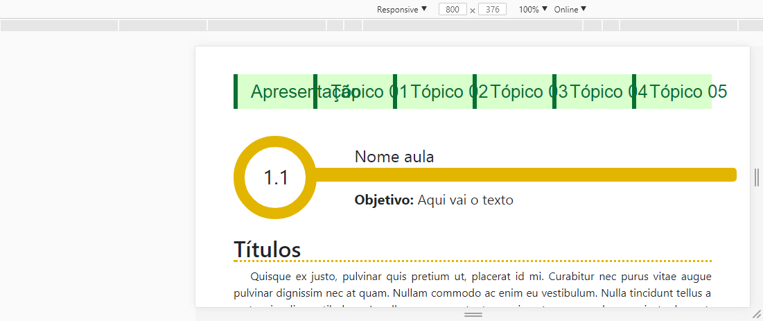
below the menu html
<div class="container">
<div class="row">
<div class="col-md-12">
<img src="../imagens/logos.png" class="img-fluid" alt="logos">
</div>
</div>
<br/>
<div class="d-block d-sm-none">
<nav class="navbar navbar-light bg-light fixed-top navbar-expand-sm float-right">
<div class="container-fluid2">
<button type="button" class="navbar-toggler collapsed" data-toggle="collapse"
data-target="#bs-example-navbar-collapse-1"> <span class="sr-only">Toggle navigation</span>
☰</button>
<img src="../imagens/logos2.png" class="logo-responsive" alt="logos">
<div class="collapse navbar-collapse" id="bs-example-navbar-collapse-1">
<ul class="nav navbar-nav">
<li class="btn-primary nav-item"><a href="index.html" class="nav-link">Apresentação</a>
</li>
<li class="btn-primary nav-item"><a href="topico01.html" class="nav-link">Tópico 1</a>
</li>
<li class="btn-primary nav-item"><a href="topico02.html" class="nav-link">Tópico 2</a>
</li>
<li class="btn-primary nav-item"><a href="topico03.html" class="nav-link">Tópico 3</a>
</li>
<li class="btn-primary nav-item"><a href="topico04.html" class="nav-link">Tópico 4</a>
</li>
<li class="btn-primary nav-item"><a href="topico05.html" class="nav-link">Tópico 5</a>
</li>
</ul>
</div>
</div>
</nav>
</div>
<div class="mobile-hide">
<div class="row">
<div class="col-lg-12">
<nav class="menu">
<ul class="ListaEst list-unstyled">
<li class="col-md-2"> <a href="index.html"> Apresentação</a></li>
<li class="col-md-2"> <a href="topico01.html">Tópico 01</a></li>
<li class="col-md-2"> <a href="topico02.html">Tópico 02</a>
</li>
<li class="col-md-2"> <a href="topico03.html">Tópico 03</a>
</li>
<li class="col-md-2"> <a href="topico04.html">Tópico 04</a>
</li>
<li class="col-md-2"> <a href="topico05.html">Tópico 05</a>
</li>
</ul>
</nav>
</div>
</div>
</div>
AND THE CSS:
    /* Smaller than standard 960 (devices and browsers) */
@media only screen and (max-width: 699px) {

.mobile-hide{ display: none !important; }
    .logo-responsive{display: none !important;}
    .img-responsive{display: none !important;}
    .textoaula{position: relative; bottom: 10px;
    }
    .nomeaula{width:70%;height:20px; position: relative; bottom: 20px;}
     .rodapeaut{position: relative;bottom:13px;}
     .rodapecopy{position: relative;top:20px;}
     .aspas2{display: inline !important; right: 20px;}
         .ListaEst li > a { position: relative; right:15px; }

}

/* Tablet Portrait size to standard 960 (devices and browsers) */
@media only screen and (min-width: 768px) and (max-width: 959px) {
.nomeaula{width:90%;height:20px; position: relative; bottom: 10px;}
      .logo-responsive{display: none !important;}
      .menu li{white-space: nowrap;}
        .ListaEst li{display: block !important;}


}

/* All Mobile Sizes (devices and browser) */
@media only screen and (max-width: 767px) {
.nomeaula{width:90%;height:20px; position: relative; bottom: 10px;}
      .logo-responsive{display: none !important;}
      .menu li{white-space: nowrap;}
    .blockquote-reverse{position: relative; left:5px;}
    .alert-citacao{width: 102%;}
}

/* Mobile Landscape Size to Tablet Portrait (devices and browsers) */
@media only screen and (min-width: 480px) and (max-width: 767px) {
  .mobile-hide{ display: none !important; }
    .logo-responsive{display: none !important;}
}


/* Mobile Portrait Size to Mobile Landscape Size (devices and browsers) */
   @media only screen and (max-width: 669px) {
    .mobile{ display: inline !important; }
    .logo-responsive{display: inline!important;}

    .img-responsive{
      display: inline !important;
    }
       .nomeaula{width:70%;height:20px;}
          .rodapeaut{position: relative;bottom:11px;}


}

    @media only screen and (min-width: 700px) {
    .desktop-hide{ display: none !important; }
    .img-responsive{display: none!important;}
    .nomeaula{width:90%;height:20px;}
      .rodapecopy{display: inline !important;}

      .ListaEst li > a {position: relative; left:5px;}


    }
Mark even with the change I continued with the same error. Below follows the link I hosted for you to visualize q occurs the error. http://joaomateuscosta.22web.org/Amarelo/Aula00/index.html?i=1
– mateusCosta