How do I show information from a particular location, viewing in responsive mode, on mobile?

Asked

Viewed 60 times

-1

I added the iframe from a certain place on my site, but location information, and suggested routes, do not appear when viewed in mobile mode, seeing on mobile.

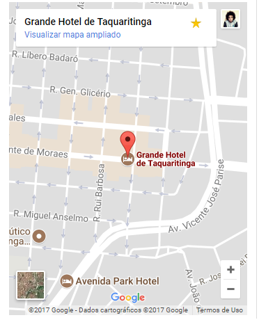
Here’s the way it appears on the phone:

Printscreen com um ponto no mapa

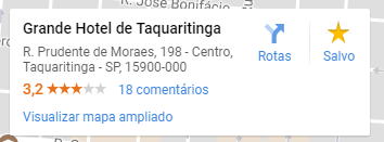
Here’s the way I want it to appear when viewed on mobile:

printscreen com um card informativo

The settings on style of the map not those:

<style>
.embed-container { 
   position: relative;
   padding-bottom: 56.25%; 
   height: 0; 
   overflow: hidden; 
   max-width: 100%;
} 

.embed-container iframe, 
.embed-container object, 
.embed-container embed {
   position: absolute;
   top: 0; left: 0; 
   width: 100%; 
   height: 500px;
}
</style>

iframe:

<iframe 
    src="https://www.google.com/maps/embed?pb=!1m18!1m12!1m3!1d3714.5088877509456!2d-48.50192088548785!3d-21.40923378579348!2m3!1f0!2f0!3f0!3m2!1i1024!2i768!4f13.1!3m3!1m2!1s0x94b93967f68b2d9f%3A0x4fd97015c3d8cff5!2sGrande+Hotel+de+Taquaritinga!5e0!3m2!1spt-BR!2sbr!4v1512313658033" 
    width="100%" 
    height="450" 
    frameborder="0" style="border:0" allowfullscreen>
</iframe>

2 answers

0

There’s no way to change that, it’s part of the iframe of Google Maps.

The map will only display complete information if the width it occupies is equal to or greater than 400 pixels. Soon, this is not directly connected to the device being cellular or not.

Open on an iPhone 4 in position landscape (480x320 pixels) that information will appear complete. Now, rotate to the position portrait (320x480 pixels), only the name of the location will appear.

  • Thank you so much for clarifying this friend, I really did the test in landscape mode and the information even appeared.

  • @Johnnyrodrigues If you found the answer helpful, make sure to dial ✔

0

Come on try the following:

in css

.container-map{
  position: relative;
  padding-bottom: 56.25%; 
  height: 0; 
  overflow: hidden; 
  max-width: 100%;
}

now in html put the iframe inside the div .container-map and change the width to auto instead of 100% so:

<iframe 
src="https://www.google.com/maps/embed?pb=!1m18!1m12!1m3!1d3714.5088877509456!2d-48.50192088548785!3d-21.40923378579348!2m3!1f0!2f0!3f0!3m2!1i1024!2i768!4f13.1!3m3!1m2!1s0x94b93967f68b2d9f%3A0x4fd97015c3d8cff5!2sGrande+Hotel+de+Taquaritinga!5e0!3m2!1spt-BR!2sbr!4v1512313658033" 
width="auto" 
height="450" 
frameborder="0" style="border:0" allowfullscreen>

and see if solved! hug!!

  • It didn’t work, man, I tried but the information doesn’t show up anyway!

Browser other questions tagged

You are not signed in. Login or sign up in order to post.