<select> not working properly

Asked

Viewed 74 times

2

I am facing a problem, which I did not find enough clear tutorials on the internet so I could learn how to solve, which apparently seems to be simple but I am not able to solve. The problem is to make the <select> go down only when you click on it. However, when I click on 1, the 3 go down:select dropdown

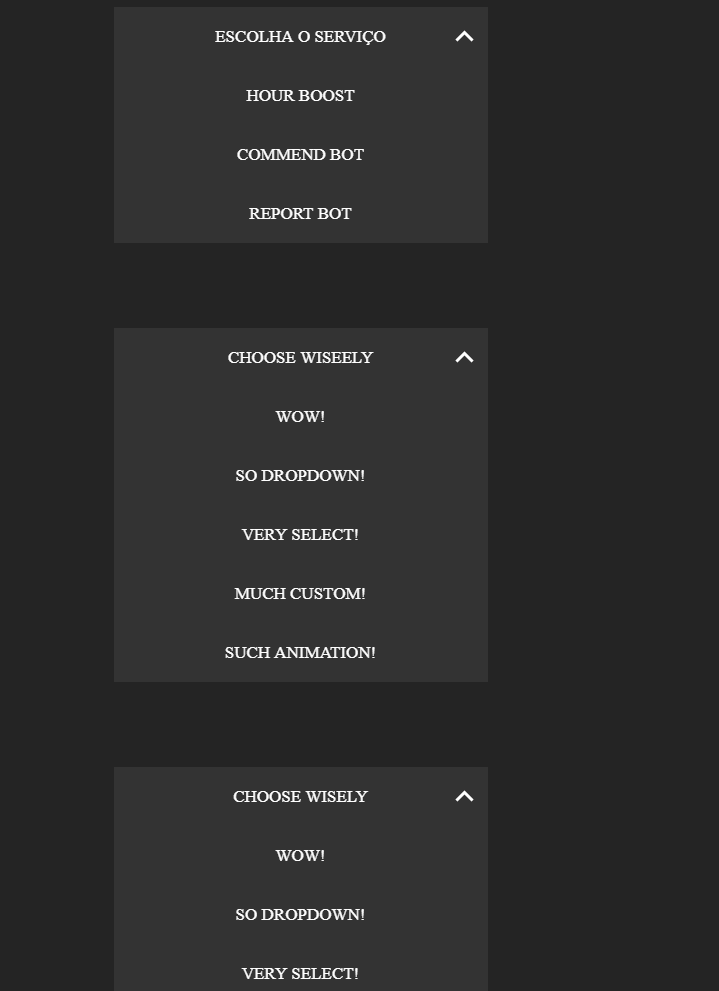
As in the code below, I tried to change the class for drop1,drop2. I also changed in . css and . Js, but I’m sure I did something wrong, I just don’t know where.

Style.css:

body {
  background: #35414a;
}

.drop {
  width: 20em;
  margin: 5em auto;
  font-family: pfs-bold;
  color: #86919a;
  text-transform: uppercase;
  position: relative;
  -webkit-transition: width 0.5s;
  transition: width 0.5s;
  will-change: width;
}
.drop .option {
  padding: 1em;
  cursor: pointer;
  background-color: #333333;
}
.drop .option:not(.active) {
  display: none;
  opacity: 0;
  -webkit-transform: translateY(-50%);
          transform: translateY(-50%);
}
.drop.visible {
  -webkit-animation: bounce 1s;
          animation: bounce 1s;
  width: 24em;
}
.drop.visible:before, .drop.visible:after {
  border-color: #fff;
}
.drop.visible:before {
  opacity: 0;
}
.drop.visible:after {
  opacity: 1;
}
.drop.visible .option {
  color: #fff;
  display: block;
}
.drop.opacity .option {
  -webkit-transform: translateZ(0);
          transform: translateZ(0);
  opacity: 1;
}
.drop.opacity .option:nth-child(0) {
  -webkit-transition: opacity 0.5s 0s, -webkit-transform 0.5s 0s;
  transition: opacity 0.5s 0s, -webkit-transform 0.5s 0s;
  transition: opacity 0.5s 0s, transform 0.5s 0s;
  transition: opacity 0.5s 0s, transform 0.5s 0s, -webkit-transform 0.5s 0s;
}
.drop.opacity .option:nth-child(1) {
  -webkit-transition: opacity 0.5s 0.1s, -webkit-transform 0.5s 0.1s;
  transition: opacity 0.5s 0.1s, -webkit-transform 0.5s 0.1s;
  transition: opacity 0.5s 0.1s, transform 0.5s 0.1s;
  transition: opacity 0.5s 0.1s, transform 0.5s 0.1s, -webkit-transform 0.5s 0.1s;
}
.drop.opacity .option:nth-child(2) {
  -webkit-transition: opacity 0.5s 0.2s, -webkit-transform 0.5s 0.2s;
  transition: opacity 0.5s 0.2s, -webkit-transform 0.5s 0.2s;
  transition: opacity 0.5s 0.2s, transform 0.5s 0.2s;
  transition: opacity 0.5s 0.2s, transform 0.5s 0.2s, -webkit-transform 0.5s 0.2s;
}
.drop.opacity .option:nth-child(3) {
  -webkit-transition: opacity 0.5s 0.3s, -webkit-transform 0.5s 0.3s;
  transition: opacity 0.5s 0.3s, -webkit-transform 0.5s 0.3s;
  transition: opacity 0.5s 0.3s, transform 0.5s 0.3s;
  transition: opacity 0.5s 0.3s, transform 0.5s 0.3s, -webkit-transform 0.5s 0.3s;
}
.drop.opacity .option:nth-child(4) {
  -webkit-transition: opacity 0.5s 0.4s, -webkit-transform 0.5s 0.4s;
  transition: opacity 0.5s 0.4s, -webkit-transform 0.5s 0.4s;
  transition: opacity 0.5s 0.4s, transform 0.5s 0.4s;
  transition: opacity 0.5s 0.4s, transform 0.5s 0.4s, -webkit-transform 0.5s 0.4s;
}
.drop.opacity .option:nth-child(5) {
  -webkit-transition: opacity 0.5s 0.5s, -webkit-transform 0.5s 0.5s;
  transition: opacity 0.5s 0.5s, -webkit-transform 0.5s 0.5s;
  transition: opacity 0.5s 0.5s, transform 0.5s 0.5s;
  transition: opacity 0.5s 0.5s, transform 0.5s 0.5s, -webkit-transform 0.5s 0.5s;
}
.drop.opacity .option:nth-child(6) {
  -webkit-transition: opacity 0.5s 0.6s, -webkit-transform 0.5s 0.6s;
  transition: opacity 0.5s 0.6s, -webkit-transform 0.5s 0.6s;
  transition: opacity 0.5s 0.6s, transform 0.5s 0.6s;
  transition: opacity 0.5s 0.6s, transform 0.5s 0.6s, -webkit-transform 0.5s 0.6s;
}
.drop.opacity .option:nth-child(7) {
  -webkit-transition: opacity 0.5s 0.7s, -webkit-transform 0.5s 0.7s;
  transition: opacity 0.5s 0.7s, -webkit-transform 0.5s 0.7s;
  transition: opacity 0.5s 0.7s, transform 0.5s 0.7s;
  transition: opacity 0.5s 0.7s, transform 0.5s 0.7s, -webkit-transform 0.5s 0.7s;
}
.drop.opacity .option:nth-child(8) {
  -webkit-transition: opacity 0.5s 0.8s, -webkit-transform 0.5s 0.8s;
  transition: opacity 0.5s 0.8s, -webkit-transform 0.5s 0.8s;
  transition: opacity 0.5s 0.8s, transform 0.5s 0.8s;
  transition: opacity 0.5s 0.8s, transform 0.5s 0.8s, -webkit-transform 0.5s 0.8s;
}
.drop.opacity .option:nth-child(9) {
  -webkit-transition: opacity 0.5s 0.9s, -webkit-transform 0.5s 0.9s;
  transition: opacity 0.5s 0.9s, -webkit-transform 0.5s 0.9s;
  transition: opacity 0.5s 0.9s, transform 0.5s 0.9s;
  transition: opacity 0.5s 0.9s, transform 0.5s 0.9s, -webkit-transform 0.5s 0.9s;
}
.drop.withBG .option {
  -webkit-transition: background-color 0.1s;
  transition: background-color 0.1s;
}
.drop.withBG .option:not(.placeholder):hover {
  background-color: #5aafee;
}
.drop.withBG .option:not(.placeholder).active {
  background-color: #5aafee;
}
.drop:after, .drop:before {
  content: "";
  position: absolute;
  top: 1.5em;
  right: 1em;
  width: 0.75em;
  height: 0.75em;
  border: 0.2em solid #86919a;
  -webkit-transform: rotate(45deg);
          transform: rotate(45deg);
  -webkit-transform-origin: 50% 50%;
          transform-origin: 50% 50%;
  -webkit-transition: opacity 0.2s;
  transition: opacity 0.2s;
}
.drop:before {
  border-left: none;
  border-top: none;
  top: 1.2em;
}
.drop:after {
  border-right: none;
  border-bottom: none;
  opacity: 0;
}

.mini-hack {
  opacity: 0;
  -webkit-transform: translateY(-50%);
          transform: translateY(-50%);
}

script js.

$(document).ready(function() {
  $(".drop .option").click(function() {
    var val = $(this).attr("data-value"),
        $drop = $(".drop"),
        prevActive = $(".drop .option.active").attr("data-value"),
        options = $(".drop .option").length;
    $drop.find(".option.active").addClass("mini-hack");
    $drop.toggleClass("visible");
    $drop.removeClass("withBG");
    $(this).css("top");
    $drop.toggleClass("opacity");
    $(".mini-hack").removeClass("mini-hack");
    if ($drop.hasClass("visible")) {
      setTimeout(function() {
        $drop.addClass("withBG");
      }, 400 + options*100); 
    }
    triggerAnimation();
    if (val !== "placeholder" || prevActive === "placeholder") {
      $(".drop .option").removeClass("active");
      $(this).addClass("active");
    };
  });

  function triggerAnimation() {
    var finalWidth = $(".drop").hasClass("visible") ? 22 : 20;
    $(".drop").css("width", "24em");
    setTimeout(function() {
      $(".drop").css("width", finalWidth + "em");
    }, 400);
  }
});

index.html

<div class="drop">
  <div class="option active placeholder" data-value="placeholder">
    Escolha o Serviço
  </div>
  <div class="option" data-value="wow">
    Hour Boost
  </div>
  <div class="option" data-value="drop">
    Commend Bot
  </div>
  <div class="option" data-value="select">
    Report Bot
  </div>
</div>
                    <div class="drop1">
  <div class="option active placeholder" data-value="placeholder">
    Choose wiseely
  </div>
  <div class="option" data-value="wow">
    Wow!
  </div>
  <div class="option" data-value="drop">
    So dropdown!
  </div>
  <div class="option" data-value="select">
    Very select!
  </div>
  <div class="option" data-value="custom">
    Much custom!
  </div>
  <div class="option" data-value="animation"> 
    Such animation!
  </div>
</div>
                    <div class="drop2">
  <div class="option active placeholder" data-value="placeholder">
    Choose wisely
  </div>
  <div class="option" data-value="wow">
    Wow!
  </div>
  <div class="option" data-value="drop">
    So dropdown!
  </div>
  <div class="option" data-value="select">
    Very select!
  </div>
  <div class="option" data-value="custom">
    Much custom!
  </div>
  <div class="option" data-value="animation"> 
    Such animation!
  </div>
</div>

Here is an example from Fiddle

  • Test to change variable $drop = $(".drop") for $drop = $(this) within its function of click.

  • @Andregusmao $drop = $(this).click(function() { still non-functional, including bugou html http://prntscr.com/hhdt97

  • You changed in the wrong place. It would be here: $(".drop .option").click(function() { var val = $(this).attr("data-value"), $drop = $(this); ...

  • It does not lack a function of click in the $(".drop")? Just click on the drop option $(".drop .option"). Page already loads with Drops appearing?

  • No, they only go down after they’re clicked.

  • See my third comment.

  • @Andregusmao I made this change, but not one of the 3 selects descend. It is incredible the complexity of something so beast

  • Put it on Stack snippet or jsfiddle to make it easier to test

  • @Guilhermenascimento I added the Fiddle link at the bottom of the question.

  • The problem seems to be in the triggerAnimation();, he’s shooting at everyone

Show 5 more comments

1 answer

2


You can open each menu by picking the index of what was clicked, but leave all menus with the class drop same (and not drop1, drop 2...):

 mIdx = $(this).closest('.drop').index('.drop');

I also changed the references to .drop creating a single variable $drop for the entire function, in addition to sending this variable to the function triggerAnimation() which will animate the menu.

See working:

$(document).ready(function() {
  $(".drop .option").click(function() {
    mIdx = $(this).closest('.drop').index('.drop');
    var val = $(this).attr("data-value"),
    $drop = $(".drop:eq("+mIdx+")"),
    prevActive = $drop.find(".option.active").attr("data-value"),
    options = $drop.find(".option").length;
    $drop.find(".option.active").addClass("mini-hack");
    $drop.toggleClass("visible");
    $drop.removeClass("withBG");
    $(this).css("top");
    $drop.toggleClass("opacity");
    $(".mini-hack").removeClass("mini-hack");
    if ($drop.hasClass("visible")) {
      setTimeout(function() {
        $drop.addClass("withBG");
      }, 400 + options*100); 
    }
    triggerAnimation($drop);
    if (val !== "placeholder" || prevActive === "placeholder") {
      $drop.find(".option").removeClass("active");
      $(this).addClass("active");
    };
  });

  function triggerAnimation($drop) {
    var finalWidth = $drop.hasClass("visible") ? 22 : 20;
    $drop.css("width", "24em");
    setTimeout(function() {
      $drop.css("width", finalWidth + "em");
    }, 400);
  }
});
@font-face {
font-family: 'Raleway', sans-serif;
}
body {
  background: #35414a;
}

.drop {
  width: 20em;
  margin: 5em auto;
  font-family: pfs-bold;
  color: #86919a;
  text-transform: uppercase;
  position: relative;
  -webkit-transition: width 0.5s;
  transition: width 0.5s;
  will-change: width;
}
.drop .option {
  padding: 1em;
  cursor: pointer;
  background-color: #333333;
}
.drop .option:not(.active) {
  display: none;
  opacity: 0;
  -webkit-transform: translateY(-50%);
          transform: translateY(-50%);
}
.drop.visible {
  -webkit-animation: bounce 1s;
          animation: bounce 1s;
  width: 24em;
}
.drop.visible:before, .drop.visible:after {
  border-color: #fff;
}
.drop.visible:before {
  opacity: 0;
}
.drop.visible:after {
  opacity: 1;
}
.drop.visible .option {
  color: #fff;
  display: block;
}
.drop.opacity .option {
  -webkit-transform: translateZ(0);
          transform: translateZ(0);
  opacity: 1;
}
.drop.opacity .option:nth-child(0) {
  -webkit-transition: opacity 0.5s 0s, -webkit-transform 0.5s 0s;
  transition: opacity 0.5s 0s, -webkit-transform 0.5s 0s;
  transition: opacity 0.5s 0s, transform 0.5s 0s;
  transition: opacity 0.5s 0s, transform 0.5s 0s, -webkit-transform 0.5s 0s;
}
.drop.opacity .option:nth-child(1) {
  -webkit-transition: opacity 0.5s 0.1s, -webkit-transform 0.5s 0.1s;
  transition: opacity 0.5s 0.1s, -webkit-transform 0.5s 0.1s;
  transition: opacity 0.5s 0.1s, transform 0.5s 0.1s;
  transition: opacity 0.5s 0.1s, transform 0.5s 0.1s, -webkit-transform 0.5s 0.1s;
}
.drop.opacity .option:nth-child(2) {
  -webkit-transition: opacity 0.5s 0.2s, -webkit-transform 0.5s 0.2s;
  transition: opacity 0.5s 0.2s, -webkit-transform 0.5s 0.2s;
  transition: opacity 0.5s 0.2s, transform 0.5s 0.2s;
  transition: opacity 0.5s 0.2s, transform 0.5s 0.2s, -webkit-transform 0.5s 0.2s;
}
.drop.opacity .option:nth-child(3) {
  -webkit-transition: opacity 0.5s 0.3s, -webkit-transform 0.5s 0.3s;
  transition: opacity 0.5s 0.3s, -webkit-transform 0.5s 0.3s;
  transition: opacity 0.5s 0.3s, transform 0.5s 0.3s;
  transition: opacity 0.5s 0.3s, transform 0.5s 0.3s, -webkit-transform 0.5s 0.3s;
}
.drop.opacity .option:nth-child(4) {
  -webkit-transition: opacity 0.5s 0.4s, -webkit-transform 0.5s 0.4s;
  transition: opacity 0.5s 0.4s, -webkit-transform 0.5s 0.4s;
  transition: opacity 0.5s 0.4s, transform 0.5s 0.4s;
  transition: opacity 0.5s 0.4s, transform 0.5s 0.4s, -webkit-transform 0.5s 0.4s;
}
.drop.opacity .option:nth-child(5) {
  -webkit-transition: opacity 0.5s 0.5s, -webkit-transform 0.5s 0.5s;
  transition: opacity 0.5s 0.5s, -webkit-transform 0.5s 0.5s;
  transition: opacity 0.5s 0.5s, transform 0.5s 0.5s;
  transition: opacity 0.5s 0.5s, transform 0.5s 0.5s, -webkit-transform 0.5s 0.5s;
}
.drop.opacity .option:nth-child(6) {
  -webkit-transition: opacity 0.5s 0.6s, -webkit-transform 0.5s 0.6s;
  transition: opacity 0.5s 0.6s, -webkit-transform 0.5s 0.6s;
  transition: opacity 0.5s 0.6s, transform 0.5s 0.6s;
  transition: opacity 0.5s 0.6s, transform 0.5s 0.6s, -webkit-transform 0.5s 0.6s;
}
.drop.opacity .option:nth-child(7) {
  -webkit-transition: opacity 0.5s 0.7s, -webkit-transform 0.5s 0.7s;
  transition: opacity 0.5s 0.7s, -webkit-transform 0.5s 0.7s;
  transition: opacity 0.5s 0.7s, transform 0.5s 0.7s;
  transition: opacity 0.5s 0.7s, transform 0.5s 0.7s, -webkit-transform 0.5s 0.7s;
}
.drop.opacity .option:nth-child(8) {
  -webkit-transition: opacity 0.5s 0.8s, -webkit-transform 0.5s 0.8s;
  transition: opacity 0.5s 0.8s, -webkit-transform 0.5s 0.8s;
  transition: opacity 0.5s 0.8s, transform 0.5s 0.8s;
  transition: opacity 0.5s 0.8s, transform 0.5s 0.8s, -webkit-transform 0.5s 0.8s;
}
.drop.opacity .option:nth-child(9) {
  -webkit-transition: opacity 0.5s 0.9s, -webkit-transform 0.5s 0.9s;
  transition: opacity 0.5s 0.9s, -webkit-transform 0.5s 0.9s;
  transition: opacity 0.5s 0.9s, transform 0.5s 0.9s;
  transition: opacity 0.5s 0.9s, transform 0.5s 0.9s, -webkit-transform 0.5s 0.9s;
}
.drop .option {
  -webkit-transition: background-color 0.1s;
  transition: background-color 0.1s;
}
.drop .option:not(.placeholder):hover {
  background-color: #5aafee;
}
.drop .option:not(.placeholder).active {
  background-color: #5aafee;
  color: #fff;
}
.drop:after, .drop:before {
  content: "";
  position: absolute;
  top: 1.5em;
  right: 1em;
  width: 0.75em;
  height: 0.75em;
  border: 0.2em solid #86919a;
  -webkit-transform: rotate(45deg);
          transform: rotate(45deg);
  -webkit-transform-origin: 50% 50%;
          transform-origin: 50% 50%;
  -webkit-transition: opacity 0.2s;
  transition: opacity 0.2s;
}
.drop:before {
  border-left: none;
  border-top: none;
  top: 1.2em;
}
.drop:after {
  border-right: none;
  border-bottom: none;
  opacity: 0;
}

.mini-hack {
  opacity: 0;
  -webkit-transform: translateY(-50%);
          transform: translateY(-50%);
}
<script src="https://ajax.googleapis.com/ajax/libs/jquery/2.1.1/jquery.min.js"></script>
<link rel="stylesheet" href="https://cdnjs.cloudflare.com/ajax/libs/bootstrap-select/1.12.4/css/bootstrap-select.min.css">
    <script src="https://cdnjs.cloudflare.com/ajax/libs/bootstrap-select/1.12.4/js/bootstrap-select.min.js"></script>
    <script src="https://cdnjs.cloudflare.com/ajax/libs/bootstrap-select/1.12.4/js/i18n/defaults-*.min.js"></script>
    <link href="https://fonts.googleapis.com/css?family=Raleway" rel="stylesheet">
 
                <center><h4 style="color: white">Escolha o plano</h4>
<div class="drop">
  <div class="option active placeholder" data-value="placeholder">
    Escolha o Serviço
  </div>
  <div class="option" data-value="wow">
    Hour Boost
  </div>
  <div class="option" data-value="drop">
    Commend Bot
  </div>
  <div class="option" data-value="select">
    Report Bot
  </div>
</div>
                    <div class="drop">
  <div class="option active placeholder" data-value="placeholder">
    Choose wiseely
  </div>
  <div class="option" data-value="wow">
    Wow!
  </div>
  <div class="option" data-value="drop">
    So dropdown!
  </div>
  <div class="option" data-value="select">
    Very select!
  </div>
  <div class="option" data-value="custom">
    Much custom!
  </div>
  <div class="option" data-value="animation"> 
    Such animation!
  </div>
</div>
                    <div class="drop">
  <div class="option active placeholder" data-value="placeholder">
    Choose wisely
  </div>
  <div class="option" data-value="wow">
    Wow!
  </div>
  <div class="option" data-value="drop">
    So dropdown!
  </div>
  <div class="option" data-value="select">
    Very select!
  </div>
  <div class="option" data-value="custom">
    Much custom!
  </div>
  <div class="option" data-value="animation"> 
    Such animation!
  </div>
</div>
                </center>

  • I copied the Fiddle code exactly, but it still doesn’t work. I click on a select and scroll down. And when I click again, it Buga/some I’m starting to get pistol with it

  • I added my fiddle code at the bottom of the question. If you add your answer to the code you will see exactly what is happening.

  • I was thinking that was my browser kk I’ll wait.

  • Thank you very much, it worked perfectly.

  • Another bug that is occurring is the :focus it does not mark the option correctly, in the fiddle itself that you made can realize this. Pass the mouse between the select options and you will see

  • That’s right, in some options it doesn’t turn blue. even tried .drop:focus{ color: red;} to test, but it was not

  • 1

    @Lucasrodrigues The problem was in CSS that I already fixed in the answer. It had a reference .drop.withBG where that .withBG does not exist, just delete it. And still put a color: #fff; pro text turn white.

  • In case I want to change the color of focus, which element(I don’t know if it’s the right name) I would have to change?

  • Excuse me, I just saw here .drop .option:not(.placeholder):hover {background-color: #5aafee; again, thank you so much.

Show 4 more comments

Browser other questions tagged

You are not signed in. Login or sign up in order to post.