0
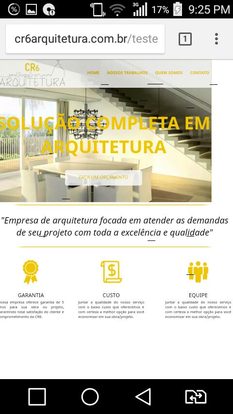
You guys, good night. I am early trying to set up my website. It is working perfectly in the desktop version and in the mobile version it creates a blank part. I’ve tried EVERYTHING to solve and I can’t.
html, body {
font-family: 'Noto Sans', sans-serif;
margin: 0 auto;
padding: 0 auto;
}

#background {
background: url (img/main) no-repeat;
height:650px;
background: url(img/main.jpg) no-repeat;
background-color:#efc500;
background-position: center center;
background-attachment: fixed;
background-size: cover;
-webkit-background-size: cover;
-moz-background-size: cover;
-ms-background-size: cover;
-o-background-size: cover;
}

#bar {
height:130px;
background-color:white;
opacity: 0.8;
filter: alpha(opacity=80%);
}

img.logotopo {float:left; margin-left:10px;}

#menu ul {
margin:0px auto;
margin-top:50px;
list-style:none;
float: right;
margin-right:10px;
}

#menu ul li { display: inline; }

#menu ul li a {
font-size:18px;
color:#efc500;
font-weight:bold;
margin-left: 30px;
   text-decoration: none;
}

#menu ul li a:hover {border-bottom:6px solid #efc500;}

h1.textomain {
font-size: 5.0em;
color:#efc500;
margin-left:auto;
margin-right:auto;
text-align:center;
position:relative;
top:50px;
}

#botao {
margin-left:auto;
margin-right:auto;
text-align:center;
width:350px;
height:70px;
display:block;
position:relative;
top:50px;
text-align:center;
margin-bottom:30px;
background-color:#FFFFFF;
border-radius: 10px;
-moz-border-radius: 10px;
-webkit-border-radius: 10px;
opacity: 0.8;
filter: alpha(opacity=80%);
}

a.botao {
color:#efc500;
margin-left: auto;
margin-right: auto;
text-align:center;
position:relative;
top:18px;
font-size:1.3em;
text-decoration:none;
}

#botao:hover {
background-color:#FFFFFF;
opacity: 1;
filter: alpha(opacity=100%);
}

#mae {
width: 1050px;
margin: 0 auto;
padding: 0 auto;
}

img.linha {
margin-left:auto;
margin-right:auto;
margin-top:50px;
position:relative;
display:block;
}

img.linha2 {
margin-left:auto;
margin-right:auto;
margin-bottom:48px;
position:relative;
display:block;
}

h2.textomiddle {
font-size:2.5em;
color:#000000;
font-weight:normal;
font-style:italic;
text-align:center;
}

#dif1 {
width: 300px;
height: 300px;
float:left;
margin-left:10px;
display:block;
}

#dif2 {
width: 300px;
height: 300px;
float:left;
margin-left:65px;
}

#dif3 {
width: 300px;
height: 300px;
float:right;
margin-right:10px;
}

h3.meio {text-align:center; font-weight:normal; font-size:1.5em;}
p.meio {text-align:justify; position:relative; bottom:20px;]
<!DOCTYPE html>
<html lang="pt-BR">
<head>
<meta charset="utf-8" />
<meta http-equiv="Content-Type" content="text/html; charset=UTF-8"/>
<meta http-equiv="X-UA-Compatible" content="IE=Edge;chrome=1">
<meta http-equiv="X-UA-Compatible" content="IE=9"/>
<meta name="language" content="PT-BR">
<meta name="author" content="Douglas Mion">
<meta name="robots" content="index,follow,all">
<meta name="keywords" content="Arquitetura, projetos, obras, paisagismo, arquitetos, arquiteto">
<link id="favicon" rel="shortcut icon" href="/img/favicon/1x/favicon.png" type="image/png" />
<link rel="stylesheet" id="style" href="style2.css">
<link href="https://fonts.googleapis.com/css?family=Noto+Sans:400,400i,700" rel="stylesheet">
<title>CR6 ARQUITETURA</title>
</head>
<div id="background">
<div id="bar">
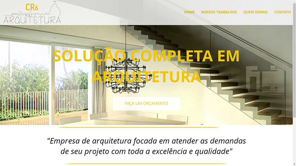
<img class="logotopo" src="img/cr6logo.png">
<nav id="menu">
<ul>
<li><a href="index.html">HOME</a></li>
<li><a href="trabalhos.html">NOSSOS TRABALHOS</a></li>
<li><a href="quem.html">QUEM SOMOS</a></li>
<li><a href="contato.html">CONTATO</a></li>
</ul>
</nav>
</div>
<h1 class="textomain">SOLUÇÃO COMPLETA EM ARQUITETURA</h1>
<div id="botao">
<a class="botao"href="contato.html">FAÇA UM ORÇAMENTO</a>
</div>
</div>
<div id="mae">
<img class="linha1" src="img/line.png">
<h2 class="textomiddle">"Empresa de arquitetura focada em atender as demandas de seu projeto com toda a excelência e qualidade"</h2>
<img class="linha2" src="img/line.png">
<div id="dif1">
<center><img class="meio" src="img/garantia-icon.png"></center>
<h3 class="meio">GARANTIA</h3>
<p class="meio">Nossa empresa oferece garantia de 5 anos para sua obra ou projeto, garantindo total satisfação do cliente e comprometimento da CR6.</p>
</div>
<div id="dif2">
<center><img class="meio" src="img/price-icon.png"></center>
<h3 class="meio">CUSTO</h3>
<p class="meio">Juntar a qualidade do nosso serviço com o baixo custo que oferecemos é com certeza a melhor opção para você economizar em sua obra/projeto.</p>
</div>
<div id="dif3">
<center><img class="meio" src="img/equipe-icon.png"></center>
<h3 class="meio">EQUIPE</h3>
<p class="meio">Juntar a qualidade do nosso serviço com o baixo custo que oferecemos é com certeza a melhor opção para você economizar em sua obra/projeto.</p>
</div>
</div>
On which device did you test? I saw here by Chrome emulator and worked right the layout
– fernandoandrade
@fernandoandrade tested on more than 3 different cell phones and the white bar on the right continues. This is the site: www.cr6arquitetura.com.br
– Douglas Mion
Oops, on the site gets really, had copy your code, I’ll see here so if I can help you ...
– fernandoandrade
Thank you my friend! I’m two days trying to solve this problem and I’m killing myself to solve haha
– Douglas Mion
The problem is that you set for some elements
width: 1050px;and to the#bgmainnot with this, it keeps picking up the size of the device while (width: 100%) while the other elements are with forced size. The best would be to putwidth: autofor small screen with a media query– fernandoandrade
@fernandoandrade there is no bgmain there.. but I think I understand you.. Can you tell me how I do this with media query? I don’t know how to work with responsive design.
– Douglas Mion
I put an example in the answer,
bgmainis the first div after<body>– fernandoandrade
I gave you the wrong website, which I’m no longer working on. I am working more, the site I am working on is: www.cr6arquitetura.com.br/teste.html
– Douglas Mion
Anyway I didn’t understand in which place I have to put the width: auto.
– Douglas Mion
Could you check this new website I sent you? @fernandoandrade
– Douglas Mion
I updated the @Dougasmion response. Now it’s up to you to adjust the middle and footer text blocks.
– fernandoandrade
@Thank you very much, man, I’ll test it here and I’ll tell you if it worked out. one last thing, these commands I replace with the existing ones, correct?
– Douglas Mion
can add at the end of the file
style2.csseven.– fernandoandrade
Just copy and paste that you sent me and put it at the end of the file?
– Douglas Mion
Yes, add at the end of the file.
– fernandoandrade
@fernandoandrade worked in parts buddy, now the little part where is the "team" is going down and leaving a huge white part on the page.
– Douglas Mion
Those there you will have to adjust the size, try to put in
%for example,width: 33.33%how are 3 blocks.– fernandoandrade