Block positioning with FLEX-BOX

Asked

Viewed 638 times

1

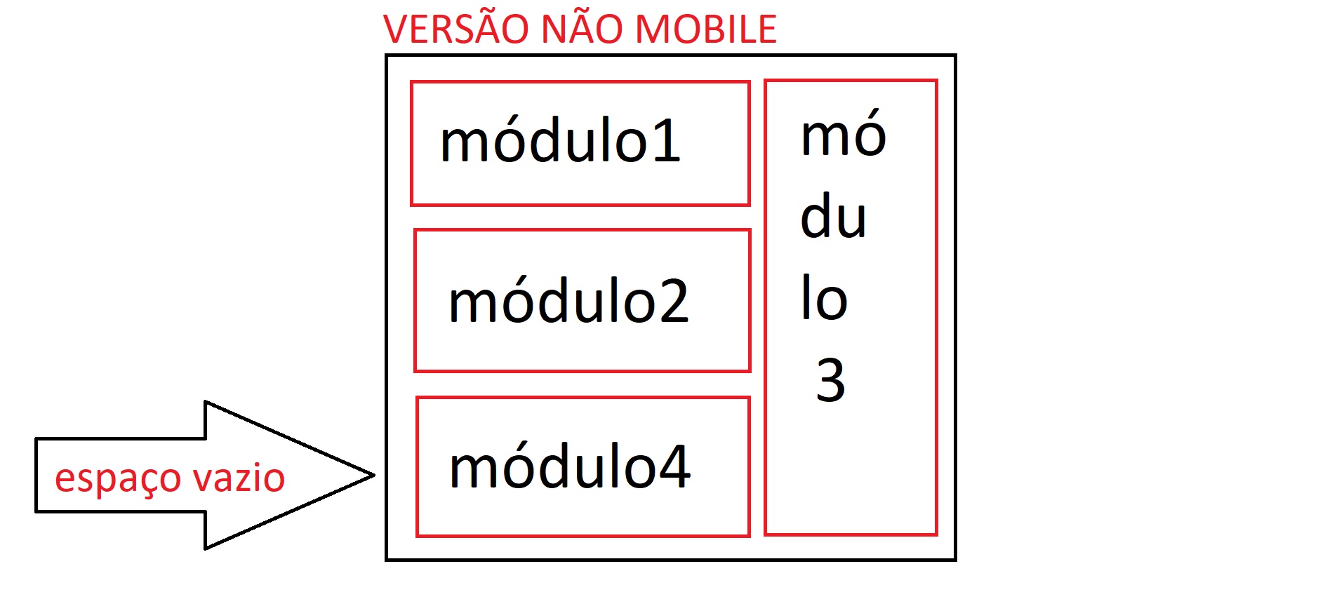
Well, I’m doing a site where in the home there are 4 modules, the first two have to be under each other, so far so good, except that the third module has to be next to these two as if it were a column, First I thought I’ll put a div around the two and it even worked, but then another problem arose, the 4 module would have to stay below the 1 and 2 only that in the layout I received, the mobile version is in that order where the 4 module has to be under the column of the non-mobile version, so my question is:

- In the version where I create a div to involve the first two modules, as I do for the 4 module to occupy the empty space?

In the version where I do not create a div to involve the first two, there is a way for the first two to stay under each other the 3 next to the two and the 4 occupying the empty space below the first two?

Remembering that I am using FLEX-BOX but if you have a better alternative I accept suggestions.

I’ll put an image to illustrate how it should look

versão não mobile que seria o certo

versão não mobile que está dando errado

FINAL SOLUTION

Instead of using flexbox I used the float property even as follows:

CSS

.pai{ float:left} Largura qualquer
.pai .mod{ width:704px; float:left;}Envolve o módulo1 e 2()
.pai .modulo3{ width:296px; float:right; }Mod3 ocupa o lado direito
.pai .modulo4{ width:704px; float:left; }Ocupará o espaço vazio

HTML

<div class="pai">
    <div class="mod">
        <div class="modulo1"></div>
        <div class="modulo2"></div>
    </div>
    <div class="modulo3"></div>
    <div class="modulo4"></div>
</div>

3 answers

2

I think it’s easier to do using grid and positioning the divs where you want. See in the example below that I can position the divs on site and with the dimensions I desire. Obviously it is just an example that should be adapted to your project.

Note: grid does not support IE, but a hack can be made to fix.

.pai {
   width: 220px;
   display: grid;
   grid-template-columns: repeat(2, 1fr); 
   grid-gap: 5px; 
   background-color: #fff; 
   color: #444; 
}

.filhos {
   width: 150px;
   height: 50px;
   float:left;
   background: red;
}

.filhos:nth-child(2) {
   grid-row-start: 2;
   grid-column: 1;
}


.filhos:nth-child(3) {
   width: 50px;
   height: 160px;
   grid-row-start: 1;
   grid-column: 2;
   grid-row-end:span 3;
}
<div class="pai">
  <div class="filhos">
   1
  </div>
  <div class="filhos">
   2
  </div>
  <div class="filhos">
   3
  </div>
  <div class="filhos">
   4
  </div>
</div>

Grid guide


Using the Flex-Box

html, body{
   height: 100%;
}

.pai{
  display: flex;
  flex-wrap: wrap;
  flex-direction: column;
  height: 100%;
}

.filhos:nth-child(1),
.filhos:nth-child(2),
.filhos:nth-child(4){
  background: orange;
}

.filhos:nth-child(3){
  flex: 0 0 100%;
  order: 1;
  background: yellow;
}

.filhos:nth-child(2){
  background: gray;
}
<div class="pai">
    <div class="filhos">1</div>
    <div class="filhos">2</div>
    <div class="filhos">3</div>
    <div class="filhos">4</div>
</div>

Flex-box guide

  • I’ll try here thanks

  • Okay, just one observation, with flex-box there is no way to do it right? Only with GRID?

  • blz, I just resorted here pq I’ve researched a lot of place and haven’t found exactly what I need, I’m even trying Nth-Child but I think it’s not working

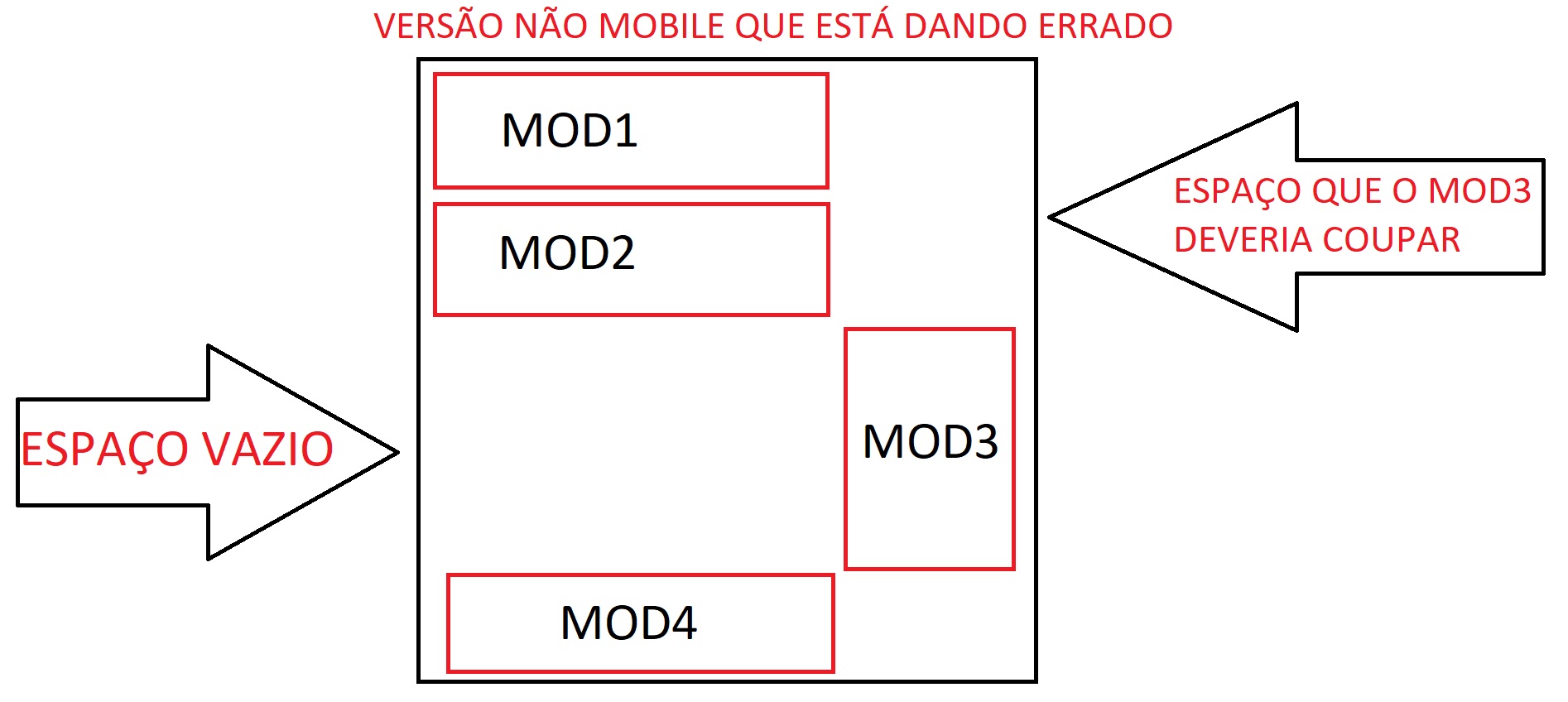
  • I tested the grid method until it worked, except that the contents will distribute their height evenly with the column

  • Well, it worked, I was just cracking my head here, only one last thing is that the way you made the column and the other kids got stuck sideways so I put a width for the column and for the rest of it, only that the column was not on the right and yes in the middle I could only put on the right qdo I gave a margin-left, is that there is some way to specify that only the column is on the right with flex-box?

  • That’s right, vlw bro, I still need to learn a lot about flex-box

  • One last thing this stretch "flex: 0 0 100%;" leaves the height of the giant column and only comes out if I take the 100%, only then it is no longer on the side

  • It didn’t work :( what happens is that when he goes to the side he keeps kind of a ghost of the same height as if he was still there, I tried overflow:Hidden; Justify-self:start but nothing

  • @user4451 the problem is in leaving the father div at the height of the sum of the 3 left Ivs... I don’t really have much mastery over the flex-box. But one solution would be to apply height in the parent div by javascript: divpai = document.querySelector('.pai');divfil = divpai.offsetHeight-document.querySelectorAll('.pai > .filhos')[3].offsetHeight;divpai.style.height = divfil+'px';

Show 4 more comments

2

I made a model with flexbox only. I used the attribute order to change the order of item 4 and the flex-basis: 100% in item 3 to leave it at 100% father height.

section {
    display: flex;
    width: 100%;
}
section>* {
    padding: 1em;
    box-sizing: border-box;
}

.tres {
    background-color: hsl(72, 70%, 80%);
    order: 4;
}
.um {
    background-color: hsl(144, 70%, 80%);
    order: 1;
}
.dois {
    background-color: hsl(216, 70%, 80%);
    order: 2;
}
.quatro {
    background-color: hsl(288, 70%, 80%);
    order: 3;
}

.grid {
    flex-direction: column;
    flex-wrap: wrap;
    height: 16em;
}
.grid .um,
.grid .dois,
.grid .quatro {
    width: 80%;
    flex-grow: 1;
}
.grid .tres {
    flex-basis: 100%;
    width: 20%;
}
<section class="grid">
    <div class="um">um</div>
    <div class="dois">dois</div>
    <div class="tres">tres</div>
    <div class="quatro">quatro</div>
</section>

  • Really! , had not remembered the flex-Asis, is the solution +1

  • I’ll test here vlw

  • this his method even worked but the height of the contents accompanied the column and this could not happen, also the column has to have a space between the other elements, but vlw same bro, today vcs helped me mto

  • @user4451 guy to solve this place section div { margin: 10px; } and remove the flex-grow: 1; do . grid . one . two . four , If you want I can edit the original code I made. The detail is that . grid still needs to have a height. []’s

  • 1

    Thank you!! I used the DVD solution, but you also deserved a +1 :), I hope it’s worth it to the staff because I did not find similar doubt here in the stack

1

Only with flexbox I believe it is not possible, but you can join it with float, to get the result, the DVD solution is ideal if you do not have to worry about support between browsers, since grid still reaches 69.57% unprefixed.

* {
box-sizing: border-box;
}
.ctn {
    display: inline-block;
    width: 400px;
    background: #333;
    }
.ctn > * {
  float: left;
  border: 1px red solid;
  width: 80%;
  height: 30px;
}
.mod3 {
height: 90px;
float: right;
width: 20%;
}

@media all and (max-width : 600px) {

.ctn {
display: flex;
flex-direction: column;
}
.mod3 {order: 3}
.mod4 {order: 4}

.ctn > * {flex: 1; width: 100%;}

}
    <div class="ctn">
      <div class="mod3">Mod3</div>
      <div class="mod1">Mod1</div>
      <div class="mod2">Mod2</div>
      <div class="mod4">Mod4</div>
    <div>

Browser other questions tagged

You are not signed in. Login or sign up in order to post.