You can do it using the srcset. It will only call the image that is configured for screen resolution.
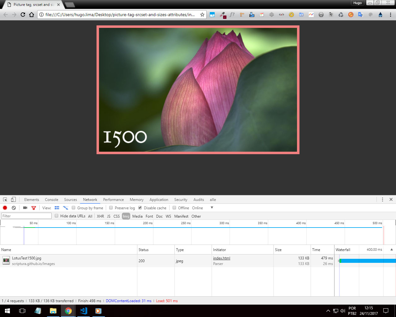
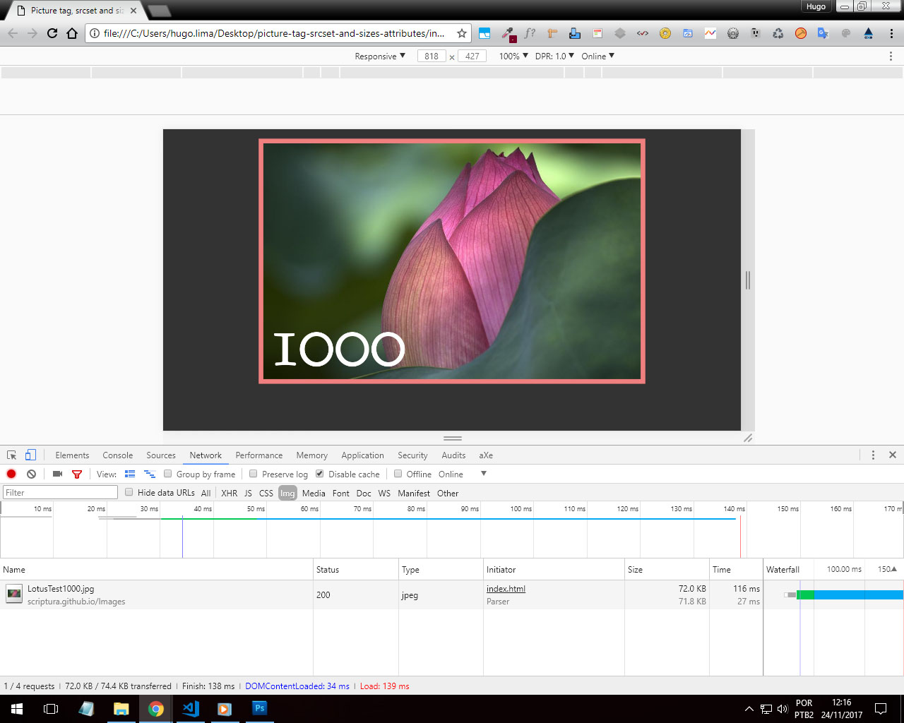
Here is a practical example. And below are the screenshots of Developer Tools.
https://codepen.io/olivier-c/pen/QNYRPG
Here you can read more about this technique.
http://w3c.github.io/html/semantics-embedded-content.html#element-attrdef-img-srcset
Example code shown above.
OBS: Perform the snipper first and it will load the 800px image, then go to "Whole Page" to see a larger image upload!
body {
  margin: 1rem;
  background-color: #333;
}
img {
  display: block;
  width: 100%;
}
figure {
  max-width: 40rem;
  margin: 1rem auto;
  padding: 0.5em;
  background-color: LightCoral;
}
<figure>
  <picture>
    <source media="(min-width: 2000px)" srcset="https://scriptura.github.io/Images/LotusTest.jpg, https://scriptura.github.io/Images/LotusTest.jpg 2x" sizes="100vw"/>
    <source media="(min-width: 1500px)" srcset="https://scriptura.github.io/Images/LotusTest2000.jpg, https://scriptura.github.io/Images/LotusTest.jpg 2x" sizes="100vw"/>
    <source media="(min-width: 1000px)" srcset="https://scriptura.github.io/Images/LotusTest1500.jpg, https://scriptura.github.io/Images/LotusTest2000.jpg 2x" sizes="100vw"/>
    <source media="(min-width: 800px)" srcset="https://scriptura.github.io/Images/LotusTest1000.jpg, https://scriptura.github.io/Images/LotusTest2000.jpg 2x" sizes="100vw"/>
    <source media="(min-width: 600px)" srcset="https://scriptura.github.io/Images/LotusTest800.jpg, https://scriptura.github.io/Images/LotusTest1500.jpg 2x" sizes="100vw"/>
    <source media="(min-width: 400px)" srcset="https://scriptura.github.io/Images/LotusTest600.jpg, https://scriptura.github.io/Images/LotusTest1000.jpg 2x" sizes="100vw"/>
    <source media="(min-width: 300px)" srcset="https://scriptura.github.io/Images/LotusTest400.jpg, https://scriptura.github.io/Images/LotusTest800.jpg 2x" sizes="100vw"/>
    <source srcset="https://scriptura.github.io/Images/LotusTest300.jpg" sizes="100vw"/><img src="https://scriptura.github.io/Images/LotusTest.jpg" alt="Lotus"/>
  </picture>
</figure>
depends on the mode you want if background by css’s, but otherwise will use the html source
– Anderson Henrique