Side menu with 100% height does not match the size of the div "content"

Asked

Viewed 1,823 times

0

I have the following structure at the moment:

inserir a descrição da imagem aqui 
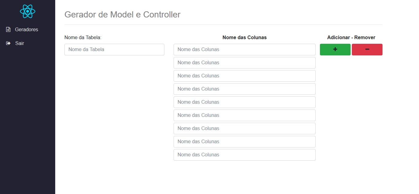
So far so good, the side menu has height: 100% and is going to the end of the page. In the content, we have 8 inputs that are not enough to reach the end of the page, then the menu is normal and does not appear scroll bar (because it is not necessary until now).

Now in the following structure:

inserir a descrição da imagem aqui 
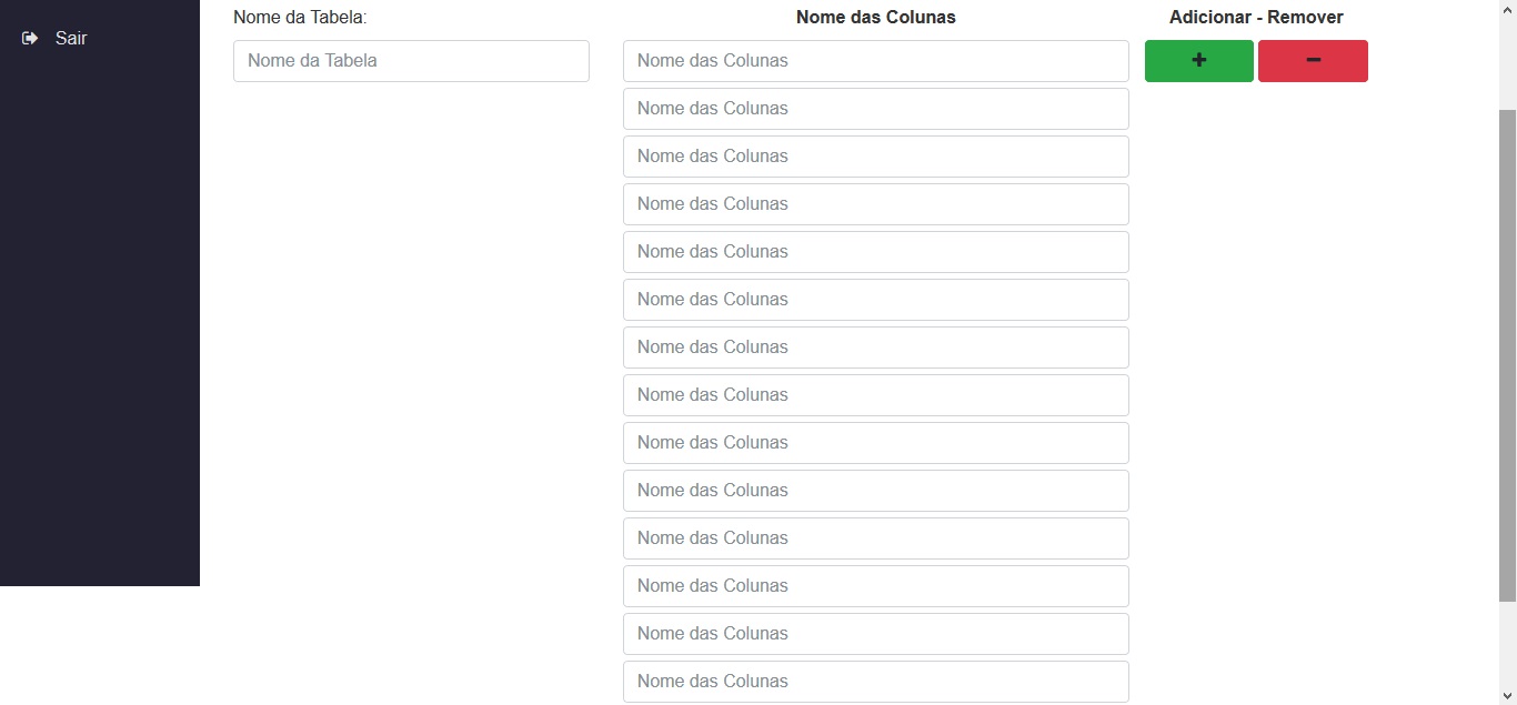
In the previous structure, we have 14 inputs (and even lower) and now they are enough to reach the end of the page and create the scroll bar, but the side menu that contains the height: 100% does not follow the size of div that contain the inputs.

My wish was that the side menu go to the end of the page, following the size of the div with the inputs. It does not matter if the div with the inputs has 500px tall or 3000px tall or 10000px height, the side menu should follow the size, as I could do for it to accompany?

CSS of the Menu:

.longBarVertical {
    width: 180px;
    min-height: 100%;
    background-color: rgb(34, 34, 50);
    float: left;
}

.logoMenu {
    margin-top: 15px;
}

.logoMenu img {
    width: 50px;
}

.menuVertical {
    position: relative;
    width: 180px;
    padding: 0px;
    margin-top: 15px;
}

.menuVertical li a {
    padding-left: 15px;
    line-height: 45px;
    display: block;
    overflow: hidden;
    position: relative;
    text-decoration: none;
    color: rgb(225, 225, 225);
    border-left: 5px solid transparent;
}

HTML from the Menu:

<!DOCTYPE html> 
<html> 
<head>
</head>
<body>
    <div class="longBarVertical">
        <div class="logoMenu text-center">
            <a href="home.php"><img src="img/atom-logo.png"></a>
        </div>
        <ul class="menuVertical">
            <li>
                <a href="#" data-toggle="collapse" data-target="#submenu-1">
                    <i class="fa fa-file-text-o"></i><span>Geradores</span>
                </a>
            </li>
            <div class="submenu">
                <ul id="submenu-1" class="collapse">
                    <li><a href="genMC.php"><i class="fa fa-plus"></i><span> Model/Controller</span></a></li>
                    <li><a href="genSenha.php"><i class="fa fa-minus"></i><span> Senha</span></a></li>
                </ul>
            </div>

            <li>
                <a href="#" data-toggle="modal" data-target="#deslogar">
                    <i class="fa fa-sign-out"></i><span>Sair</span>
                </a>
            </li>
        </ul>
    </div>

    <div class="modal fade" id="deslogar" role="dialog">
        <div class="modal-dialog modal-md" style="width: 210px; text-align: center;"> 
            <div class="modal-content">
                <div class="modal-body" style="padding-bottom: 0px;">
                    <p>Sair?</p>                
                </div>
                <div class="modal-footer" style="padding-top: 5px; padding-bottom: 5px; text-align: center;">
                    <a href="../controller/controller.deslogar.php" type="button" class="btn btn-success" style="width: 80px;">Sim</a>
                    <a href="#" type="button" type="button" class="btn btn-danger" data-dismiss="modal" style="width: 80px;">Não</a>
                </div>
            </div>
        </div>
    </div>
</body>
</html>

Page CSS (which has the inputs):

.row .page {
    width: 90%;
}

.row .page .title {
    color: gray; 
    margin-top: 30px; 
    margin-left: 30px;
}

.row .page .content {
    margin-top: 30px; 
    margin-left: 30px;
}

.row .page .content label{
    color: #333;
}

Page HTML (which has the inputs):

<body>
    <div class="row no-gutters">
        <div class="page">
            <div class="title">
                <h3>Gerador de Model e Controller</h3>
                <hr>
            </div>
            <div class="content">
                <div class="row">
                    <div class="col-xl-4">
                        <div class="form-group">
                            <label for="nomeTabela">Nome da Tabela:</label>
                            <input type="text" class="form-control" name="nomeTabela" placeholder="Nome da Tabela">
                        </div>
                    </div>
                    <div class="col-xl-8">
                        <div>
                            <div class="form-group text-center" style="width: 68%; float: left;">
                                <label for="nomeColunas"><b>Nome das Colunas</b></label>
                                <input type="text" class="form-control" name="colunas[]" placeholder="Nome das Colunas">
                                <?php 
                                    for ($i=0; $i < 15; $i++) { 
                                        echo '<input type="text" class="form-control" name="colunas[]" placeholder="Nome das Colunas" style="margin-top: 5px;">';
                                    }
                                ?>

                            </div>
                            <div class="text-center" style="width: 30%; float: right;">
                                <label for="tipoTransfMIA"><b>Adicionar - Remover</b></label>
                                <a id="add" class="pull-left btn btn-success" style="width: 49%;"><i class="fa fa-plus"></i></a>
                                <a id="del" class="pull-right btn btn-danger" style="width: 49%;"><i class="fa fa-minus"></i></a>
                            </div>                          
                        </div>
                    </div>
                </div>
            </div>
        </div>
    </div>
</body>
</html>

Note: I am using the framework Bootstrap 4.

  • You’re using html, body { height: 100%; }?

  • Positive In the beginning. In the beginning mine style.css has a: html, body {&#xA; margin: 0px;&#xA; padding: 0px;&#xA; font-family: "myriad-pro", sans-serif;&#xA; height: 100%;&#xA;}

2 answers

1


It’s hard to make two divs that are not sisters have the same height via CSS. Could put some codes in jQuery that would solve this, however, I suggest an easier and CSS-only solution:

First: its layout is very simple, has only two divs bigger side-by-side, as if they were two columns. So do the following: create a div-mother and put these two divs inside it, this way (this should not affect the original page layout):

<div id="wraper">
    <div DIV DA ESQUERDA - MENU>
    </div>
    <div DIV DA DIREITA>
    </div>
</div>

According to: add the code below to your CSS:

#wraper {
  overflow: hidden;
  min-height: 100%;
}

#wraper > div {
   padding-bottom: 500em;
   margin-bottom: -500em;
}

This way you will have solved the problem and when the div right grow, will grow next to div left-wing.

  • I’m thankful for the answer, but it didn’t work, maybe I didn’t put the codes in the right way or maybe it’s because the side menu is on another page, it comes to "home.php" or any other page for include_once 'menu.php'. Knowing that comes through include, how could I put the code suggested by you? Thank you and sorry for the lack of knowledge. (I suffer too much with HTML and CSS)

  • I understood the logic of your idea and realized that I had misplaced your idea of code. I created the <div id="wraper"> on the "home.php" page and put the include_once 'menu.php' within the <div id="wraper">, before I put the include_once 'menu.php' there at the top of the page, on line 3 more or less. Now it worked correctly.

  • Thank you very much for the help Ĩsêdjê, you already helped me in 2 answers and in another answer that was not my question but it is exactly the doubt that I also had. You’re a beast! Thank you very much.

  • Only one question: What is the function of these lines #wraper > div {&#xA; padding-bottom: 500em;&#xA; margin-bottom: -500em;&#xA;}?

  • @Gabrielq. Thanks man! Next, this is just a hack to leave the two Divs with equal height. It adds a huge bottom padding and a negative bottom margin of the same size. Thus, the Divs get a huge height but in the same position, and the overflow: Hidden in the Wraper is so that it does not generate a scroll bar. Being a hack, it’s like a gambiarra, because CSS does not have facilities to do this, except if you used display: flex, but this would give problem with Bootstrap.

0

100% height will track the value of the parent element, you must have another div that holds the side menu that is not set to height: 100%; so it takes the initial size of the browser window without scrolling, because the parent element is as 'auto' per defult and that is the behavior.

What I advise to do is to place the parent element with height: 100% and if it doesn’t work as a test also try:

body, html { height: 100%; }

  • At the beginning of my CSS file I have the following code: html, body { margin: 0px; padding: 0px; font-family: "myriad-pro", sans-serif; height: 100%; }. The div on the menu is longBarVertical and she has the height: 100%, as much as she can have of "div pai" is body and the html and I tried to put a <body style="height: 100%"> but continued the same way.

Browser other questions tagged

You are not signed in. Login or sign up in order to post.