0
I’m making a table with bootstrap, and I’m testing on google Chrome, only when I put to see how it would look on Iphone 5, the table does not decrease and bursts the layout.
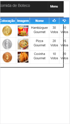
This black line in front of the table, it was a border I put on Class Row, just to show her the limit.
table img {
  width: 50px;
  height: 50px;
}

thead tr {

  background-image: -webkit-linear-gradient(top, #4183D7, #22A7F0);
  font-weight: bold;
  color: #FFF;

}
.row {
  border:2px solid black;
}
<!DOCTYPE html>
<html>
<head>
<meta charset="utf-8">
<meta name="viewport" content="width=device-width, initial-scale=1">
<title>Resultados da Votação</title>
<link rel="stylesheet" href="bootstrap/css/bootstrap.min.css">
<link rel="stylesheet" href="css/estilo-padrao.css">
<link rel="stylesheet" href="css/resultado-votacao-estilo.css">
</head>
<body>
<header>
<nav class="navbar navbar-inverse">
<div class="container-fluid">
<div class="navbar-header">
<a class="navbar-brand" href="index.html">Comida de Boteco</a>
<button data-toggle="collapse" data-target="#menu" class="navbar-toggle collapsed">Menu</button>
</div><!-- fim navbar-header -->
<div id="menu" class="collapse">
<ul class="nav navbar-nav">
<li><a href="index.html">Início</a></li>
<li><a href="lista-comidas.html">Lista de Comidas</a></li>
</ul>
</div><!-- fim menu -->
</div><!-- fim container -->
</nav>
</header>
<section class="container">
<div class="row">
<div class="col-xs-12 col-sm-12">
<table class="table table-bordered table-condensed table-responsive text-center">
<thead>
<tr>
<td>Colocação</td>
<td>Imagem</td>
<td>Nome</td>
<td><span class="glyphicon glyphicon-thumbs-up"></span></td>
<td><span class="glyphicon glyphicon-thumbs-down"></span></td>
</tr>
</thead>
<tbody>
<tr>
<td><img src="img/medalha-ouro.png" alt="Primeiro Colocado" title="1°"></td>
<td><img src="img/comidas/comida1.jpg" alt="imagem da comida"></td>
<td>Hambúrguer Gourmet</td>
<td>30 Votos</td>
<td>10 Votos</td>
</tr>
<tr>
<td><img src="img/medalha-prata.png" alt="Segundo Colocado" title="1°"></td>
<td><img src="img/comidas/comida2.jpg" alt="imagem da comida"></td>
<td>Pizza Gourmet</td>
<td>20 Votos</td>
<td>15 Votos</td>
</tr>
<tr>
<td><img src="img/medalha-bronze.png" alt="Terceiro Colocado" title="1°"></td>
<td><img src="img/comidas/comida3.jpg" alt="imagem da comida"></td>
<td>Coxinha Gourmet</td>
<td>10 Votos</td>
<td>20 Votos</td>
</tr>
</tbody>
</table>
</div><!-- fim Col-->
</div><!-- fim da Row-->
</section>
<script src="js/jquery.min.js"></script>
<script src="bootstrap/js/bootstrap.min.js"></script>
</body>
</html>
What happens is that if you need to have a different css for different browsers, it takes work, but you can get better results also using media queries. for differentiated screen formats.
– Wilson Rosa Gomes