1
I’m starting a project for the university and I can’t do the grid system in the main content tag. I’ve been trying for a long time!
I can’t implement the grid! This is my code..
`
<img src="../Logincheck/assets/img/image2.png" class="company-logo"><br>
<div id="welcome">
<b><?php echo $result['username'] ?> </b>
</div>
<div class="sidebar-links">
<div class="link-blue">
<a href="logout.php">
<i class="fa fa-sign-out"></i>Logout
</a>
</div>
<div class="link-orange selected">
<a href="#">
<i class="fa fa-home"></i>Home
</a>
</div>
<div class="link-blue ">
<a href="#">
<i class="fa fa-table"></i>Tables
</a>
<ul class="sub-links">
<li><a href="#">Automóveis</a></li>
<li><a href="#">Motociclos</a></li>
<li><a href="#">Caravanas</a></li>
<li><a href="#">Autocarros</a></li>
</ul>
</div>
<div class="link-red">
<a href="#">
<i class="fa fa-plus-square-o"></i> Inserir
</a>
<ul class="sub-links">
<li><a href="#">Automóveis</a></li>
<li><a href="#">Motociclos</a></li>
<li><a href="#">Caravanas</a></li>
<li><a href="#">Autocarros</a></li>
</ul>
</div>
<div class="link-yellow">
<a href="#">
<i class="fa fa-tachometer"></i>Estado
</a>
<ul class="sub-links">
<li><a href="#">Automóveis</a></li>
<li><a href="#">Motociclos</a></li>
<li><a href="#">Caravanas</a></li>
<li><a href="#">Autocarros</a></li>
</ul>
</div>
<div class="link-blue">
<a href="#">
<i class="fa fa-folder-open"></i>Reservas
</a>
</div>
<div class="link-red">
<a href="#">
<i class="fa fa-book"></i>Clientes
</a>
</div>
<div class="link-green">
<a href="#">
<i class="fa fa-money"></i>Budget Maker
</a>
</div>
<div class="link-blue">
<a href="#">
<i class="fa fa-area-chart"></i>Estatísticas
</a>
</div>
</div>
</aside>
<div class="main-content">
<div class="menu">
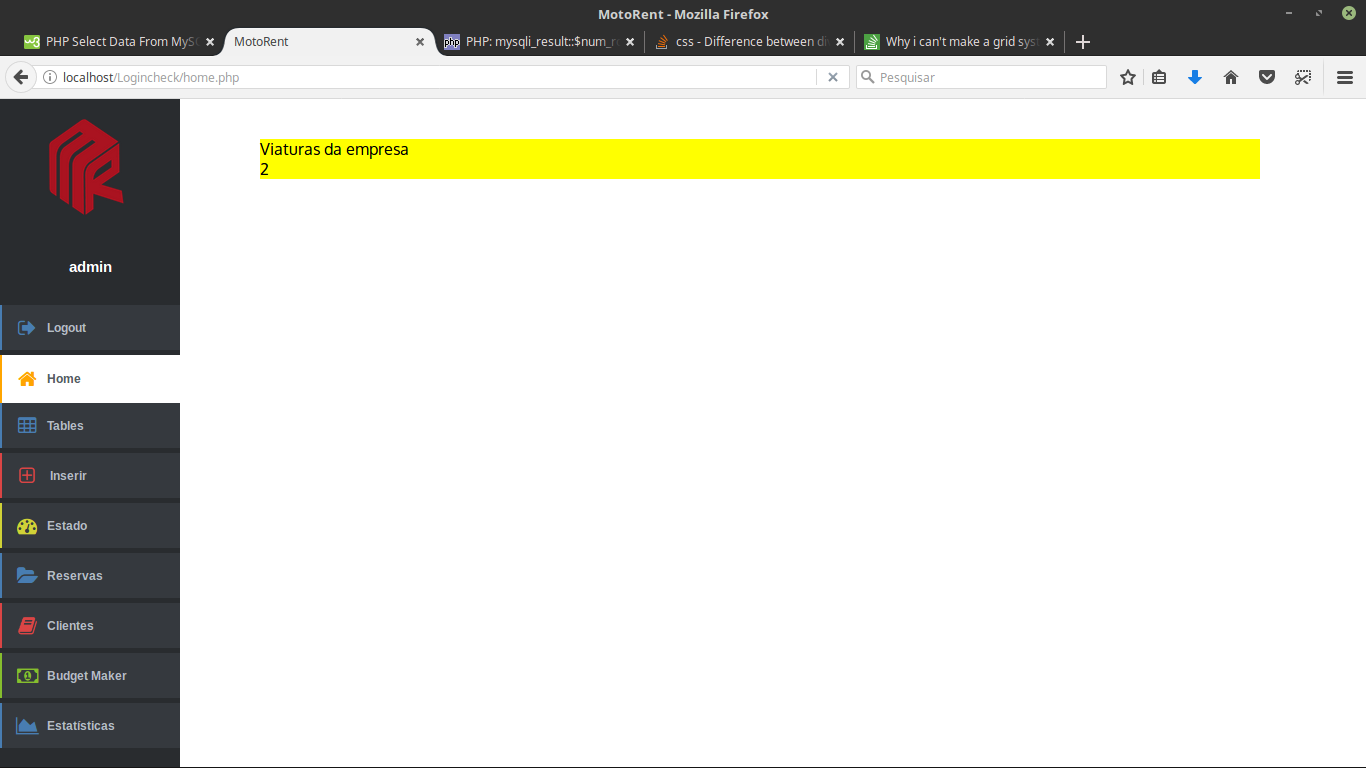
<!--div de número de viaturas que a empresa possui-->
<div id="ncf" style="color:black; background-color: yellow">
<div style="font-family: Oxygen, sans-serif; align-content: center">
<?php
$sql1 = "SELECT * FROM vehicle";
$numcars = $connect->query($sql1);
if ($result = $numcars ) {
$row_cnt = $result->num_rows;
print 'Viaturas da empresa'.'<br>'.$row_cnt;
}else{
echo 'sem viaturas';
}
?></div>
</div>
<!--div número de clientes-->
<div id="nclts"></div>
<!--div número de reservas (ultima semana)-->
<div id="nrsv"></div>
<!--div de país com mais viaturas da empresa-->
<div id="pvemp"></div>
<!--div dados de funcionário-->
<div ids="dfunc"></div>
<!--div download aplicação mobile-->
<div id="dapk"></div>
<!--div viatura mais requisitada do mês-->
<div id="vmrm"></div>
</div>
</div>
`
I already tried to do the grid, however it always keeps formatting the image above and I can’t understand why! Can anyone help me please?
update
Here is the css.
.main-content {
	font-family: Arial, Helvetica, sans-serif;
	max-width: 1000px;
	padding-top: 40px;
	margin: 0 0 40px 260px;

}

#welcome{
    color: white;
    text-align: center;
    font-family: Arial, Helvetica, sans-serif;
    font-size: 15px;
}
.sidebar-left-collapse {
	font-family: Arial, Helvetica, sans-serif;
	position: fixed;
	top: 0;
	left: 0;
	background-color: #292c2f;
	width: 180px;
	height: 100%;
	padding: 20px 0;
}

.sidebar-left-collapse > img {
	display: block;
	text-decoration: none;
	font-family: Cookie, cursive;
	width: 122px;
	height: 122px;
	margin: 0 auto;
	text-align: center;
	font-size: 44px;
	font-weight: normal;
	line-height: 2.6;
	border-radius: 50%;
        background-image: url(../Logincheck/assets/img/image1.png);
}

.sidebar-left-collapse .sidebar-links {
	margin: 30px auto;
}

.sidebar-links div > a {
	display: block;
	text-decoration: none;
	margin: 0 auto 5px auto;
	padding: 10px 0 10px 5px;
	background-color: #35393e;
	text-align: left;
	color:  #b3bcc5;
	font-size: 12px;
	font-weight: bold;
	line-height: 2;
	border-left-width: 2px;
	border-left-style: solid;
}

.sidebar-links div.selected > a{
	background-color: #ffffff;
	color: #565d63;
	line-height: 2.3;
	margin: 0;
}

.sidebar-links div > a i.fa {
	position: relative;
	font-size: 20px;
	top: 3px;
	width: 40px;
	text-align: center;
}

.sidebar-links div ul.sub-links {
	max-height: 0;
	overflow: hidden;
	list-style: none;
	padding: 0 0 0 30px;
	color:  #b3bcc5;
	font-size: 12px;
	font-weight: bold;
	line-height: 24px;
	margin: 0;
	transition: 0.4s;
}

.sidebar-links div.selected ul.sub-links {
	max-height: 150px;
	padding: 12px 0 12px 30px;
}

.sidebar-links div .sub-links a {
	text-decoration: none;
	color: #b3bcc5;
	display: block;
	text-align: left;
}

/* Link Colors */
.sidebar-links div.link-orange > a {
	border-color: #FFA500;
}

.sidebar-links div.link-orange > a i.fa {
	color: #FFA500;
}

.sidebar-links div.link-blue > a {
	border-color: #487db2;
}

.sidebar-links div.link-blue > a i.fa {
	color: #487db2;
}

.sidebar-links div.link-red > a {
	border-color: #da4545;
}

.sidebar-links div.link-red > a i.fa {
	color: #da4545;
}

.sidebar-links div.link-yellow > a {
	border-color: #d0d237;
}

.sidebar-links div.link-yellow > a i.fa {
	color: #d0d237;
}

.sidebar-links div.link-green > a {
	border-color: #86be2e;
}

.sidebar-links div.link-green > a i.fa {
	color: #86be2e;
}

/* Making the sidebar responsive */

@media (max-width: 900px) {

	.main-content{
		max-width: none;
		padding: 70px 20px;
		margin: 0 0 40px;
	}

	.sidebar-left-collapse {
		width: auto;
		height: auto;
		position: static;
		padding: 20px 0 0;
	}

	.sidebar-left-collapse .sidebar-links {
		text-align: center;
		margin: 20px auto 0;
	}

	.sidebar-links div {
		display: inline-block;
		width: 100px;
	}

	.sidebar-links div > a {
		text-align: center;
		margin: 0;
		padding: 10px 0;
		border-left: none;
		border-top-width: 2px;
		border-top-style: solid;
	}

	.sidebar-links div > a i.fa {
		display: block;
		margin: 0 auto 5px;
	}

	.sidebar-links div ul.sub-links {
		display: none;
	}

	.sidebar-links div.selected .sub-links {
		display: block;
		position: absolute;
		text-align: center;
		width: auto;
		left: 0;
		right: 0;
	}

	.sidebar-links div.selected .sub-links li {
		display: inline-block;
	}

	.sidebar-links div.selected .sub-links a {
		display: inline-block;
		margin-right: 20px;
		font-size: 13px;
		color: #748290;
	}

}

/* Smartphone version */

@media (max-width: 450px) {

	.main-content{
		padding: 90px 20px;
	}

	.sidebar-left-collapse {
		padding: 20px 0;
	}

	.sidebar-left-collapse .sidebar-links {
		text-align: center;
		margin: 20px auto 0;
		position: relative;
	}

	.sidebar-links div {
		display: block;
		width: 240px;
		margin: 0 auto 5px;
	}

	.sidebar-links div > a {
		text-align: left;
		padding: 10px 25px;
		vertical-align: middle;
		border-top: none;
		border-left-width: 2px;
		border-left-style: solid;
	}

	.sidebar-links div > a i.fa {
		display: inline-block;
		font-size: 20px;
		width: 20px;
		margin: 0 20px 0 0;
	}

	.sidebar-links div.selected .sub-links {
		bottom: -90px;
	}

}

/*	Removing margins and paddings from the body, so that
    the sidebar takes the full height of the page */

body {
	margin: 0;
	padding: 0;
}
@Andersoncarloswoss I in this code snippet did not put the grid... because when I put the grid the result of exactly the same as the image , but I will update and put the css
– Alexandre Reis