1
Hello,
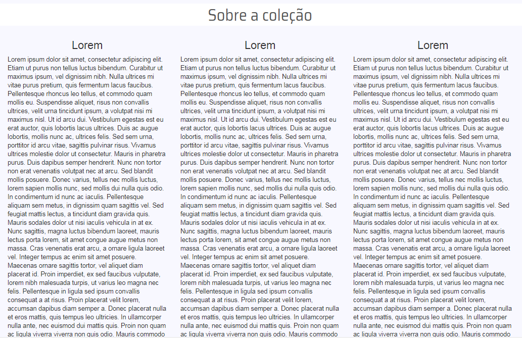
I’m a bootstrap beginner and came across a text visualization problem that I’m having trouble solving. The situation is as follows, as in the attached images, my page has a field that displays a text divided into 3 columns in the desktop version (col-Md-4) and when the screen is decreased, it goes to 1 column (col-Sm-12, col-Xs-12). My problem is, how can you that the div is not leaving space on the left and right, as it is in the version with 3 columns. I have tried to put a 5% padding left and right to col-Sm-12, but this change for some reason I do not know also put this padding in col-Md-4, so I undone the changes. I didn’t add css here because I’m using the bootstrap default. Does anyone know how I could put this space in the small version without affecting the large version?big version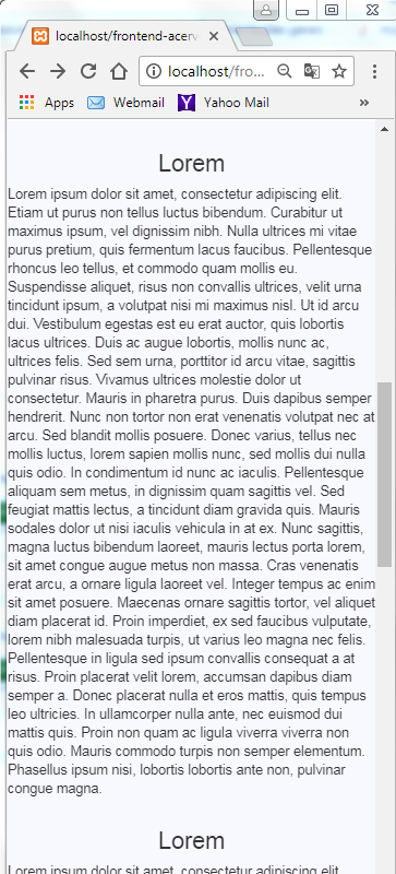
With @media, you can define when to apply this css. In this case when screen size is less than 768px the css will add 15 px to the left and 15 px to the right of the div(Row) that surrounds the columns.
– Wesley S.