Let’s go in pieces.
Grid in the bootstrap:
Up to version 3.3.7 See the BR documentation for version 3.3.7 for a base
In version 3.3.7 the bootstrap divides the screen into 12 equal parts, but uses a percentage to render it for each type of screen. The calculation is quite simple to do is the amount of elements divided by the total quantity, example?
Let’s imagine that the screen will have 12 spaces and you want to know the size of each space.
1 / (12 * 100) = 8.333% então cada parte terá este tamanho en relação ao tamanho de tela.
Let’s say we have a line class="row" and we want to put in it 2 parts yellow and 10 parts blue, colored the line red to be able to differentiate.
<div class="row alert alert-danger">
<div class="col col-md-2 alert alert-warning"> </div>
<div class="col col-md-10 alert alert-info">  </div>
</div>
Having the following result:
 I used
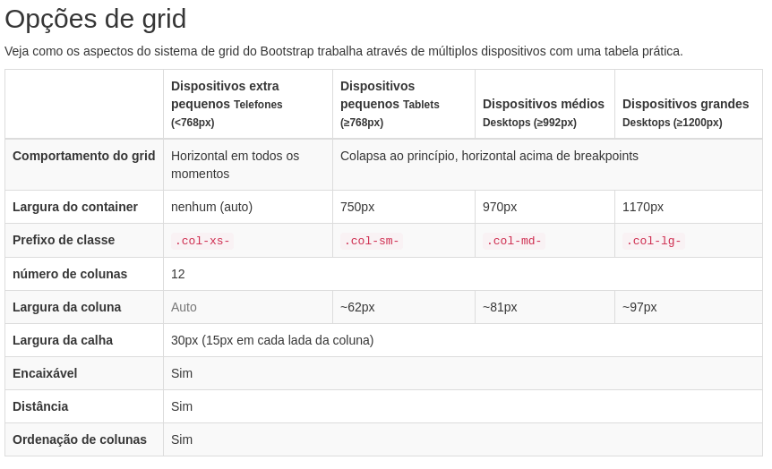
 col-md-, to illustrate but the bootstrap works with 4 different settings for each screen size as per table below
- col-Xs for screens < 768px;
- col-Sm for screens >= 768px;
- col-Md for screens > 992px;
- col-lg for screens > 1200px;
Both with grid of 12 spaces
It is common to work with 2 columns on devices larger than 992px col-md-2 and in the same div with 4 columns for devices with screens smaller than 768px col-xs-4, thus making the code.
<div class="col-md-2 col-xs-4"></div>
Using bootstrap render using @media to make it responsive.
/* telas pequenas (smarphones com resoluções menores que 768px) */
@media (min-width: @screen-sm-min) { ... }

/* Telas maiores que 992px) */
@media (min-width: @screen-md-min) { ... }
This way the developer only needs to worry about following the table below.
Below I played your screen and the screen I imagine would be the ideal, and after this example I talk about the bootstrap 4 alpha 6.
<link href="https://maxcdn.bootstrapcdn.com/bootstrap/4.0.0-beta.2/css/bootstrap.min.css" rel="stylesheet"/>
<h1 class="alert alert-danger">
Este é o seu código
</h1>
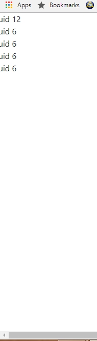
<div class="row"> <!-- altera para row-fluid e o probelma desaperece -->
<div class="span12">
Fluid 12
<div class="row-fluid">
<div class="span6">
Fluid 6
<div class="row-fluid">
<div class="span6">Fluid 6</div>
<div class="span6">Fluid 6</div>
</div>
</div>
<div class="span6">Fluid 6</div>
</div>
</div>
</div>
<br>
<h1 class="alert alert-warning">
Esse deve ser o resultado que você esperava
</h1>
<div class="row"> <!-- altera para row-fluid e o probelma desaperece -->
<div class="col col-md-12 alert alert-warning">
Fluid 12
<div class="row">
<div class="col col-md-6 alert alert-success">
Fluid 6
<div class="row">
<div class="col col-md-6 alert alert-danger">Fluid 6</div>
<div class="col col-md-6 alert alert-info">Fluid 6</div>
</div>
</div>
<div class="col col-md-6 alert alert-danger">Fluid 6</div>
</div>
</div>
</div>
Bootstrap v4 alpha6## see the manual on grids, but the documentation is not yet translated.
In version 4 alpha 6 bootstrap abandons the space-rendered Grip model and implements the flexbox making it easier to practice and organize the code.
In this bootstrap no longer exists col-xs now he has become only col-, according to new grid table.
Grid options
While Bootstrap is wearing em or rem to define most sizes, the pxs are used for grid breakpoints and container widths. This is because the width of the display window is in pixels and does not change with the font size, ie the fonts are no longer used in px in this version and will use only em or rem to set the fonts and maintain a ratio of size (may be larger or smaller, depending on the screen size).
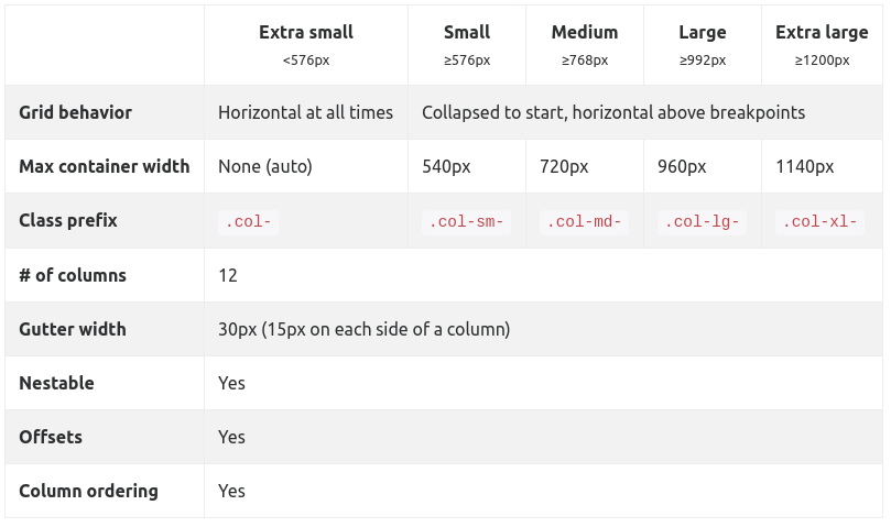
But it works the same way in class names.
What is the bootstrap version?
– WMomesso
I am using version 4.0.0-beta.2
– Paty Rodrigues
One more question you are starting to use bootstrap, or have already used other versions? if it is not a problem can I make an example in version 4.6 Alpha? If I do not do so in the version that is in the question, just reply that I have given the answer.
– WMomesso
Hello, I’m a beginner, never used another later version. Feel free to use any version.
– Paty Rodrigues
resolved with my reply?
– WMomesso