1
I have a wordpress site in which I installed the plugin Owl Carousel (v0.53), with a horizontal Carousel of 14 items, being 4 visible at a time.
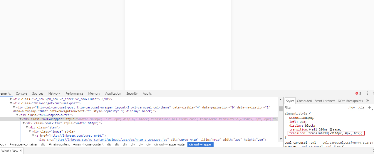
On the desktop, the width of the thumbnails is 298px, while on mobile, I’ve specified the css of the theme 175px. While in the first one everything is normal, in the mobile versions after the end of the 14 items, there is a blank space (which is exactly the size of + 14 empty items).
Does anyone know how to solve this problem? I imagine it is something related to the image below, in transform: translate3d, but I don’t know how to modify it exactly.
I tried to install Owl Carousel 2, which claims to be responsive, but wordpress accuses failure in installation whenever I try to install it.
When I put the width of thumbnails in mobile by 350px, it is normal, but only with 1 item, while I wish it was possible to have 2 at a time.