0
Friends, I am in the middle of an academic bias work, and I have the mission to transform this map into virtual and responsive content.
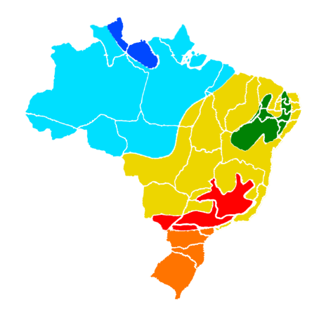
For that I already have a structure of Divs self-generated Photoshop. Is my doubt about how to turn this into responsive content? I thank you for understanding.
<html>
<head><style>
    .mainMap {
  position: absolute;
  left: 0px;
  top: 0px;
  z-index: 14;
        max-width: 100%;

}
.Preenchimento6 {
  background-image: url("img/part1.png");
  position: absolute;
  left: 697px;
  top: 1203px;
  width: 288px;
  height: 316px;
  z-index: 13;
    background-repeat: no-repeat;
}

.Preenchimento2 {
    background-image: url("img/part2.png");
  position: absolute;
  left: 709px;
  top: 908px;
  width: 438px;
  height: 316px;
  z-index: 12;
    background-repeat: no-repeat;

}
.Preenchimento3 {
    background-image: url("img/part3.png");

  position: absolute;
  left: 565px;
  top: 512px;
  width: 781px;
  height: 717px;
  z-index: 11;
    background-repeat: no-repeat;
}
.Preenchimento1 {
    background-image: url("img/part4.png");

  position: absolute;
  left: 1040px;
  top: 614px;
  width: 305px;
  height: 261px;
  z-index: 10;
    background-repeat: no-repeat;
}
.Preenchimento4 {
    background-image: url("img/part5.png");
  position: absolute;
  left: 514px;
  top: 299px;
  width: 226px;
  height: 228px;
  z-index: 9;
    background-repeat: no-repeat;
}
.Preenchimento5 {
    background-image: url("img/part6.png");
  position: absolute;
  left: 162px;
  top: 333px;
  width: 905px;
  height: 583px;
  z-index: 8;
    background-repeat: no-repeat;
}

    </style>
    <link rel="stylesheet" href="css/materialize.min.css"></head>
<body>

    <div class="mainMap container">
        <div class="Preenchimento1"></div>
        <div class="Preenchimento2"></div>
        <div class="Preenchimento3"></div>
        <div class="Preenchimento4"></div>
        <div class="Preenchimento5"></div>
        <div class="Preenchimento6"></div>
    </div>

    <script type="text/javascript" src="js/jquery-3.2.1.min.js"></script>
    <script type="text/javascript" src="js/materialize.min.js"></script>
    <script>

    </script>
</body>
</html>
https://developer.mozilla.org/en-US/docs/Web/Guide/CSS/CSS_Media_queries
– MagicHat
Make the map with SVG instead of images. By the way: map of Brazil svg.
– Renan Gomes
With jQuery I was able to do responsive. See Jsfiddle: https://jsfiddle.net/q5a2h446/ . Copy the Fiddle code and create a file. html on your computer to test, because Fiddle is not cool to view.
– Sam
Since I don’t have the images, I put a background color on each
divto get an idea of how it looks.– Sam