How to make the amount of DIV to adapt

Asked

Viewed 147 times

-1

Good afternoon, my doubt is the following, on my site there is a section where the highlights part is, and in this section there are 6 more Divs for the products display (image)

inserir a descrição da imagem aqui

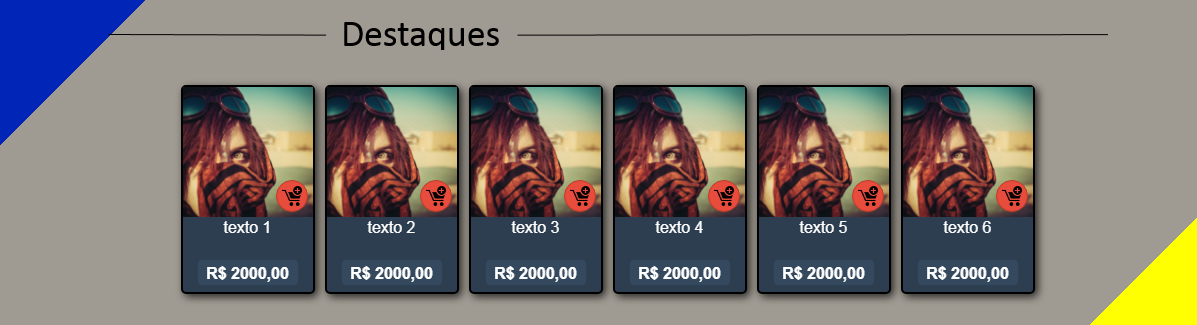
Well, so far so good, the problem is that when you zoom in, they start to group at the bottom and get messy with the bottom

inserir a descrição da imagem aqui

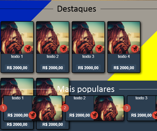
What I imagined as a solution to this problem is that as it zooms in, instead of organizing down it just disappears, but I don’t know how to do that... And that’s the best way to fix it?

  • https://answall.com/questions/218191/como-distribuir-imagens-horizontalmente-por-igual-dentro-de-um-elemento-section/218198#218198 friend take a look at this link in my reply. on the topic detaching itself from the fixed number of images, I believe this is it.

  • You should not be using clearfix. Take a look at this video https://www.youtube.com/watch?v=OUPpnCnB7uo

2 answers

0

I believe that using the grid system Bootstrap would solve your problem.

<div class="row">
    <div class="col-md-2">
        <!-- Conteúdo-->
    </div>
    <div class="col-md-2">
        <!-- Conteúdo-->
    </div>
    <!-- ... -->
</div>

Adapt this code to your need and so should solve your problems.

  • 1

    And if he had a 300-page project, and several of those pages needed an adaptation of Ivs, would you indicate bootstrap as a response? bootstrap is an excellent framework, but it needs to be used from the beginning of a project to meet the needs.

  • If he has a project with 300 pages for sure he will want to use bootstrap or any other framework that helps in the scalability of the site.

  • It wasn’t very helpful to me in this problem, but it solved another problem I was having, vlw

-1


See if that’s what you want...

#conteiner{
  display: flex;
  flex-wrap: wrap;
  justify-content: center;
  align-content: space-between;
  height: 200px;
  width: 100%;
  overflow: hidden;
  resize: horizontal;
}
.item{
  flex-basis: auto;
  width: 198px;
  height: 198px;
  border: solid 1px black;
}
<div id="conteiner">
  <div class="item">Ítem 1</div>
  <div class="item">Ítem 2</div>
  <div class="item">Ítem 3</div>
  <div class="item">Ítem 4</div>
  <div class="item">Ítem 5</div>
  <div class="item">Ítem 6</div>
</div>

  • Exactly that, vlw!

Browser other questions tagged

You are not signed in. Login or sign up in order to post.