Transition timing Function
The transition-timing-function defines how a transformation is applied over time. Whether it is applied consistently or faster/slowly in a given part.
Example:
Imagine that we are transforming the position of an element, and so moving it, it doesn’t have to move at the same speed all the time. You can go faster in some parts and slower in others.
Before analyzing the various options I leave the note that:
lineareaseease-inease-outease-in-out
These are particular cases of cubic-bezier and therefore representable only with cubic-bezier. They were created so that it would be simpler to apply a transition-timing-function without having to configure several values.
Linear
This is the simplest, and represents a constant animation over time.
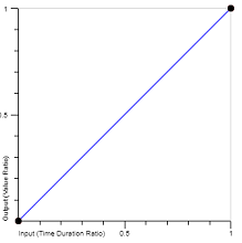
The graph shows how much the value of the property changes with respect to time. The x represents time, and the axis of y represents the animated property, be this color, background-color, left, etc....
The graphics have as limits 0 and 1 because they are percentages, so 0 represents 0% and 1 represents 100%.
setInterval(function(){
  const cs = document.getElementById("caixa").style;
  cs.marginLeft = cs.marginLeft == "300px" ? "0px" : "300px";
}, 3000);
div {
  width:100px; height:100px; background-color:lightBlue;
  transition: margin-left 1.5s linear; /*linear*/
}
<div id="caixa"></div>
Framing this animation with the graphic, we would have as property margin-left. Soon it would represent how much margin-left changes as time progresses. Looking at the graph that represents y = x it can be seen that the margin-left increases in proportion with time giving a constant animation over time.
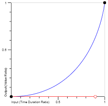
Ease In
Slow at the beginning and accelerating until normal at the end.
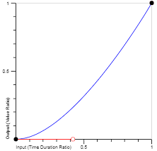
Note however that the curve is quite smooth, so the effect is very subtle, but looking closely you can see that it is faster at the beginning.
setInterval(function(){
  const cs = document.getElementById("caixa").style;
  cs.marginLeft = cs.marginLeft == "300px" ? "0px" : "300px";
}, 3000);
div {
  width:100px; height:100px; background-color:lightBlue;
  transition: margin-left 1.5s ease-in; /*ease-in*/
}
<div id="caixa"></div>
Ease Out
This is normal at the beginning and slows down at the end.
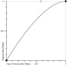
Just like the previous one this effect is also quite subtle.
setInterval(function(){
  const cs = document.getElementById("caixa").style;
  cs.marginLeft = cs.marginLeft == "300px" ? "0px" : "300px";
}, 3000);
div {
  width:100px; height:100px; background-color:lightBlue;
  transition: margin-left 1.5s ease-out; /*ease-out*/
}
<div id="caixa"></div>
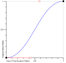
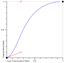
Ease In Out
This is a combination of the two getting slow at the beginning, normal at the middle and slow at the end.
setInterval(function(){
  const cs = document.getElementById("caixa").style;
  cs.marginLeft = cs.marginLeft == "300px" ? "0px" : "300px";
}, 3000);
div {
  width:100px; height:100px; background-color:lightBlue;
  transition: margin-left 1.5s ease-in-out; /*ease-in-out*/
}
<div id="caixa"></div>
Ease
Much like the ease-in-out but with the difference that it accelerates faster at the beginning, and starts to slow down less than half the way.
setInterval(function(){
  const cs = document.getElementById("caixa").style;
  cs.marginLeft = cs.marginLeft == "300px" ? "0px" : "300px";
}, 3000);
div {
  width:100px; height:100px; background-color:lightBlue;
  transition: margin-left 1.5s ease; /*ease*/
}
<div id="caixa"></div>
Cubic Bezier
Defines the transition in the form of:
cubic-bezier (x1, y1, x2, y2)
Where it implies that we have 2 points given both in x, time, as in y the value of the property.
Soon a cubic-bezier of (0.1,0.45,0.8,1) indicates that the 10% of time the value of the property goes to 45% and the 80% of time the value already goes to us 100%.
This allows representing much more personalized animations!
For example:
Which is pretty fast at first, very slow in the middle, and pretty fast at the end.
setInterval(function(){
  const cs = document.getElementById("caixa").style;
  cs.marginLeft = cs.marginLeft == "300px" ? "0px" : "300px";
}, 3000);
div {
  width:100px; height:100px; background-color:lightBlue;
  transition: margin-left 1.5s cubic-bezier(0.035,0.99,0.99,0.09); /*cubic-bezier*/
}
<div id="caixa"></div>
As I mentioned above all other transition functions are built on the basis of this one. Here is a list of these and their corresponding cubic-bezier:
linear - cubic-bezier(0,0,1,1)ease-in - cubic-bezier(0.42,0,1,1)ease-out - cubic-bezier(0,0,0.58,1)ease-in-out - cubic-bezier(0.42,0,0.58,1)ease - cubic-bezier(0.25,0.1,0.25,1)
This also allows you to create variants of the types represented by cubic-bezier but more notorious.
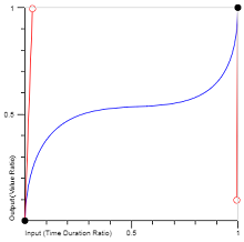
As an example, a much clearer version of ease-in with:
cubic-bezier(0.9,0,1,1)
Whose chart would be:
setInterval(function(){
  const cs = document.getElementById("caixa").style;
  cs.marginLeft = cs.marginLeft == "300px" ? "0px" : "300px";
}, 3000);
div {
  width:100px; height:100px; background-color:lightBlue;
  transition: margin-left 1.5s cubic-bezier(0.9,0,1,1); /*cubic-bezier*/
}
<div id="caixa"></div>
Steps
Sets the animation at the expense of steps by dividing the time span by the amount of steps. It also takes into account whether the animation is done at the beginning or at the end of that step.
The notation is :
steps(quantidade, start | end);
Start
With start the animation is defined at the beginning of each step.
Exemplifying, steps(4, start) indicates that the animation has 4 steps and is done at the beginning.
setInterval(function(){
  const cs = document.getElementById("caixa").style;
  cs.marginLeft = cs.marginLeft == "300px" ? "0px" : "300px";
}, 3000);
div {
  width:100px; height:100px; background-color:lightBlue;
  transition: margin-left 1.5s steps(4,start); /*steps start*/
}
<div id="caixa"></div>
End
In variant end the animation is defined at the end of each step, and follows the same syntax as the previous one just by changing the word start for end
setInterval(function(){
  const cs = document.getElementById("caixa").style;
  cs.marginLeft = cs.marginLeft == "300px" ? "0px" : "300px";
}, 3000);
div {
  width:100px; height:100px; background-color:lightBlue;
  transition: margin-left 1.5s steps(7,end); /*steps end*/
}
<div id="caixa"></div>
Relevant links:
Note: I apologize for the CSS the snippet be formatted strangely, but it was to take up less space since the answer is quite large.
That’s a great question, but I’ll tell you soon, some of the examples will have a long explanation, so I think it would be nice to wait as long as possible to accept any answer, leaving this question open will be very useful to the community (personal opinion only).
– Guilherme Nascimento
ps: I will publish the answer later, for it is very half-mouth :P
– Guilherme Nascimento