Align left and decrease distance between bootstrap controls

Asked

Viewed 6,998 times

3

See the following image:

inserir a descrição da imagem aqui

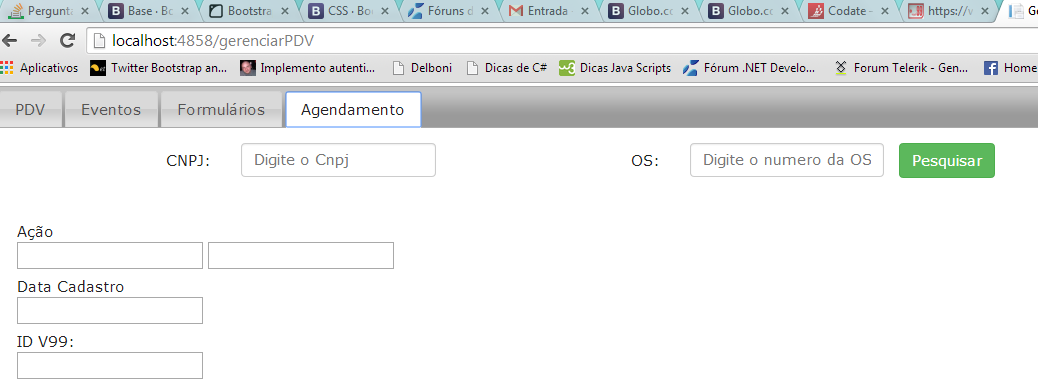
Note that the first label (CNPJ) is very far from the margin and the most important for me. The distance between the label and the control is very large and the distance between the label OS and the input control of CNPJ is great too. How do I resolve this issue: My code below.

<link rel="stylesheet" href="//code.jquery.com/ui/1.10.4/themes/smoothness/jquery-ui.css" />
    <link rel="stylesheet" href="http://jqueryui.com/resources/demos/style.css" />

    <script src="//code.jquery.com/jquery-1.10.2.js"></script>
    <script src="//code.jquery.com/ui/1.10.4/jquery-ui.js"></script>

    <link href="~/Content/Menu.css" rel="stylesheet" />
    <link href="~/Content/Styles.css" rel="stylesheet" />

    <link rel="stylesheet" href="//maxcdn.bootstrapcdn.com/bootstrap/3.2.0/css/bootstrap.min.css">
    <script type="text/javascript" src="~/Scripts/bootstrap.js"></script>
    <link href="~/Content/datepicker.css" rel="stylesheet" media="screen" />
    <script src="~/Scripts/bootstrap-datepicker.js"></script>

................
 <form class="form-horizontal" role="form">
                <div class="form-group">
                    <label for="txtCnpj1" class="col-sm-2 control-label">CNPJ:</label>
                    <div class="col-sm-2">
                        <input type="text" class="form-control" id="txtCnpj1" placeholder="Digite o Cnpj">
                    </div>
                    <label for="txtOS" class="col-sm-2 control-label">OS:</label>
                    <div class="col-sm-2">
                        <input type="text" class="form-control input-small" id="txtOS" placeholder="Digite o numero da OS">
                    </div>
                    <input id="btnPesquisar" type="button" class="btn btn-success" value="Pesquisar" onclick=" return MontaAgendamento();" />
                </div>
            </form>
............
  • I don’t quite understand how you want me to stay.

  • I want it to be very close to the margin. I switched to col-Sm-1, and I gained so, some space, I mean, it’s close to what I want. I think the way will be to decrease that space. What I do not know what it is: col-Sm-, col-Md-, col-lg-* and etc... How I work within the grid the bootstrap mounts, making shift to anywhere. That’s missing.

  • tries to use the pull-left in the CNPJ label class. Or in the form-group div.

1 answer

1

The classes col-Xs, col-Sm, col-Md, col-lg are used to specify which size the column should take in each resolution.

Explaining:

.col-Xs-(column size) : Specifies which column size will be in cell phones

.col-Sm-(column size) : Specifies which column size on tablets

.col-Md-(column size) : Specifies which column size on desktops

.col-lg-(column size) : Specifies which column size will be on monitors larger than normal desktops.

Now for the classes to work correctly you need to encompass your code in two other Ivs that serve to define the total grid size.

In your case the code would look like this:

<div class="container">
  <div class="row">
   <div class="col-md-12">
     <form class="form-horizontal" role="form">
       <div class="form-group col-md-4">
         <label for="txtCnpj1" class="col-md-2 control-label">CNPJ:</label>
         <div class="col-md-10">
           <input type="text" class="form-control" id="txtCnpj1" placeholder="Digite o Cnpj">
        </div>
     </div>
    <div class="form-group col-md-4">
      <label for="txtOS" class="col-md-2 control-label">OS:</label>
      <div class="col-md-10">
         <input type="text" class="form-control input-small" id="txtOS" placeholder="Digite o numero da OS">
       </div>
       </div>
       <input id="btnPesquisar" type="button" class="btn btn-success" value="Pesquisar" onclick=" return MontaAgendamento();" />
     </form>
    </div>
  </div>
</div>

This code will align the CNPJ and OS block as you want, for the other fields just follow as it is in the code above. And for more information on how the bootstrap grid system works, visit http://getbootstrap.com/css/#grid

Browser other questions tagged

You are not signed in. Login or sign up in order to post.