4
Well, I’m trying to create a gallery, display:flex, how can I accomplish this?
- I thought about using the float, but I remembered that the flex display ignores any float :/
4
Well, I’m trying to create a gallery, display:flex, how can I accomplish this?
5
A very simple example is to create a "father div":
/*o BODY no doctype HTML5 ou Strict não ocupa 100%, então isso deve ajustar*/
html, body {
    height: 100%;
}

.flex-parent {
    display: -webkit-flex;
    display: flex;
    width: 100%;
    height: 100%;
}

.col {
    -webkit-flex-direction: column; /* Safari 6.1+ */
    flex-direction: column;
}

.flex-child {
    width: 100%;
    height: 100%;
    background-color: #c0c0c0;
    margin: 2px;
}
<div class="flex-parent col">
<div class="flex-parent">
<div class="flex-parent">
<div class="flex-child">Filho 0</div>
</div>
<div class="flex-parent col">
<div class="flex-child">Filho 1</div>
<div class="flex-child">Filho 2</div>
</div>
</div>
<div class="flex-parent">
<div class="flex-child">Filho 1</div>
<div class="flex-child">Filho 2</div>
<div class="flex-child">Filho 3</div>
</div>
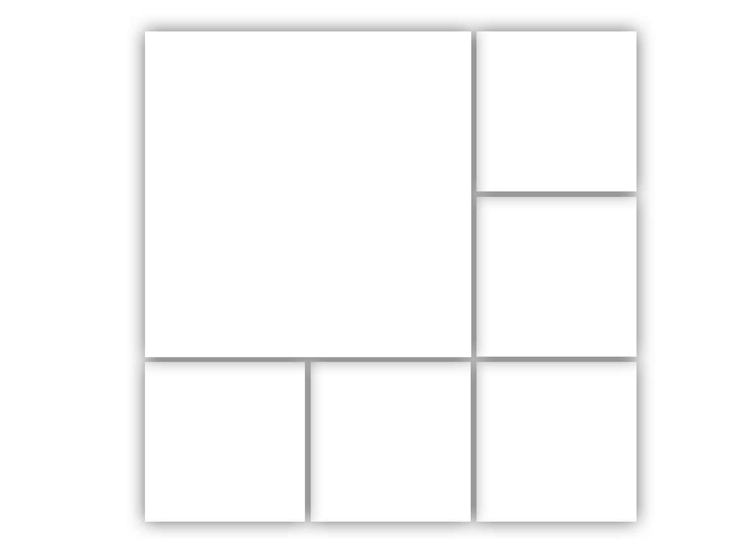
</div>flex-parent is responsible for raising parents and grandparentsflex-child is to take up 100% of the space (can be replaced and can be optional, ie the children may vary in size), however it may be better to use it to prevent the orientation of buttons and forms or other things within the flex are affectedcol changes the orientation of childrenIf you have any concerns about older browsers, like some mobile for example, you can try using float: ...; and adjusting the percentage of width and height as needed, an example:
/*
o BODY no doctype HTML5 ou Strict não ocupa 100%, então isso deve ajustar
A margem afeta os elementos filhos, então neste caso é melhor remover
*/
html, body {
    margin: 0;
    height: 100%;
}

.top, .child, .bottom, .v-block, .big-block {
   box-sizing: border-box;
}


.main {
    width: 100%;
    height: 100%;
}

.top {
    width: 100%;
    height: 66.6665%;
}

.bottom {
    width: 100%;
    height: 33.3332%;
}

.big-block {
    width: 66.6665%;
    height: 100%;
    float: left;
}
.v-block {
    float: left;
    width: 33.3332%;
    height: 100%;
}

.child {
    background-color: #c0c0c0;
    width: 100%;
    height: 100%;

    /*sombra só pra identificar o childs*/
    box-shadow: inset 0 0 2px 2px rgba(0,0,0,.26);
}
.v-block > .child {
    height: 50%;
}
.bottom > .child {
    float: left;
    width: 33.3332%;
    height: 100%;
}
<div class="main">
<div class="top">
<div class="big-block">
<div class="child">Filho 0</div>
</div>
<div class="v-block">
<div class="child">Filho 1</div>
<div class="child">Filho 2</div>
</div>
</div>
<div class="bottom">
<div class="child">Filho 3</div>
<div class="child">Filho 4</div>
<div class="child">Filho 5</div>
</div>
</div>can only pay in 23 hours, so release I give the rep
@Murilogambôa doesn’t even need to worry, I like CSS questions a lot, if you had seen before the reward I would have answered. PS: I’ll start following the CSS feed https://answall.com/feeds/tag?tagnames=css&sort=newest :D
1
You can use the CSS GRID that self-adjusting to the width of the div:
.wrapper {
    display: grid;
    grid-template-columns: repeat(3, 1fr);
    grid-gap: 5px;
    background-color: #fff;
    color: #444;
    grid-auto-rows: minmax(150px, auto);
}

.box {
    background-color: #444;
    color: #fff;
    padding: 20px;
    font-size: 150%;
}

.box.a{
    grid-column-start: 1;
    grid-column-end: 3;
    grid-row-end:span 2;
}
<div style="display: block; width: 100%;">
<div class="wrapper">
<div class="box a">a</div>
<div class="box b">b</div>
<div class="box c">c</div>
<div class="box d">d</div>
<div class="box e">e</div>
<div class="box f">f</div>
</div>
</div>Browser other questions tagged css grid gallery flexbox
You are not signed in. Login or sign up in order to post.
Why would I have to use the
display: flex?– Sam
I know it’s not really an answer, but take a look at this http://bulma.io/documentation/layout/tiles/
– Caio Felipe Pereira
@Dvdsamm, to learn how to do this with the flex display, since I already know how to do it with float
– Murilo Melo
Have you used GRID? Check out this Fiddle: https://jsfiddle.net/xe468gz8/
– Sam
@Dvdsamm formulates an answer with this example, got very good.
– Guilherme Nascimento
Posted answer. Abs!
– Sam